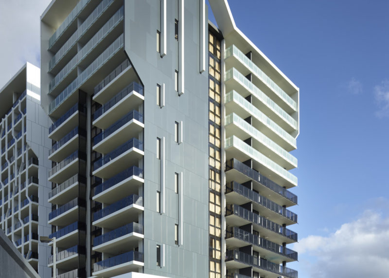
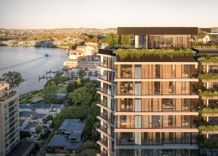
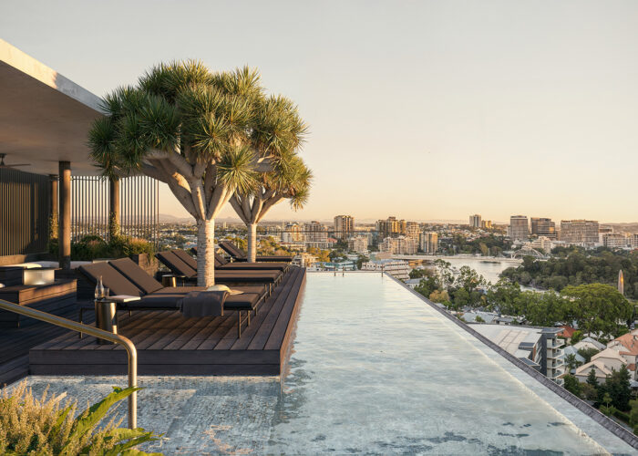
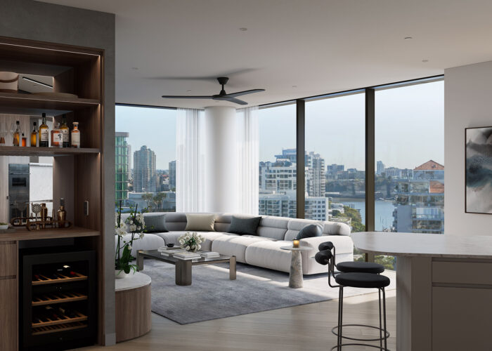
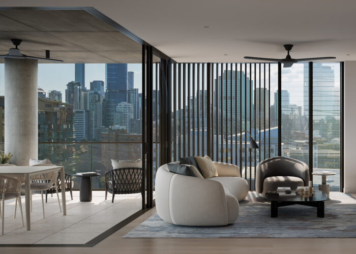
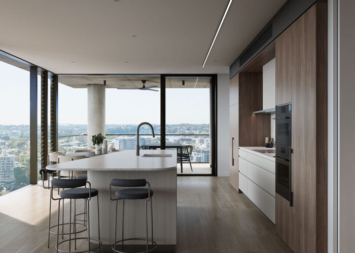
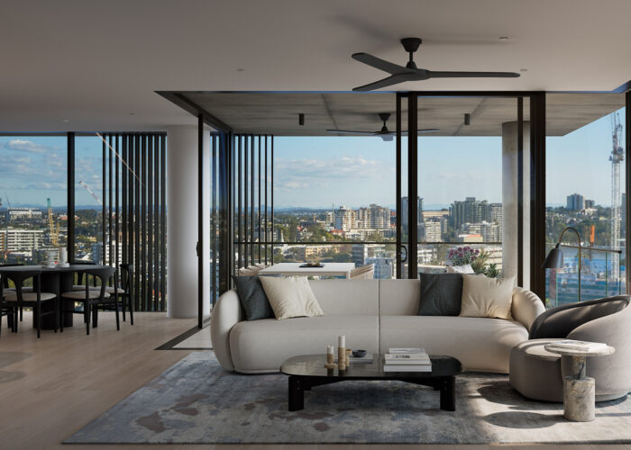
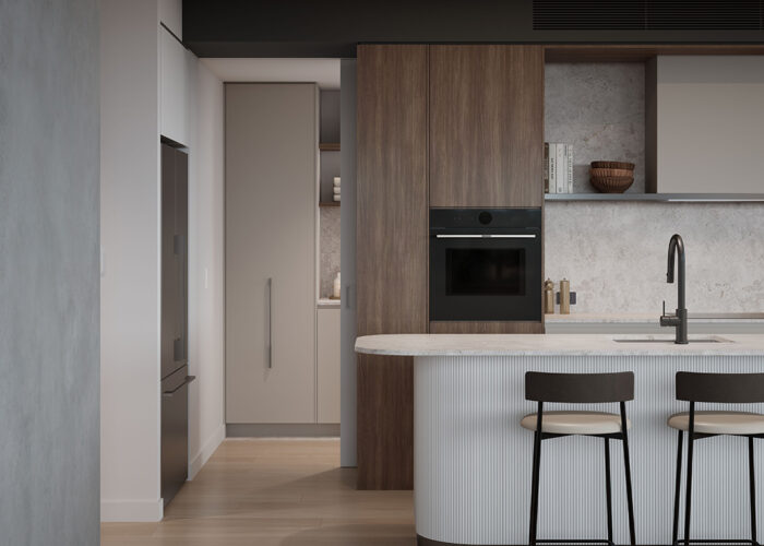
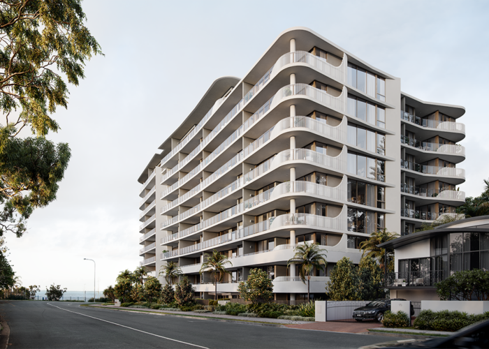
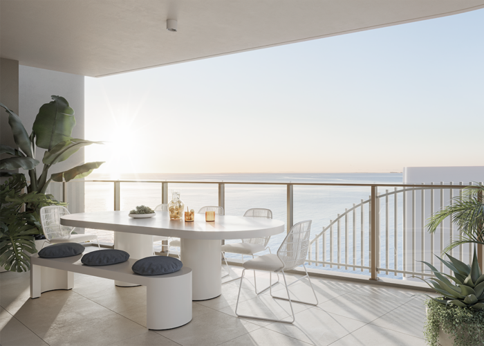
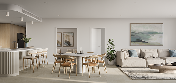
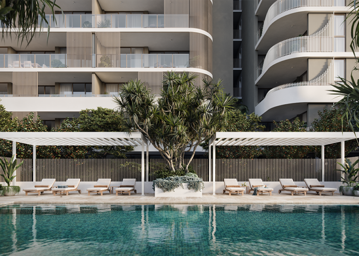
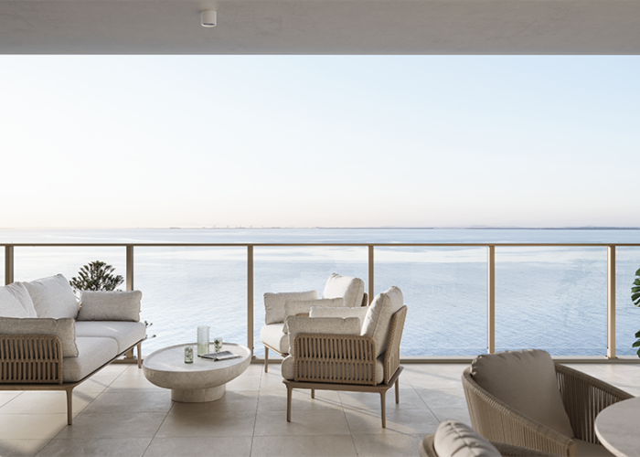
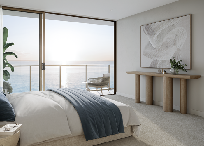
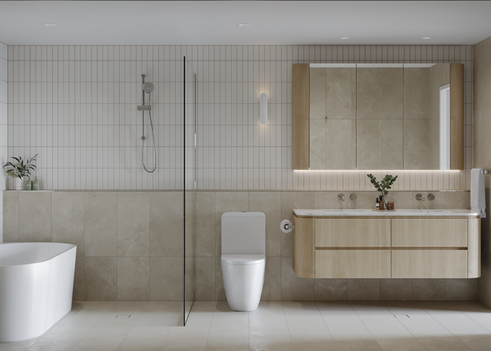
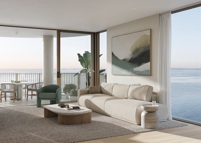
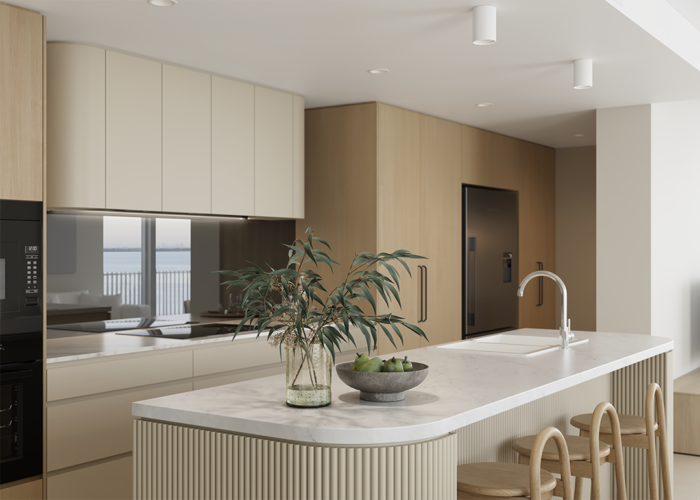
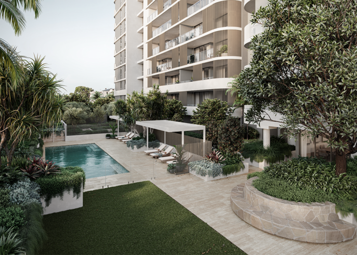
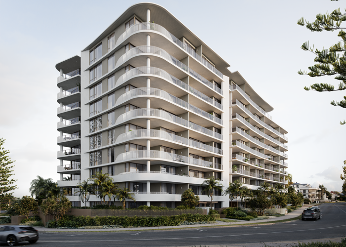
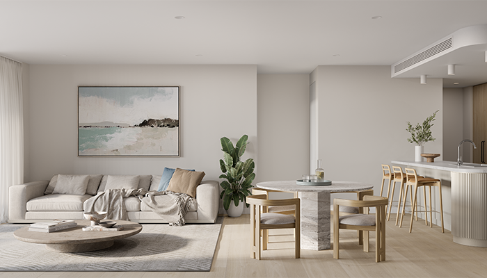
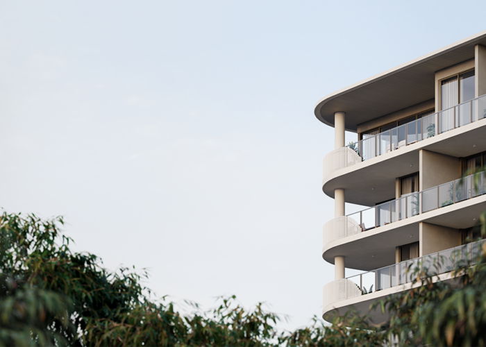
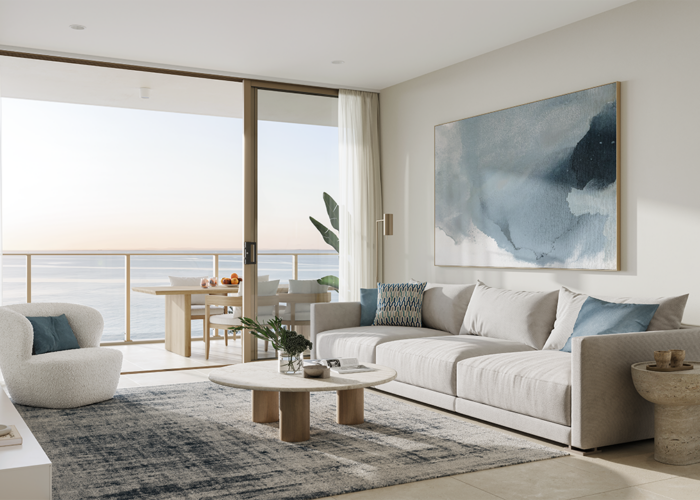
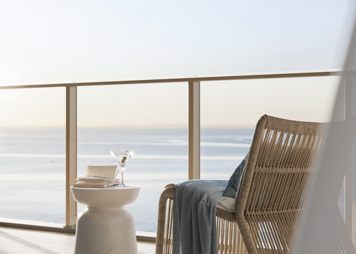
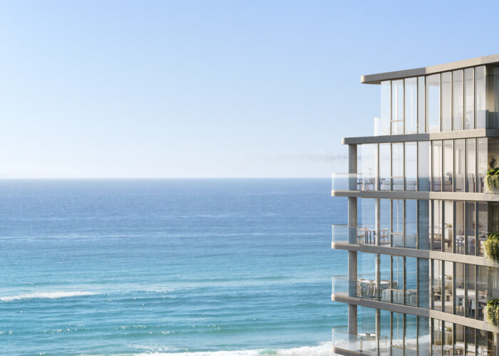
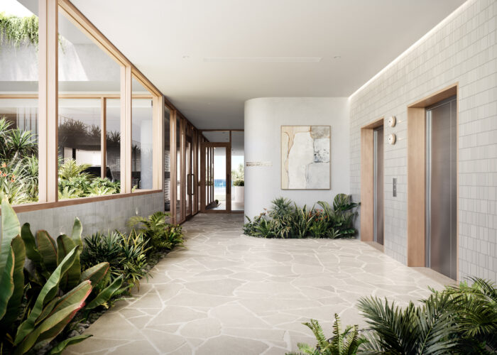
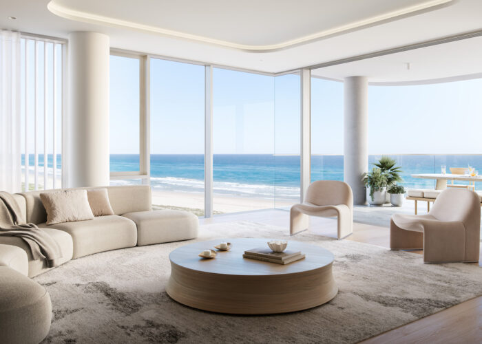
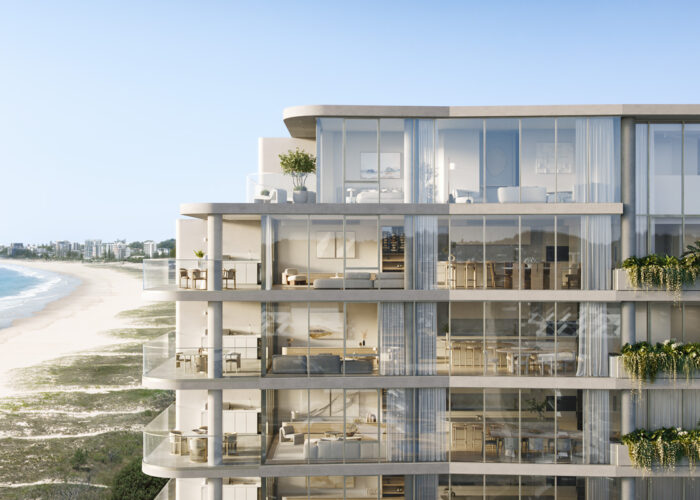
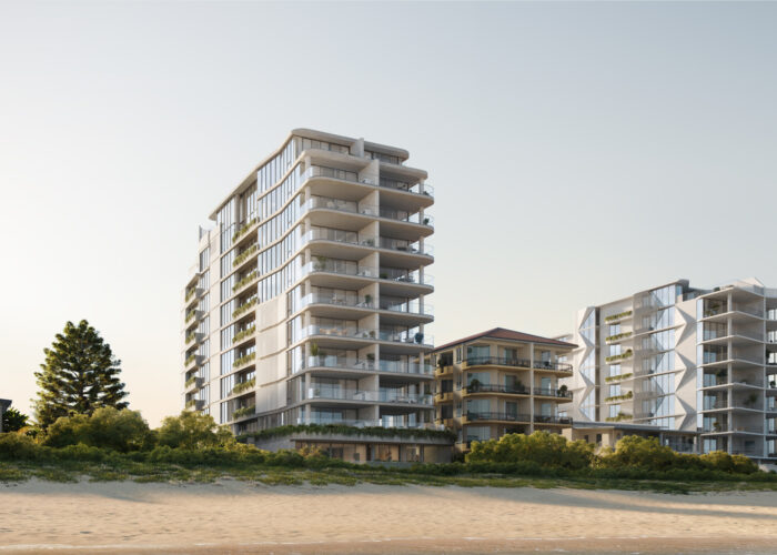
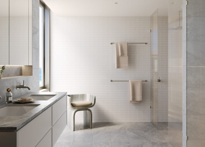
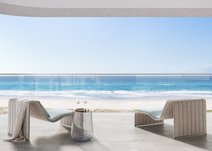
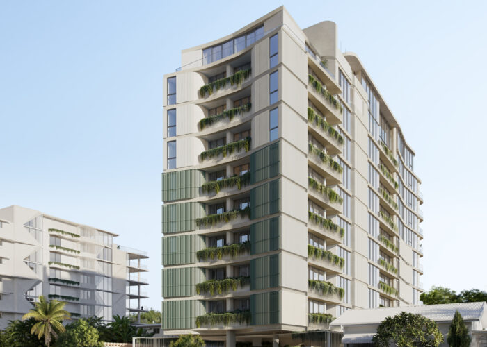
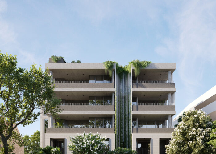
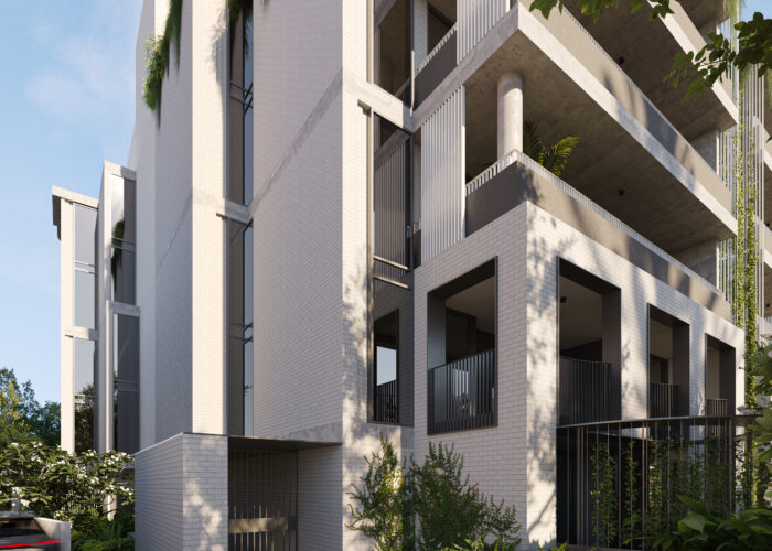
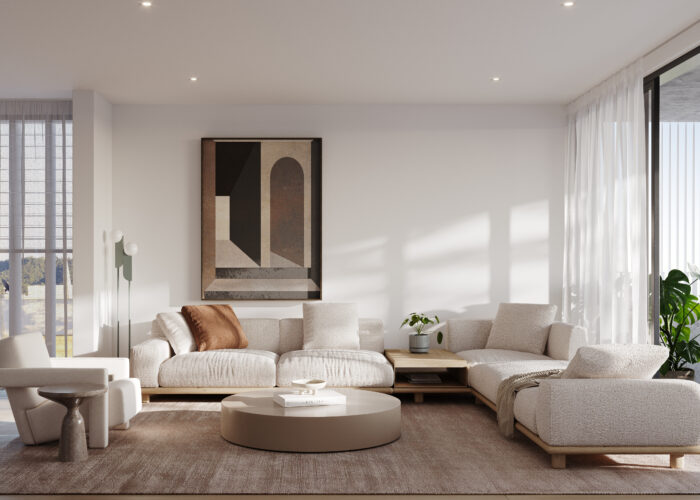
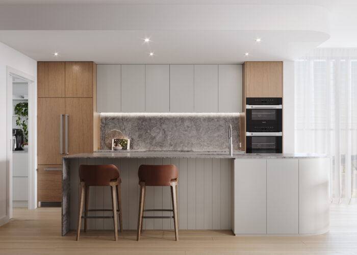
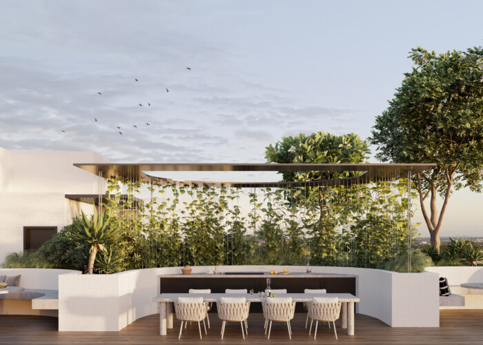
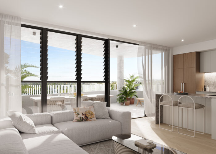
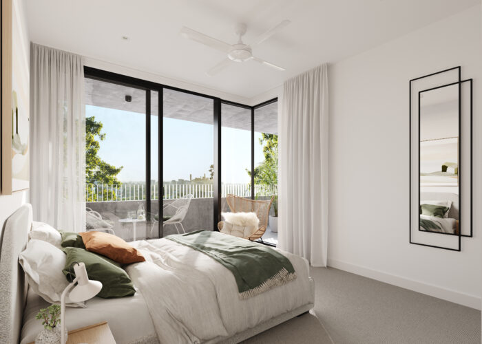
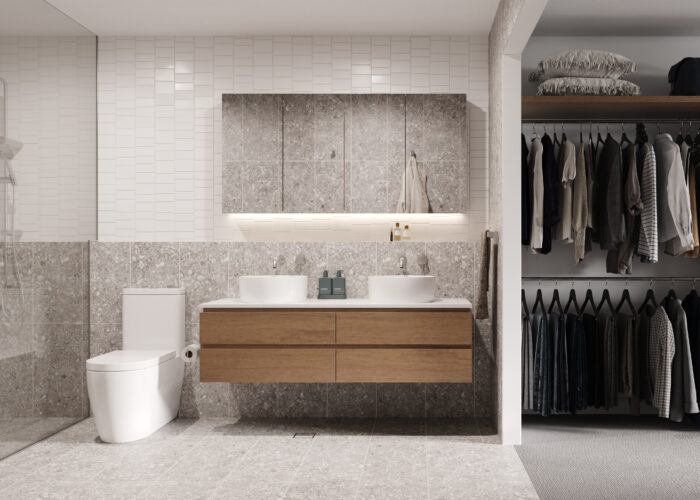
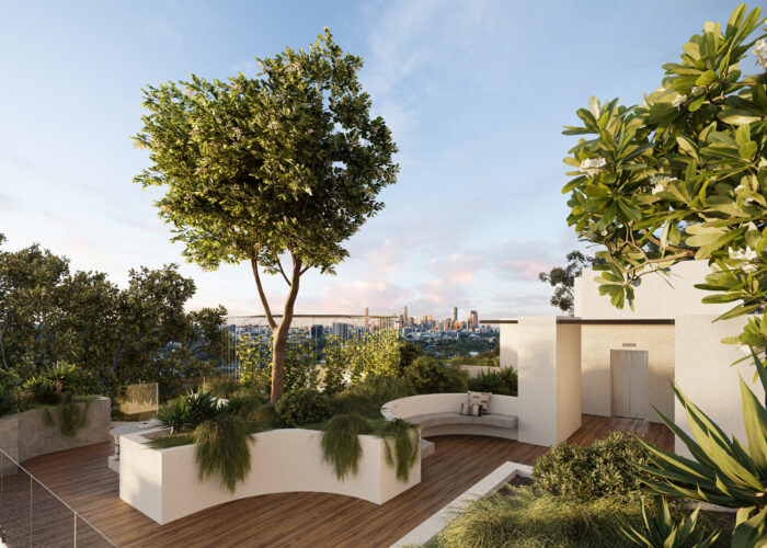
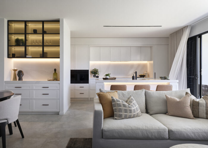
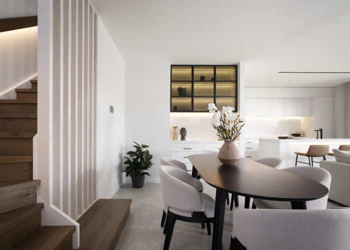
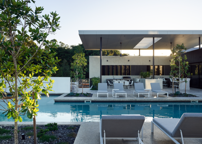
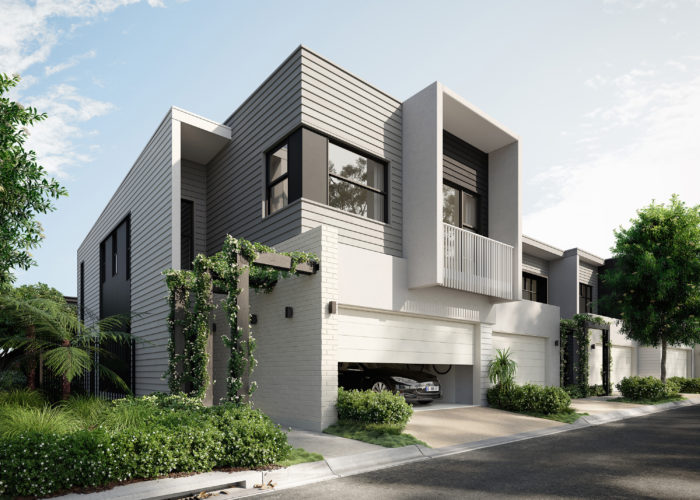
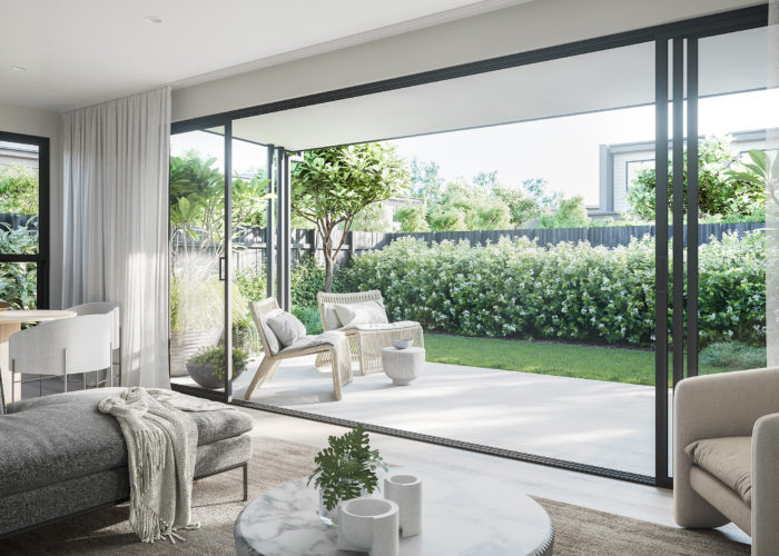
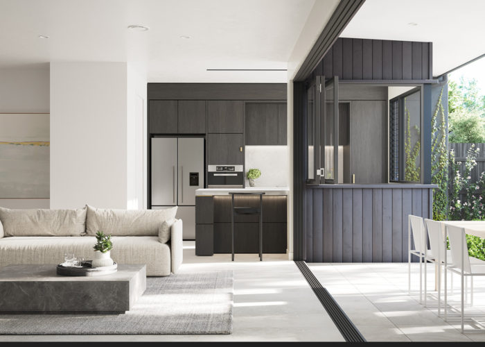
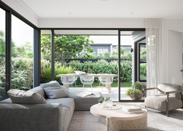
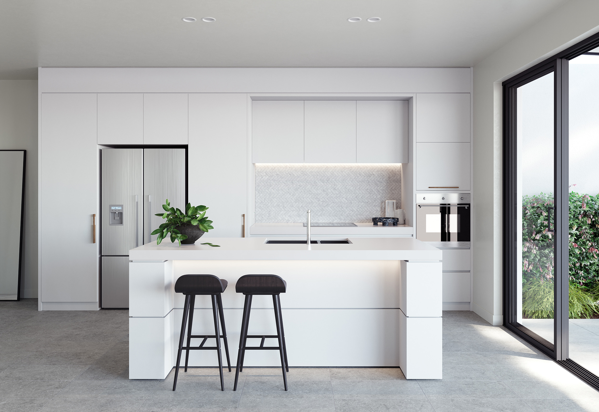
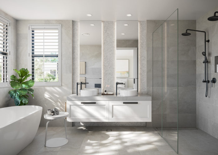
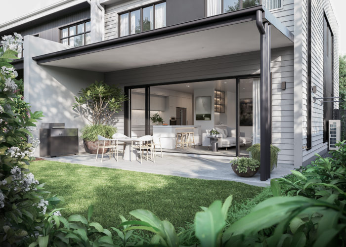
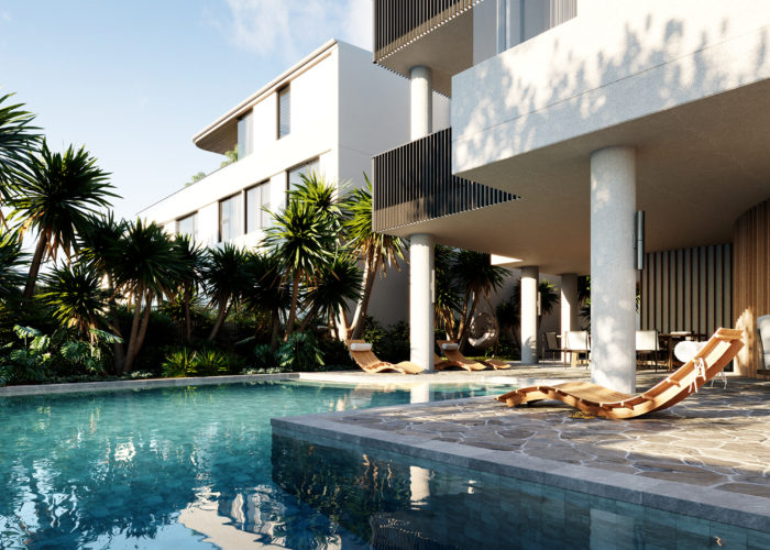
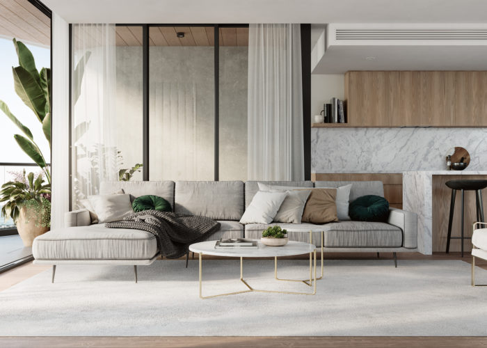
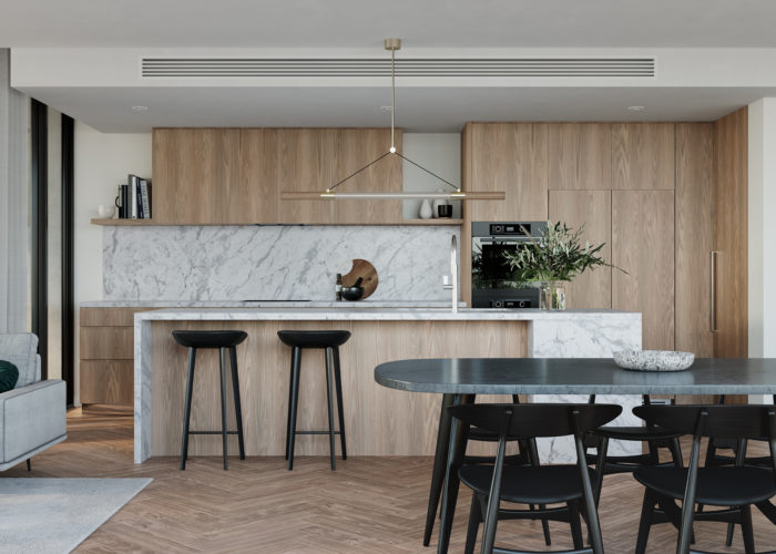
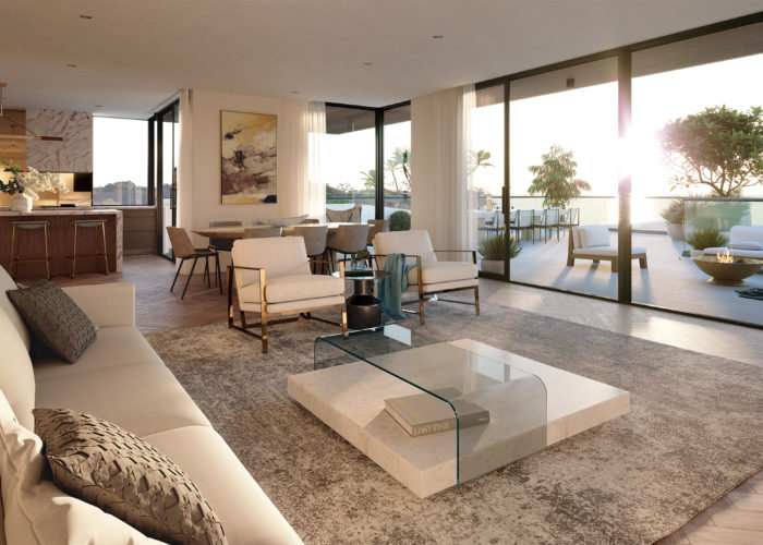
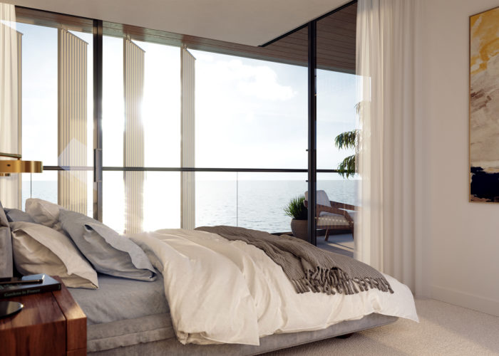
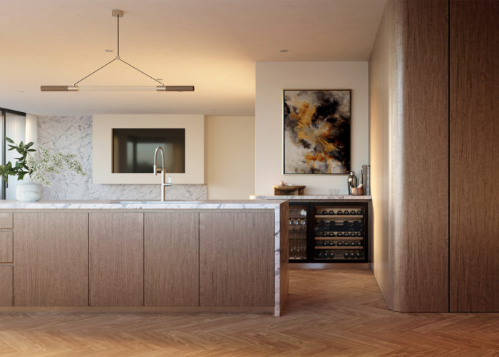
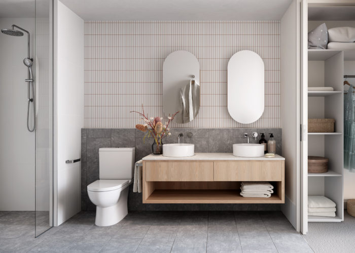
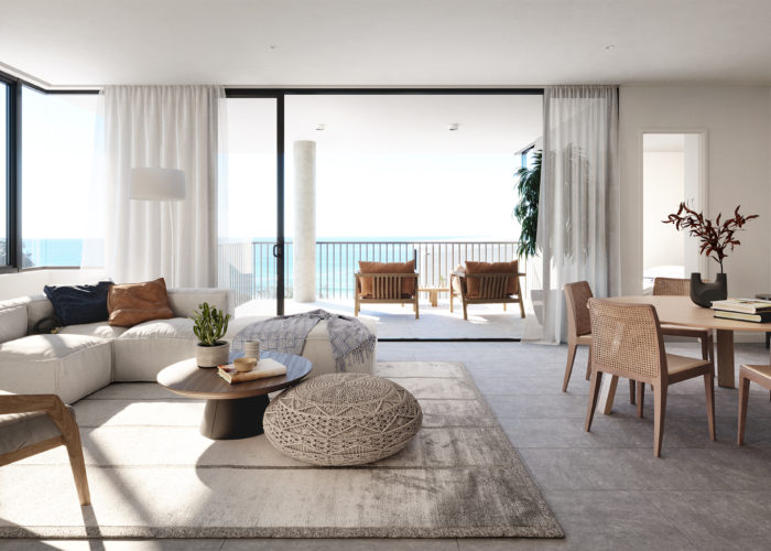
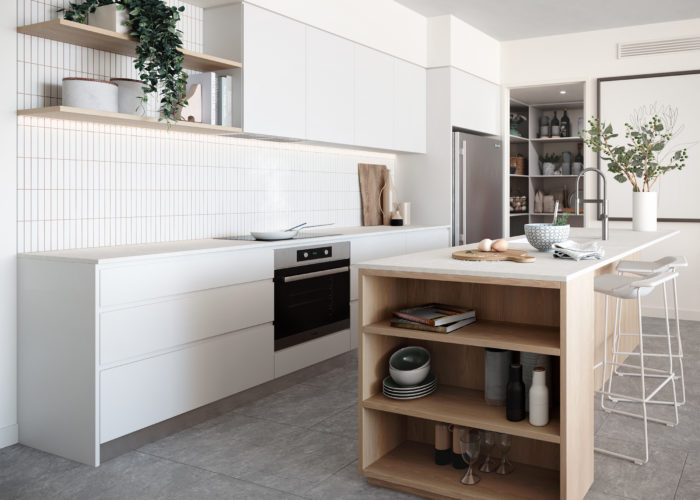
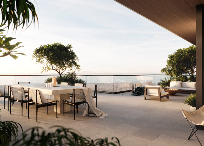
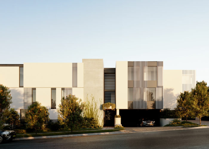
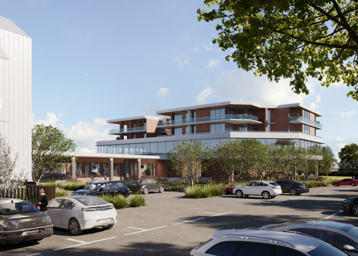
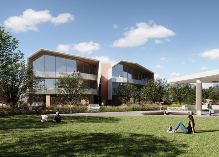
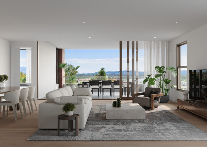
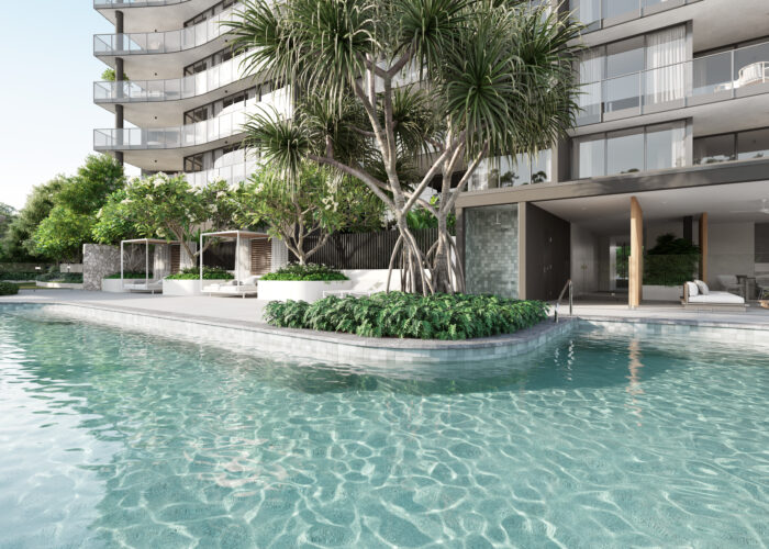
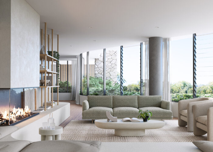
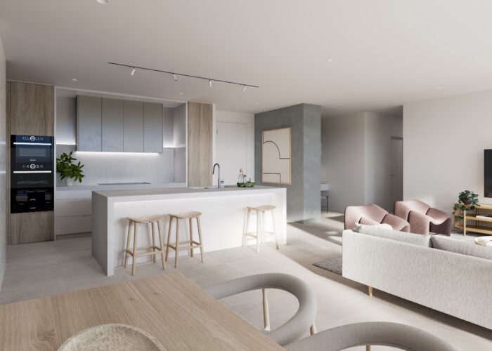
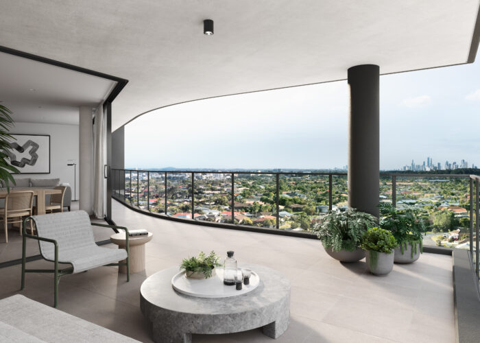
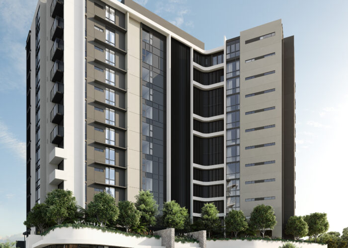
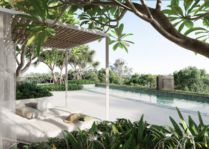
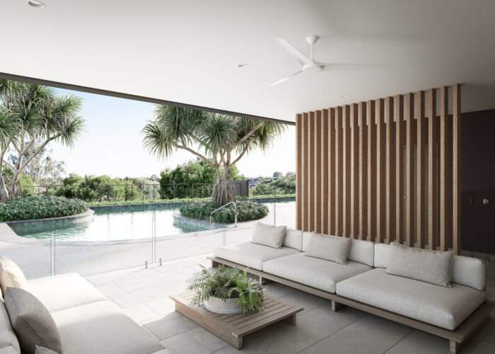
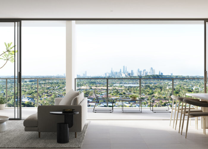
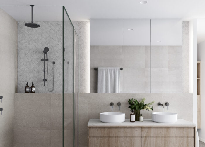
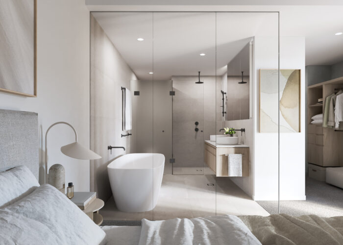
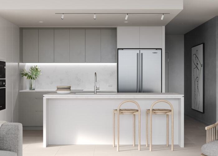
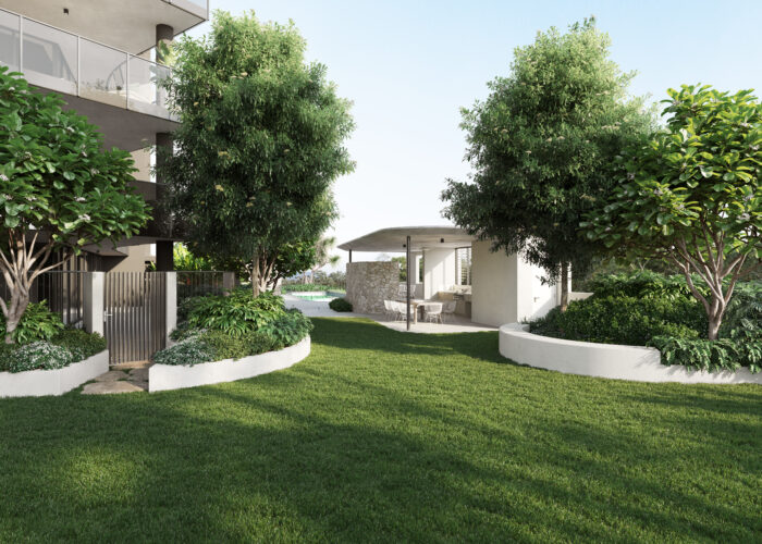
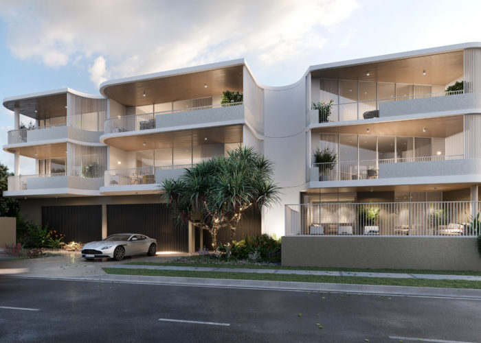
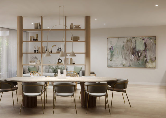
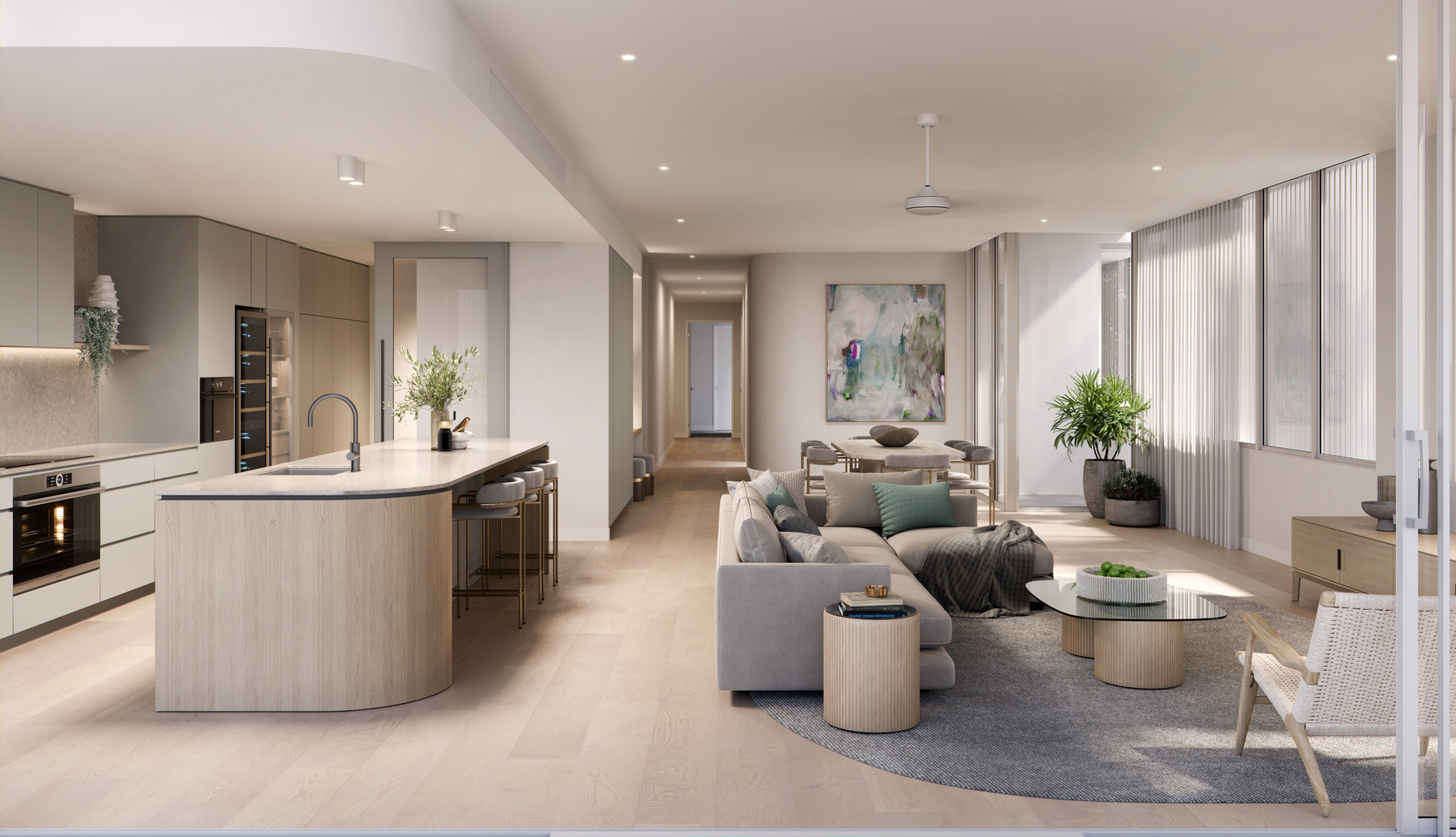
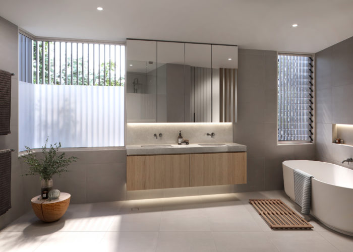
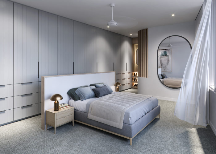
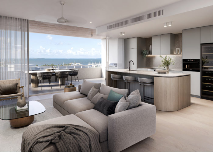
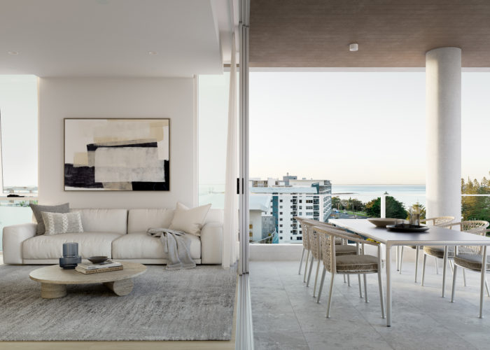
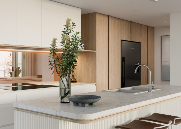
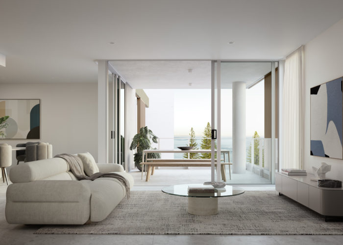
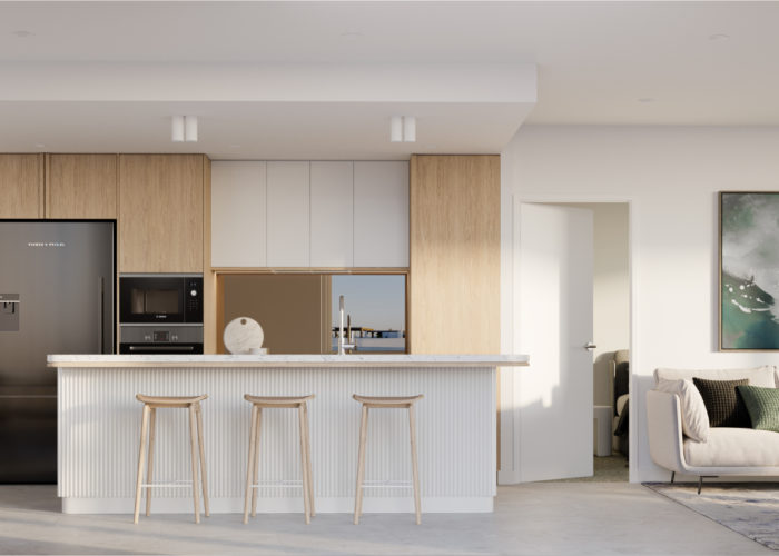
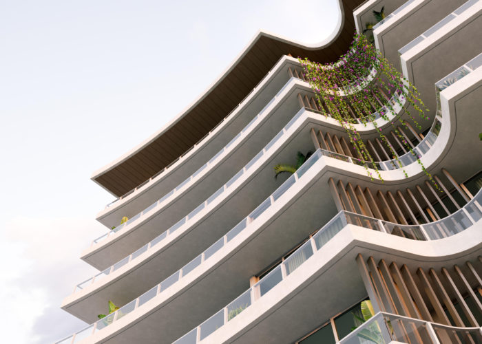
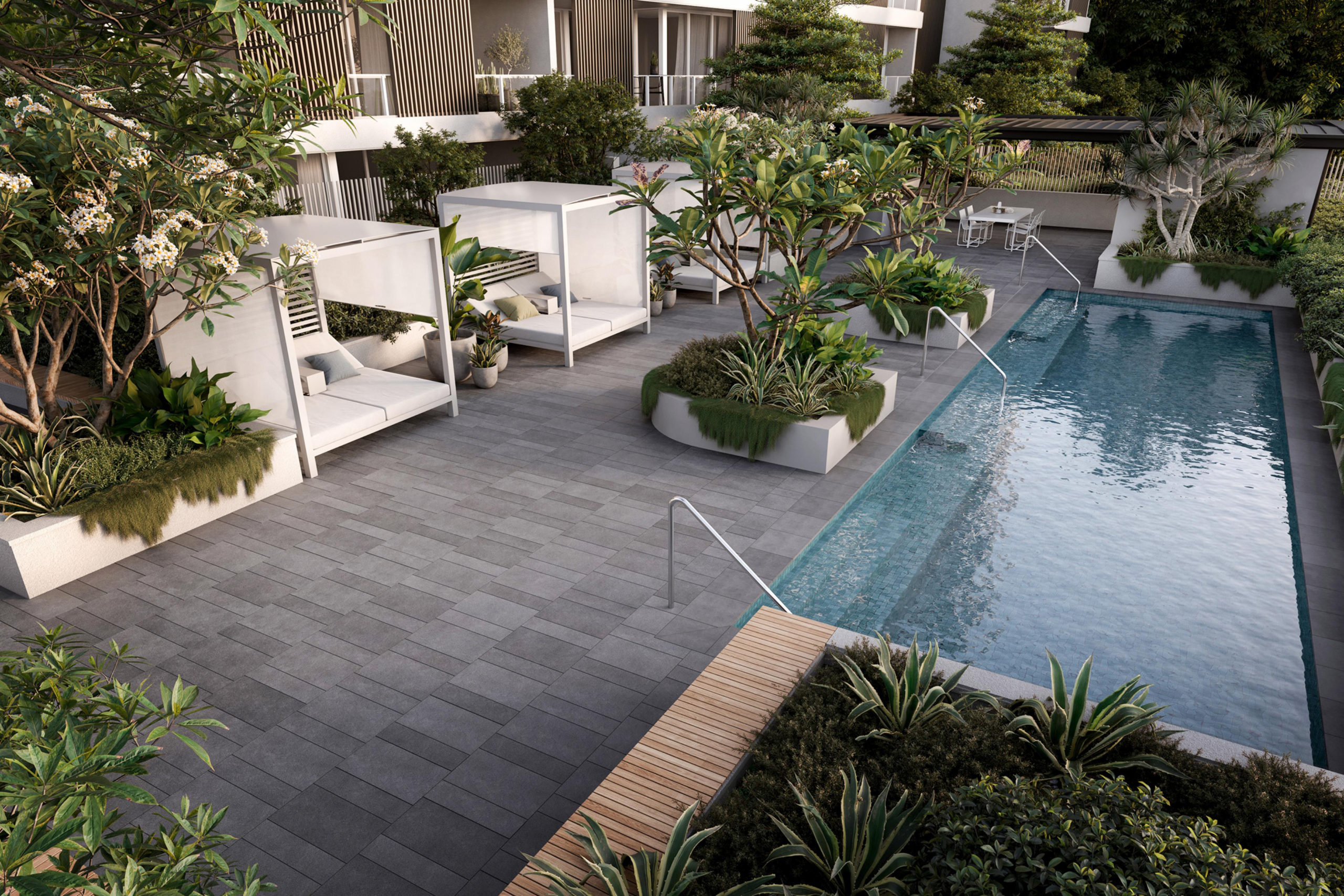
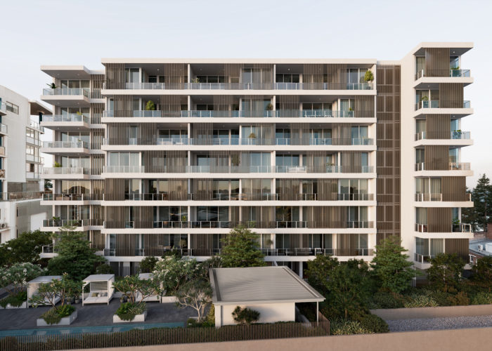
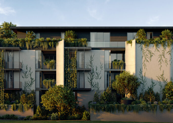
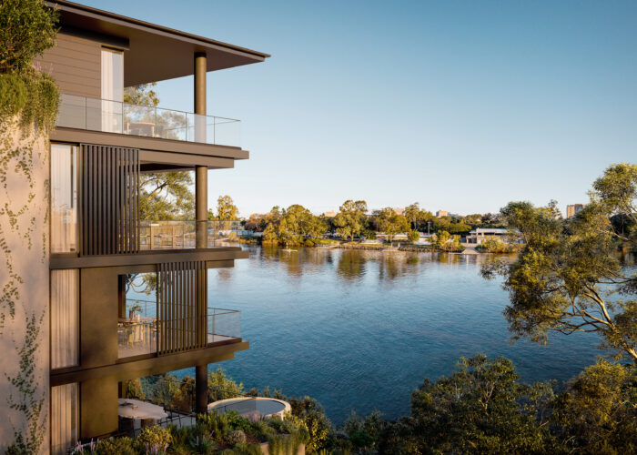
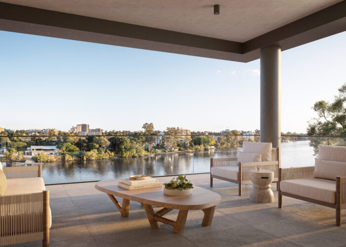
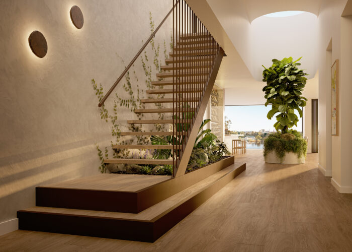
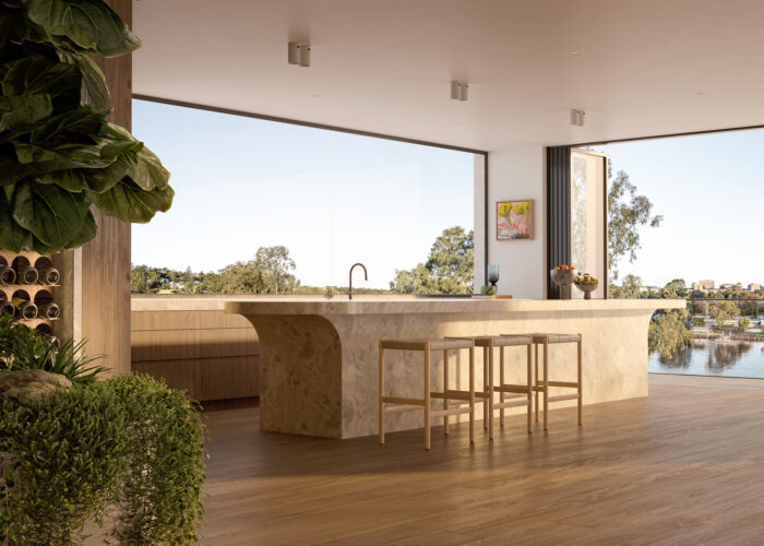
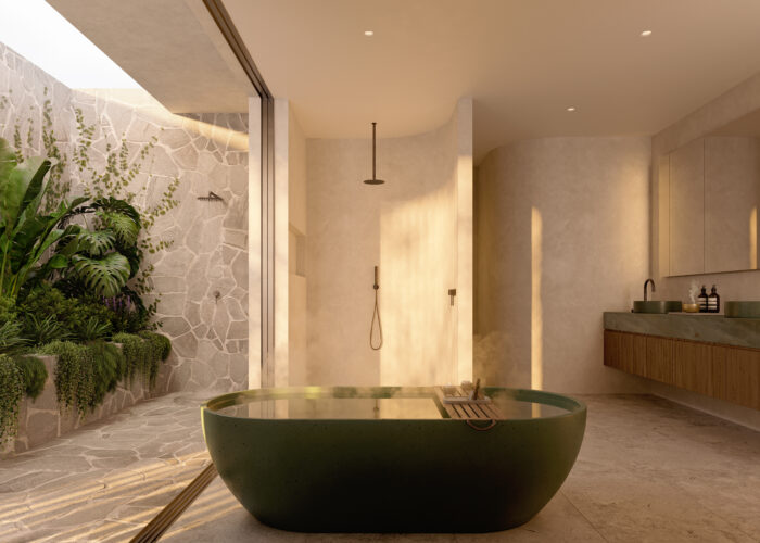
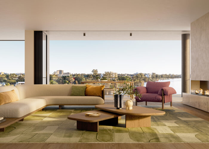
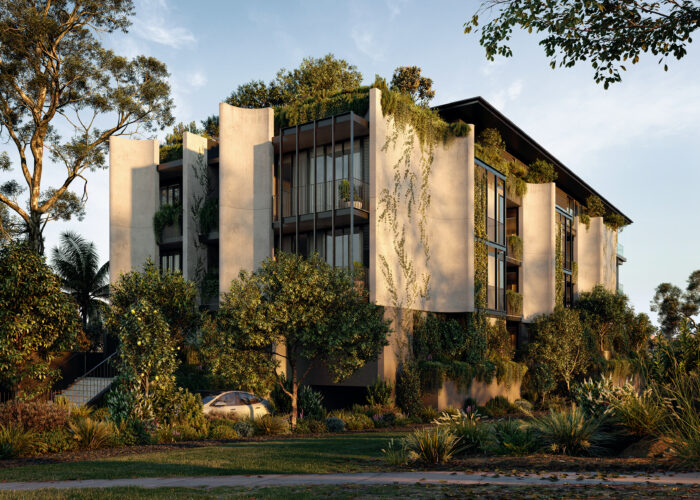
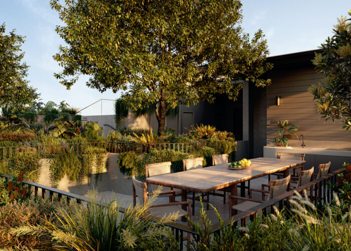
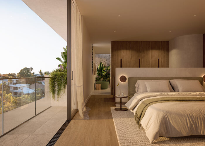
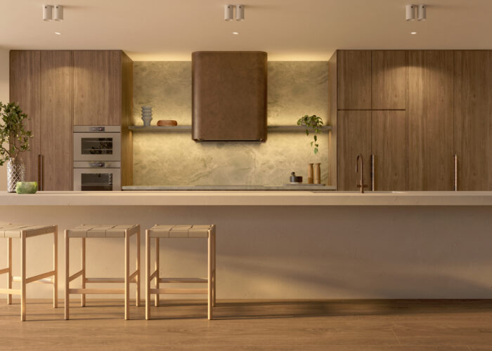
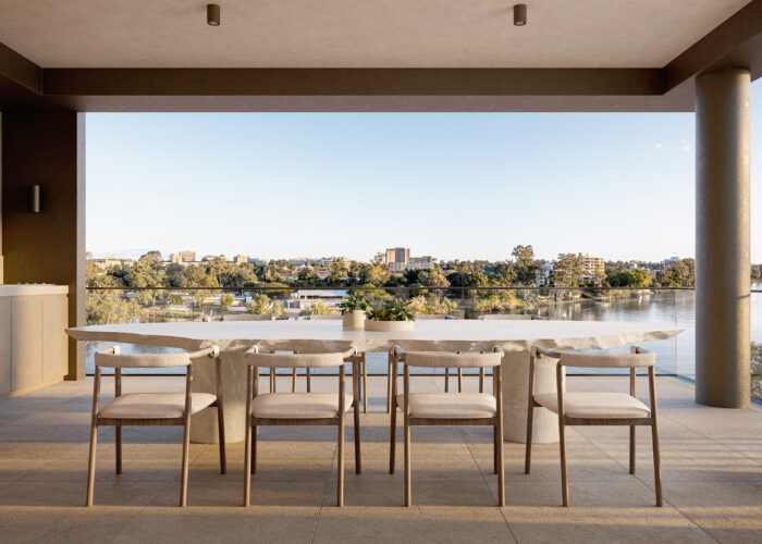
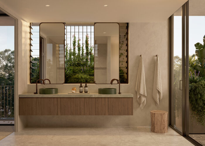
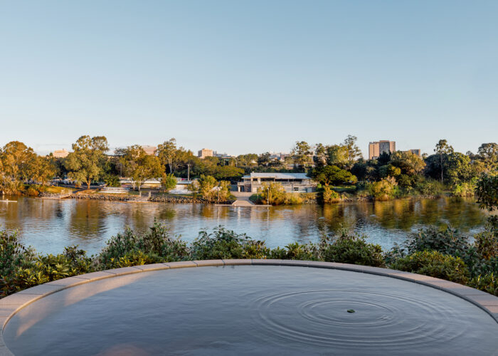
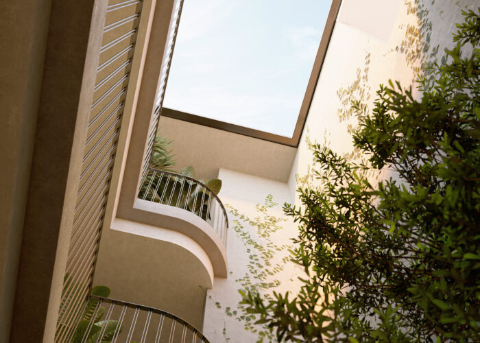
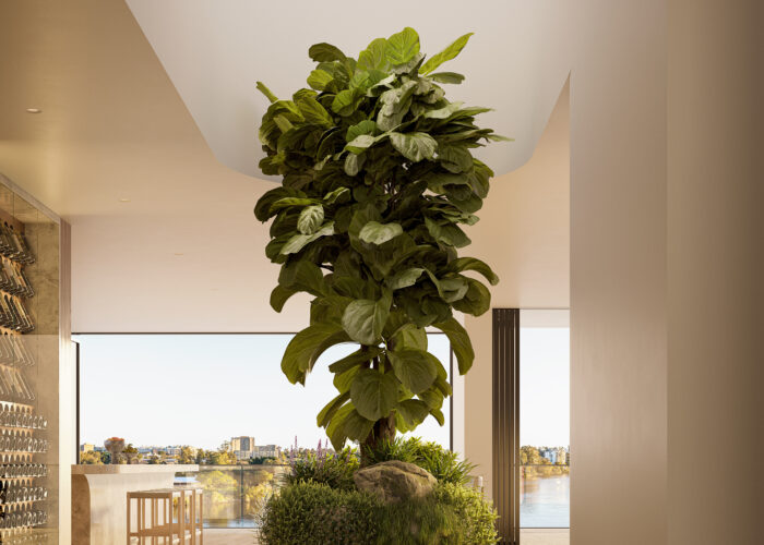
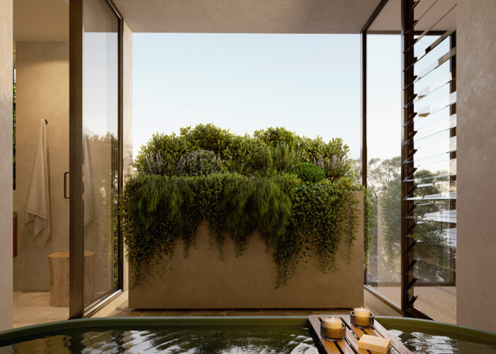
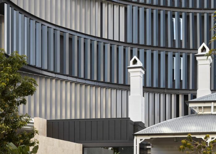
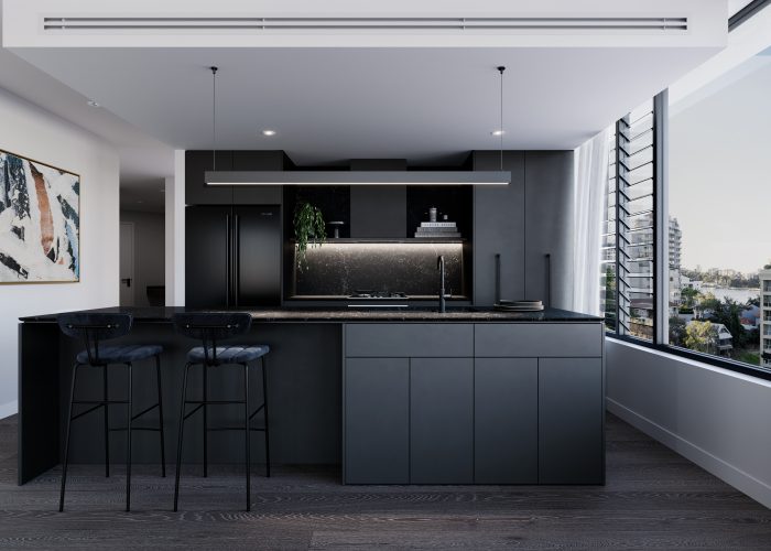
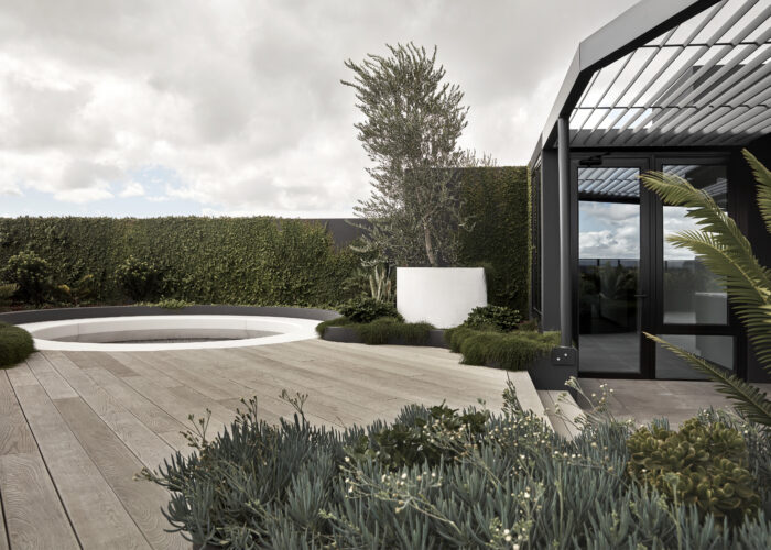
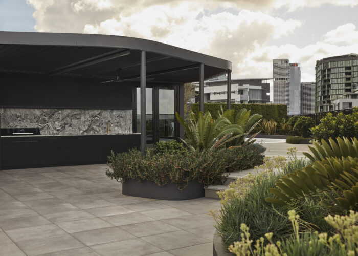
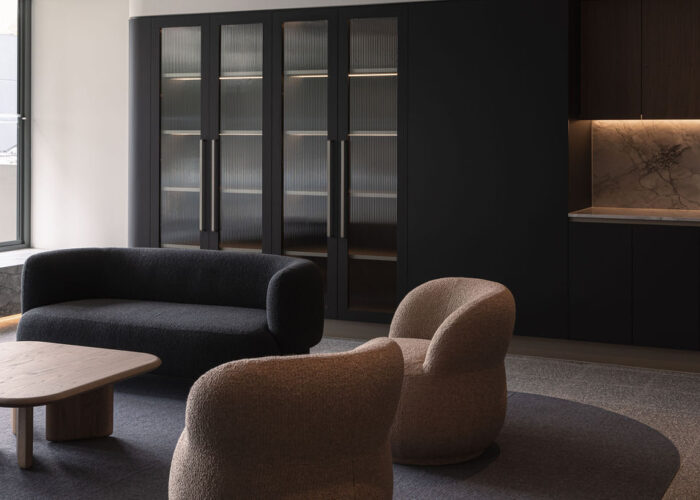
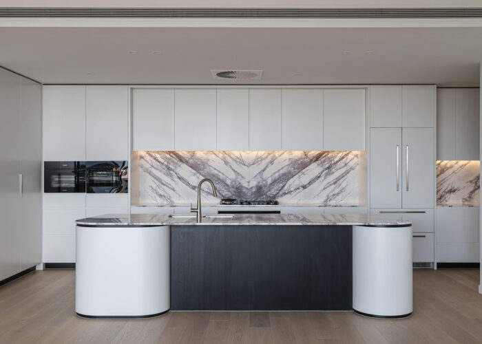
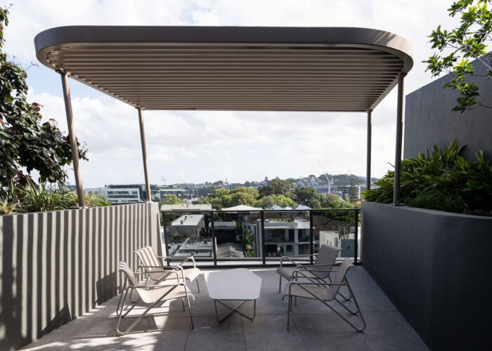
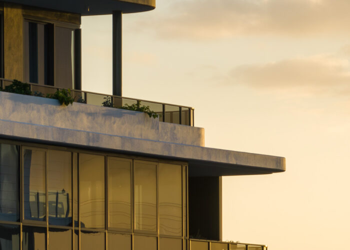
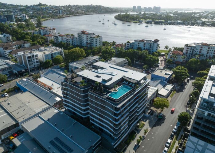
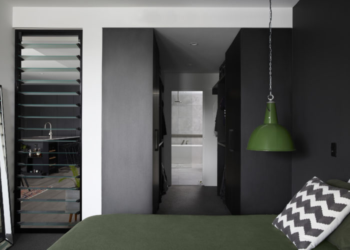
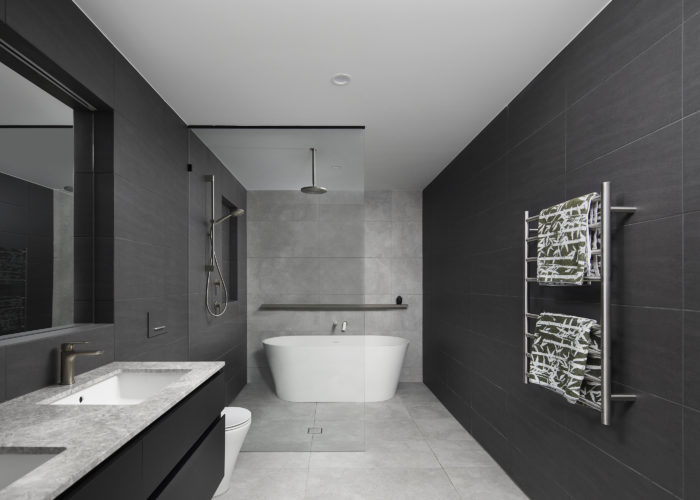
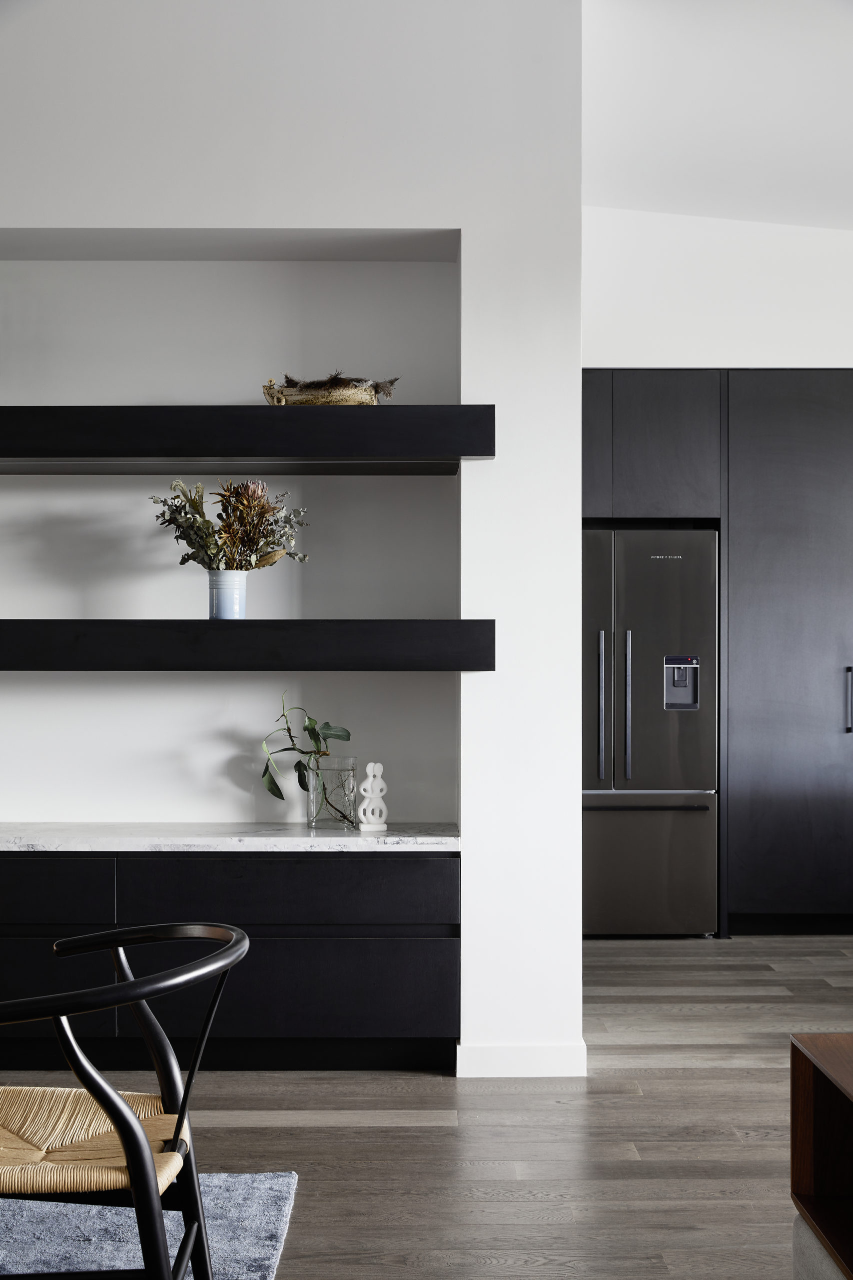
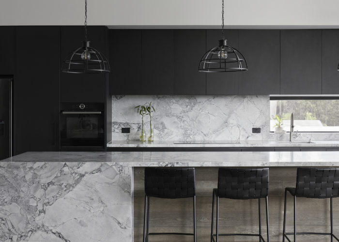
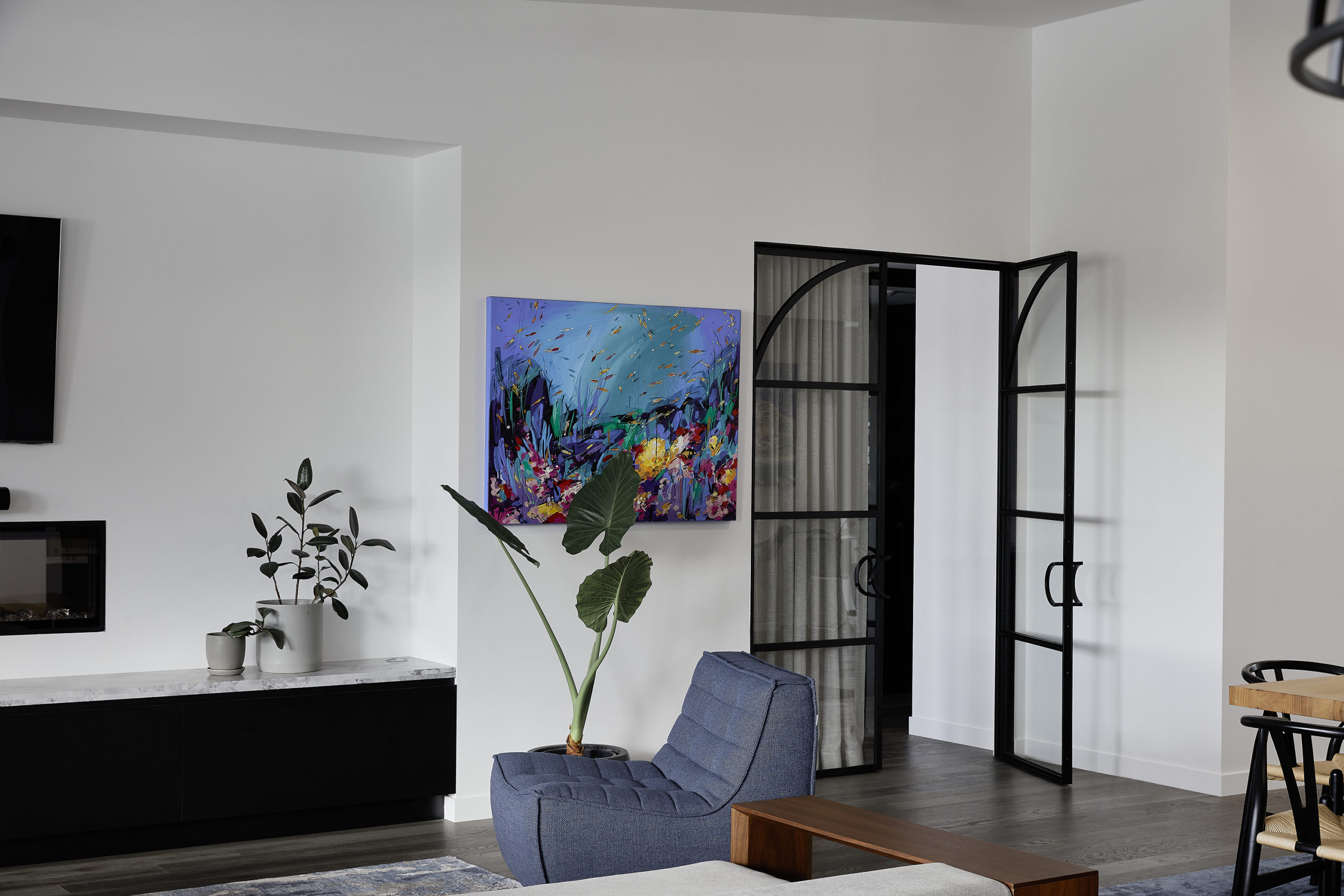
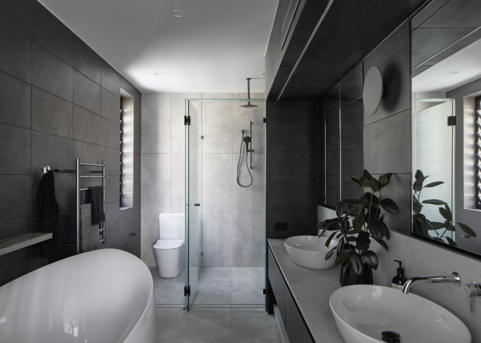
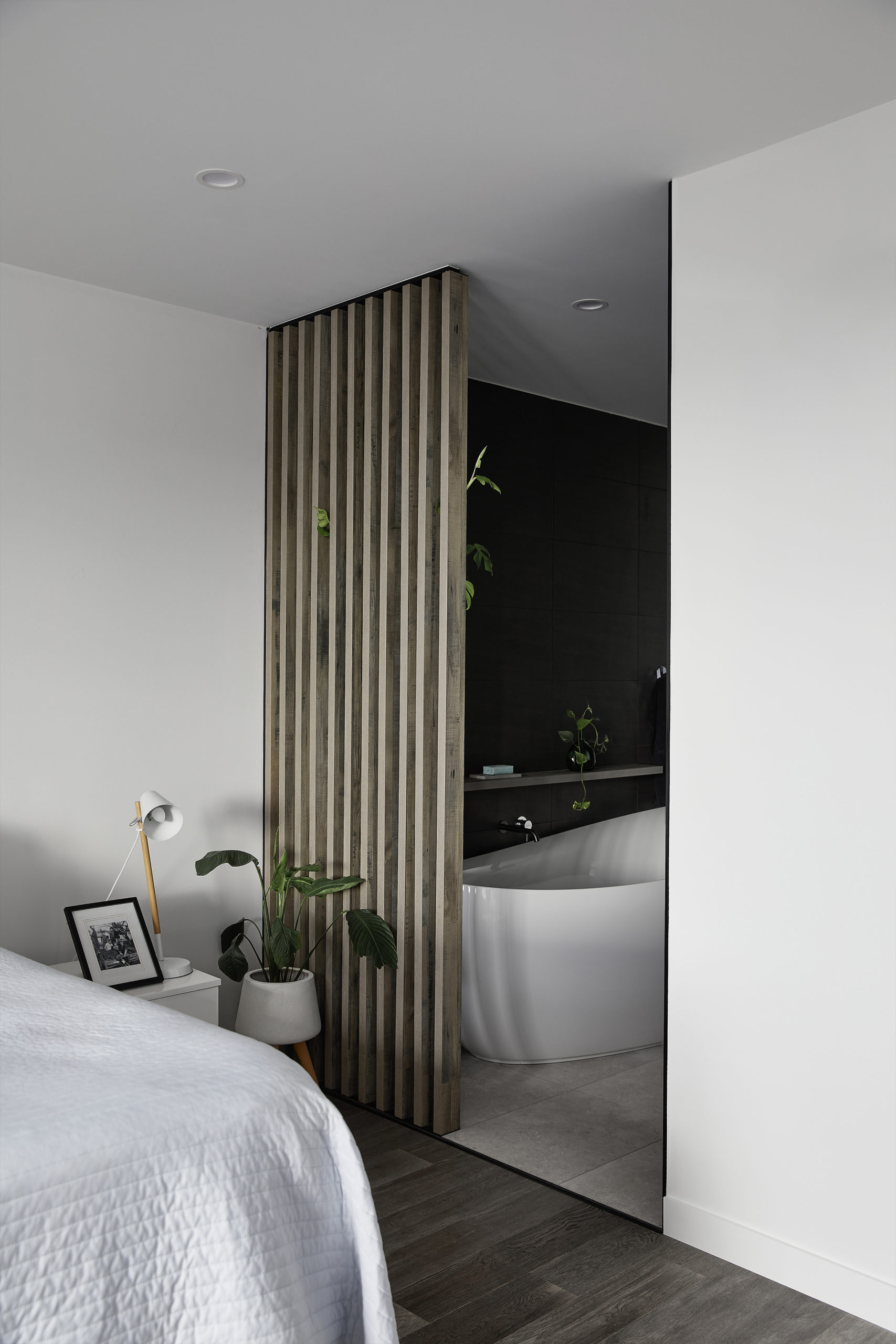
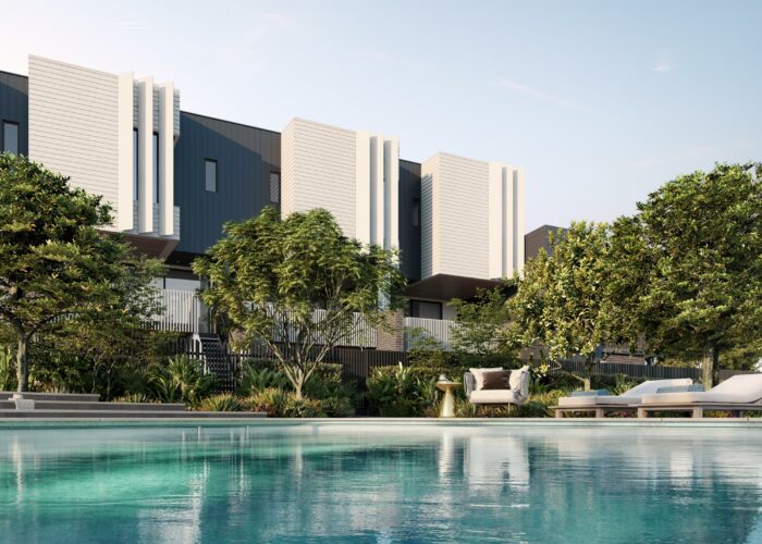
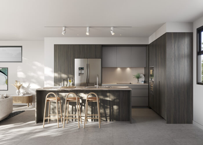
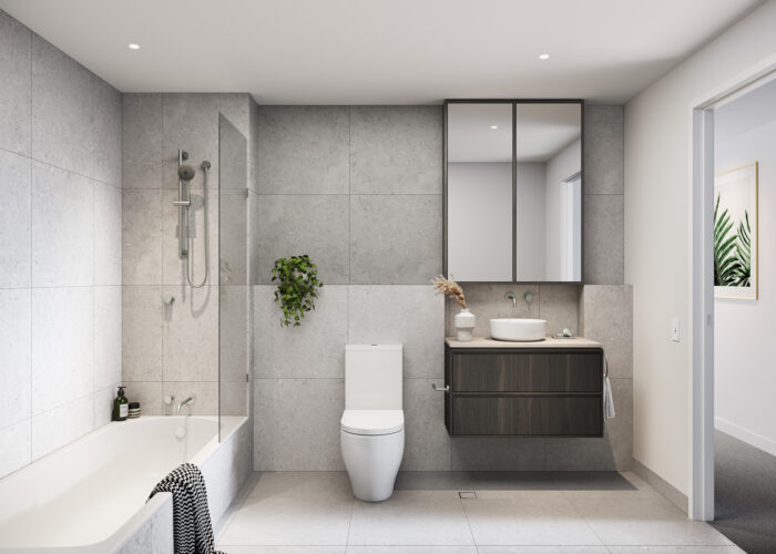
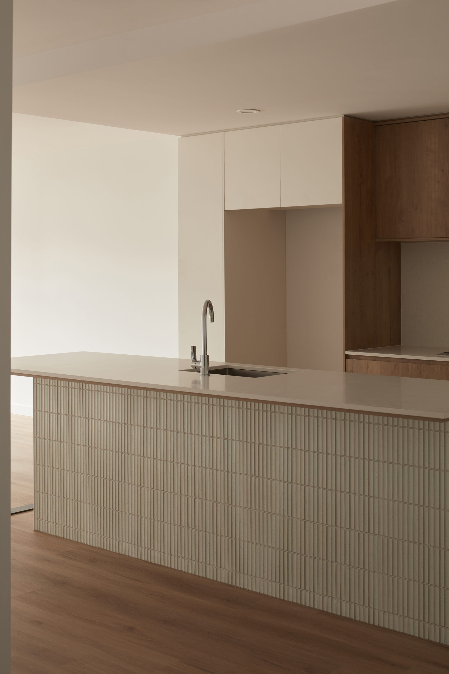
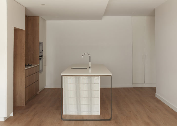
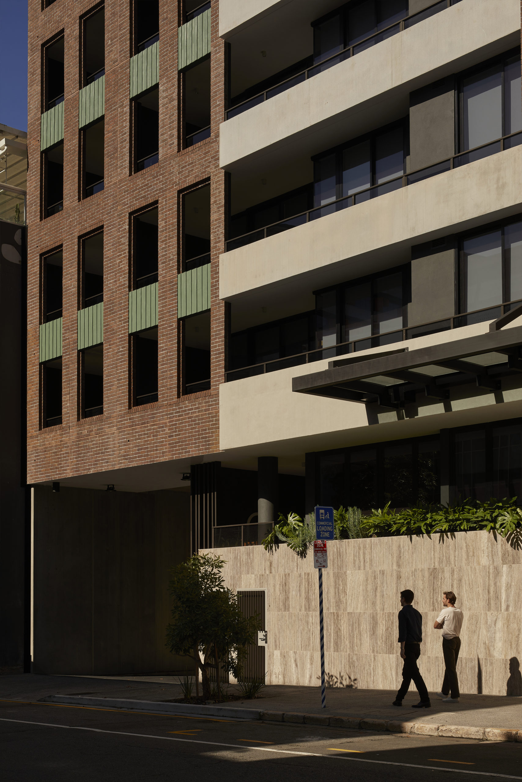
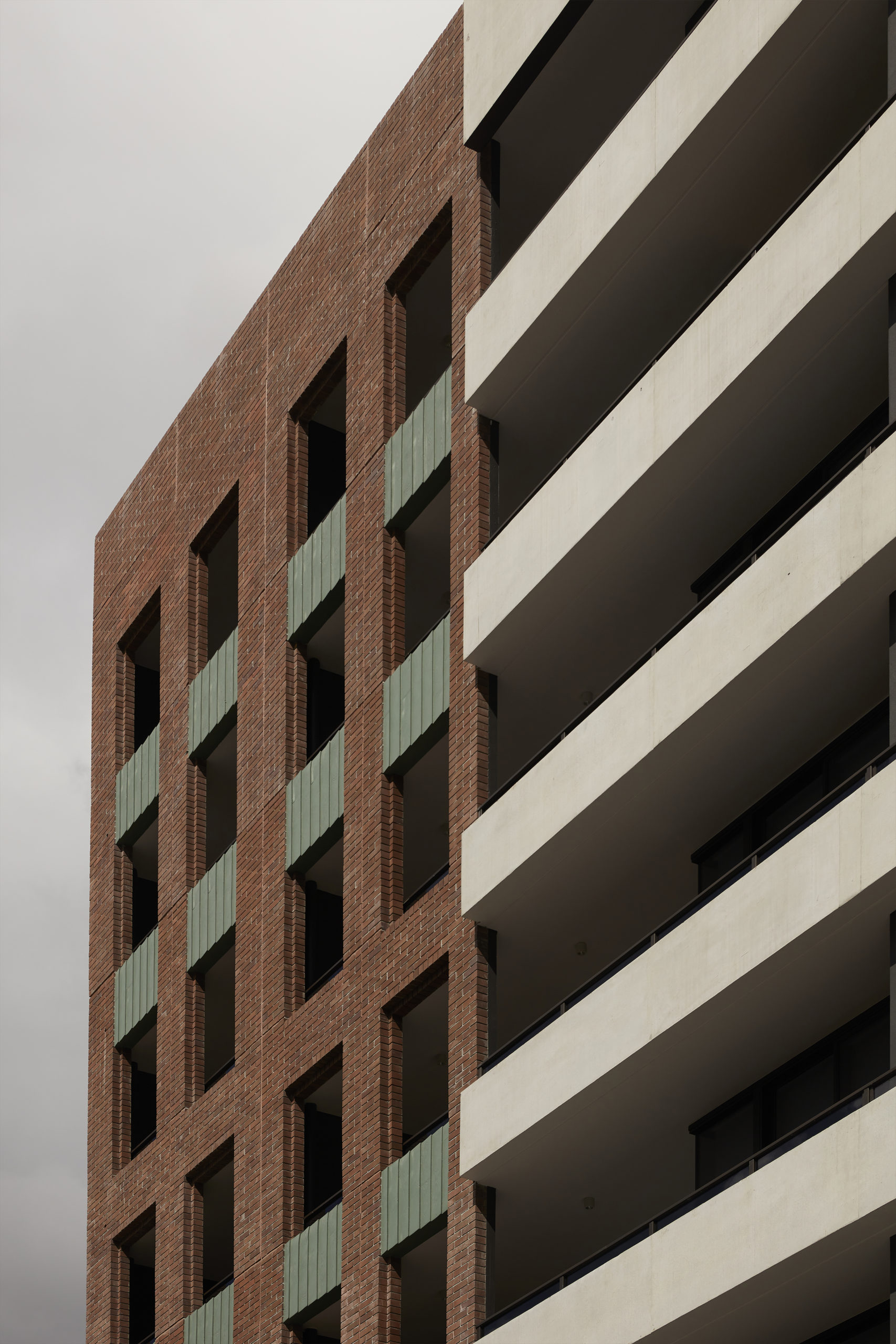
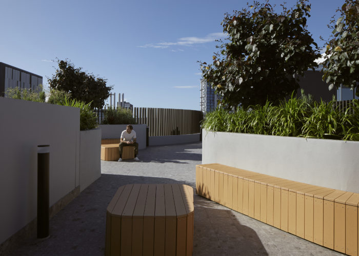
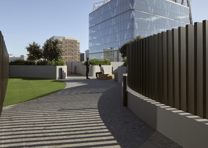
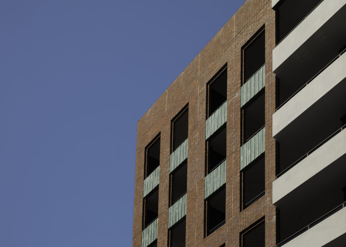
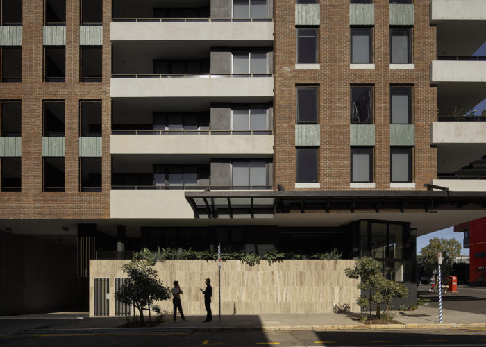
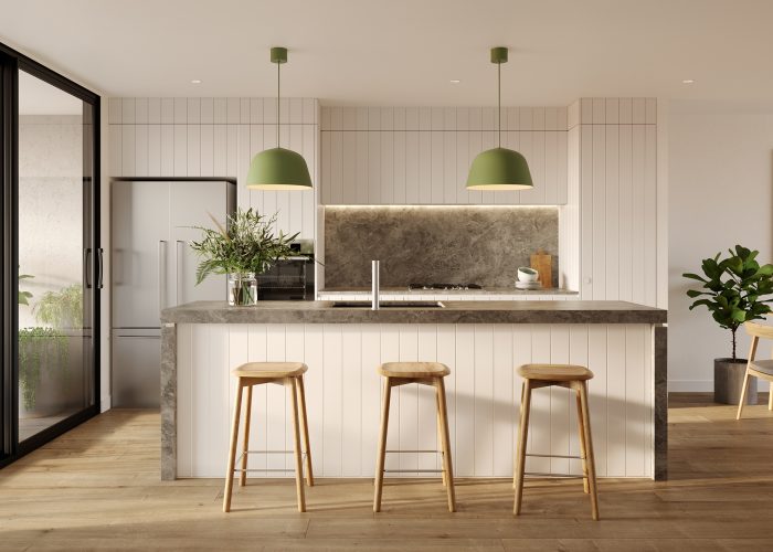
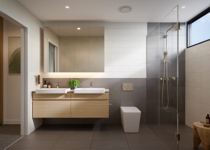
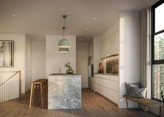
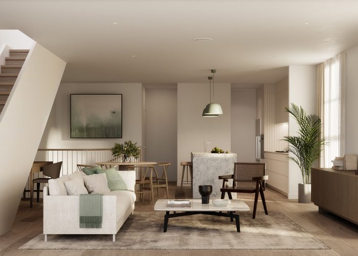
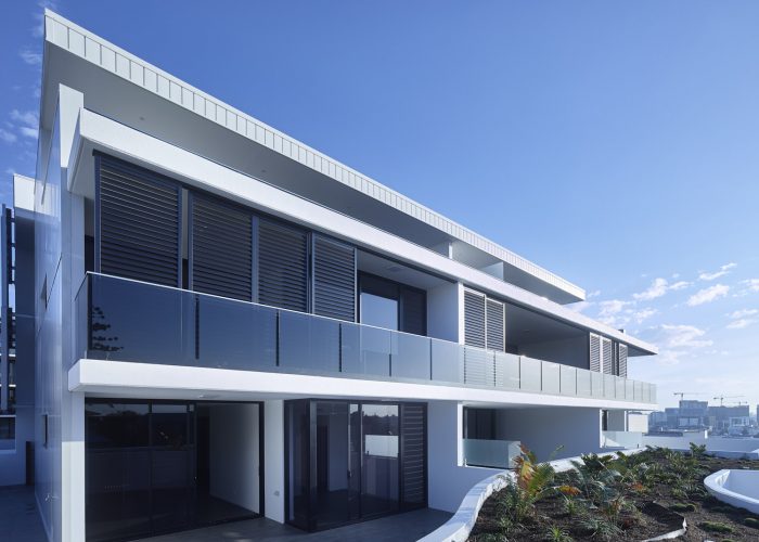
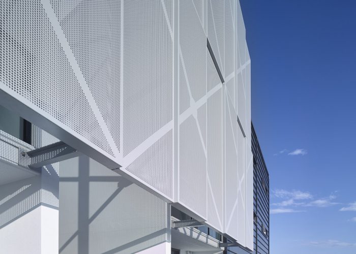
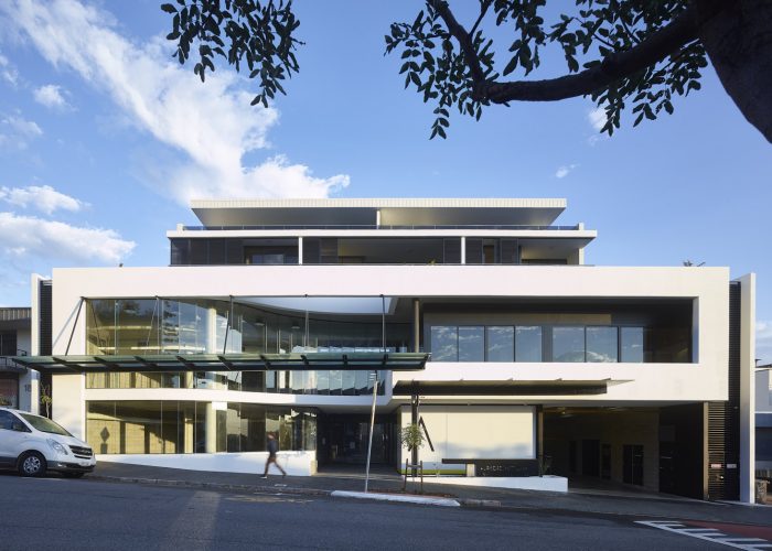
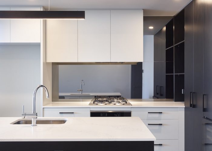
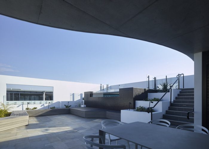
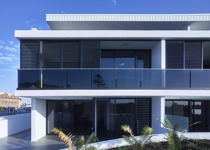
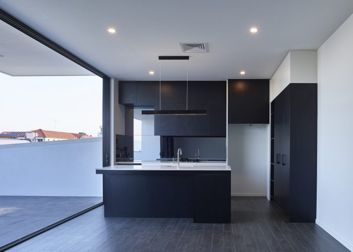
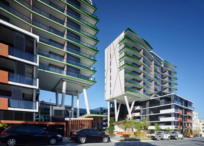
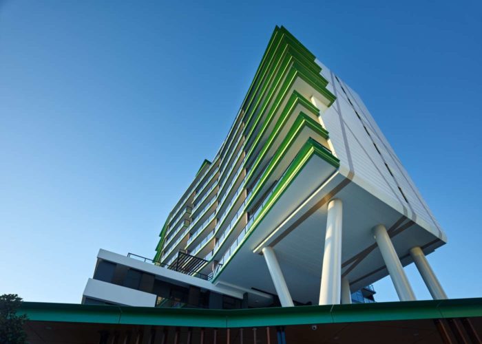
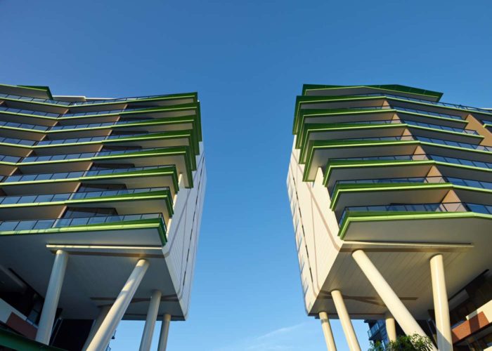
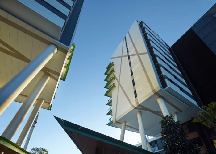
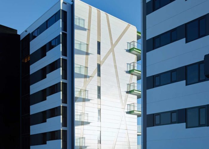
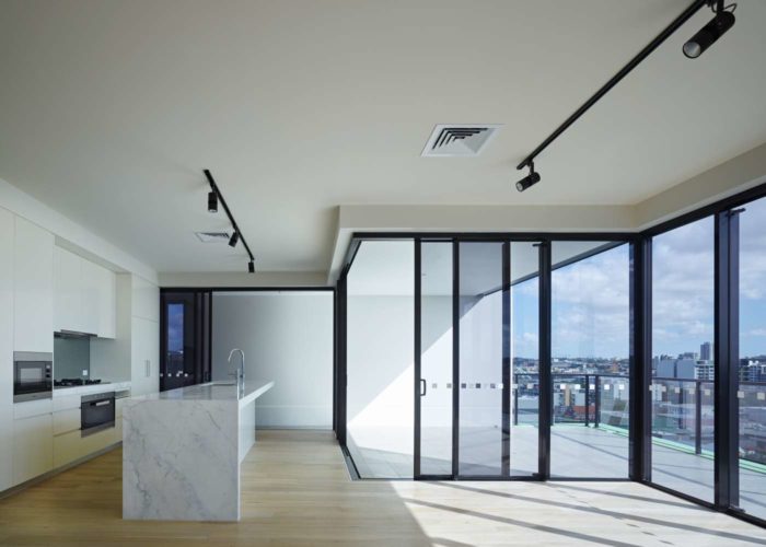
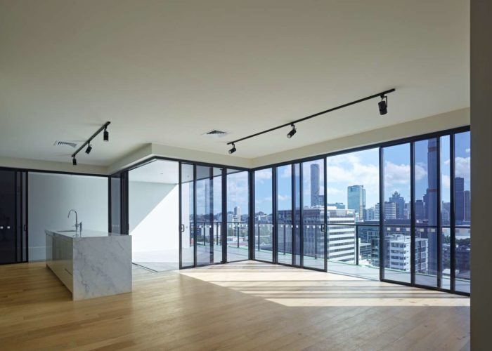
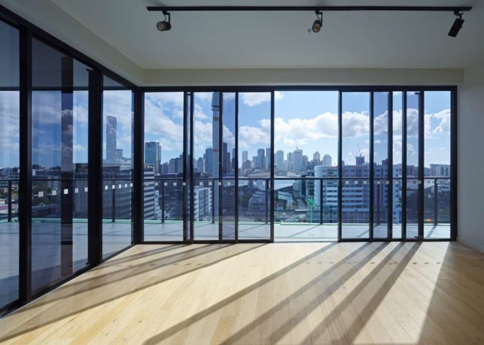
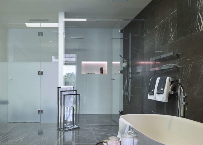
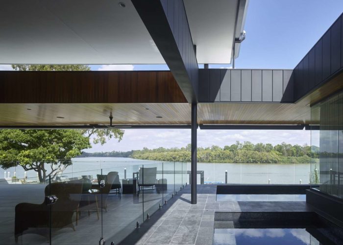
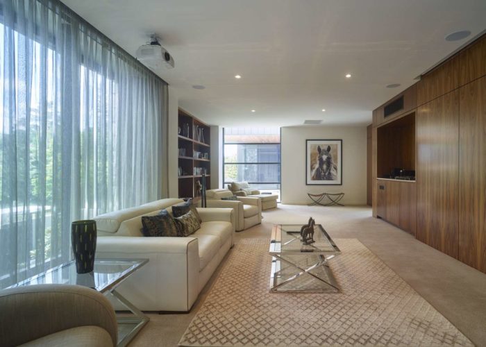
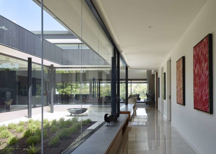
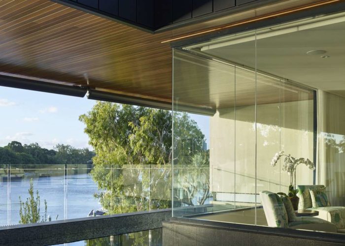
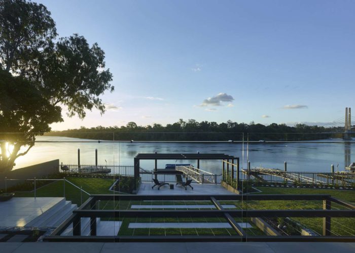
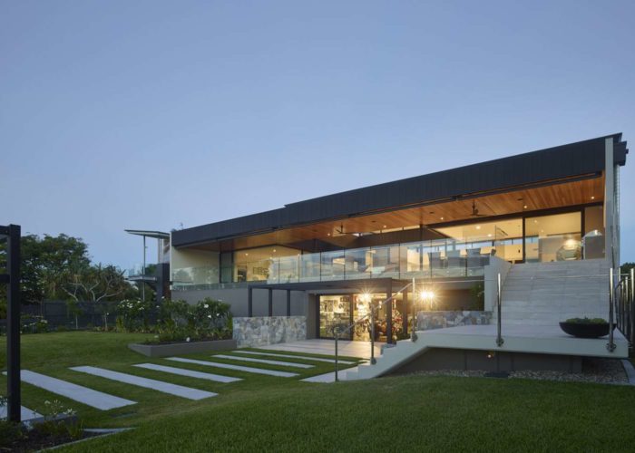
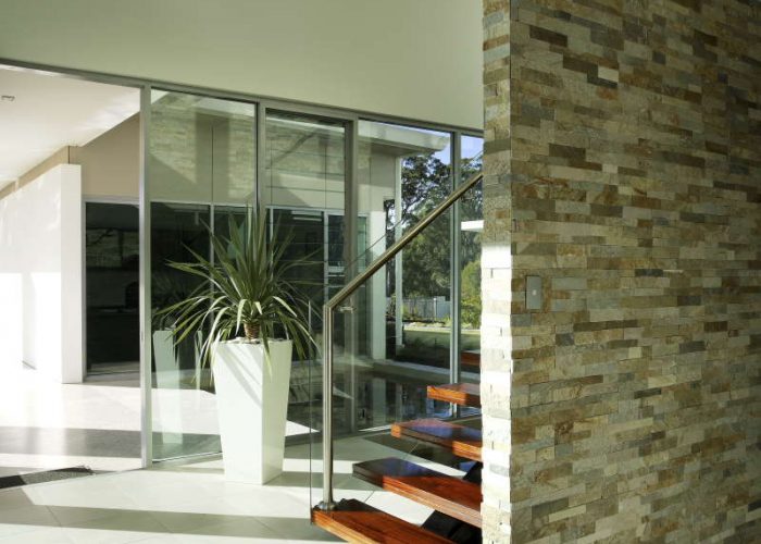
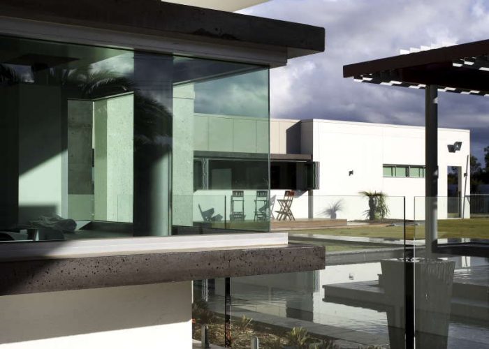
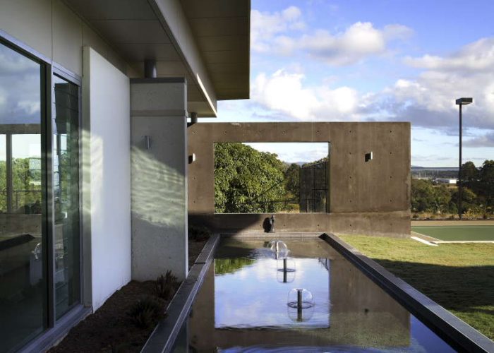
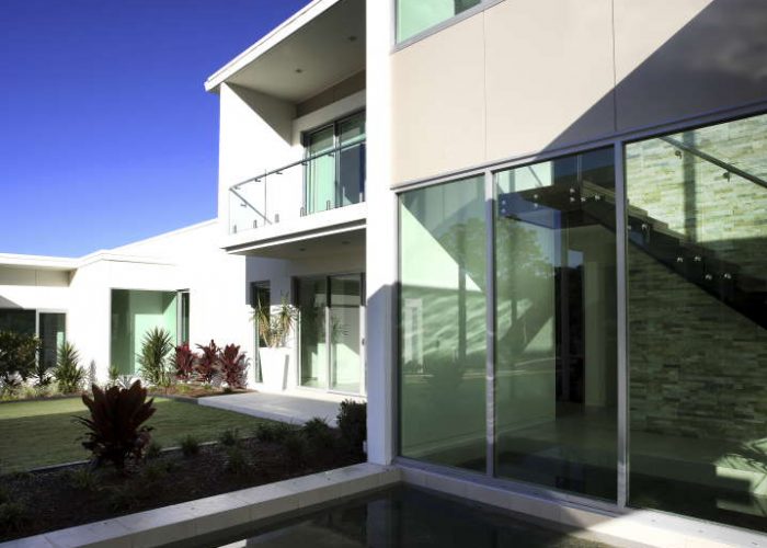
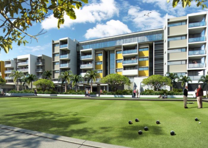
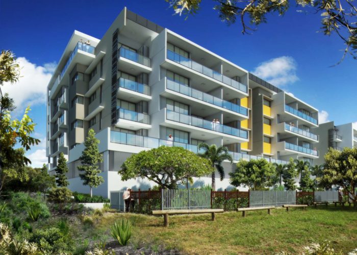
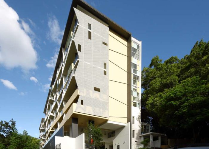
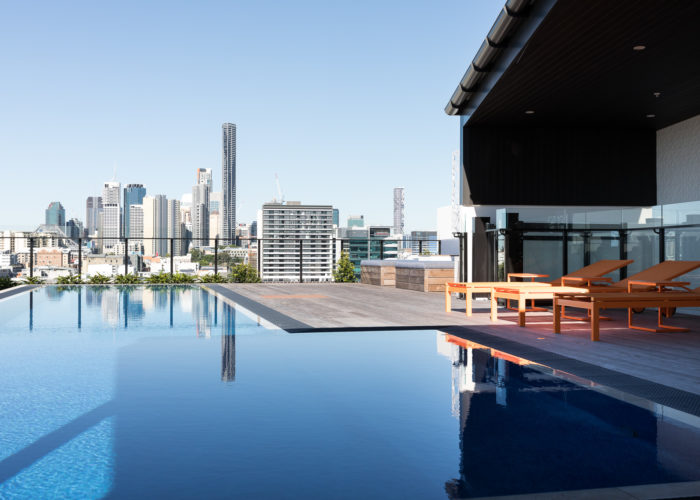
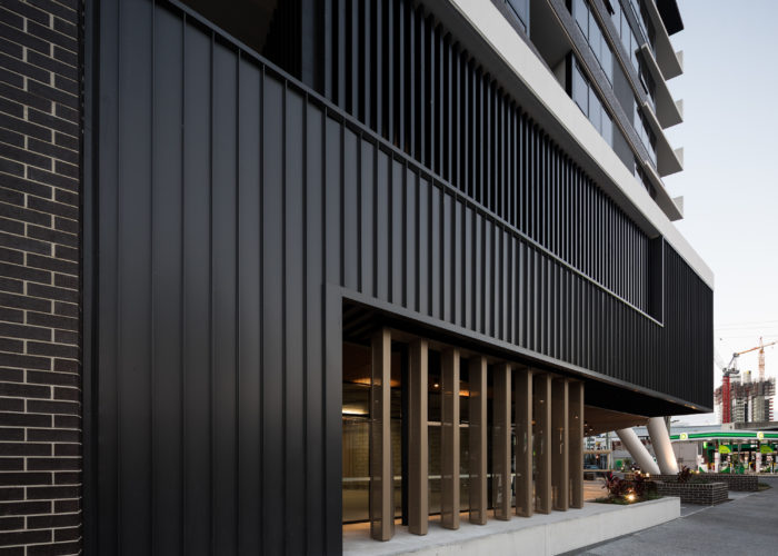
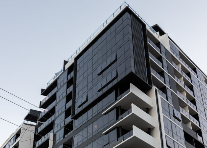
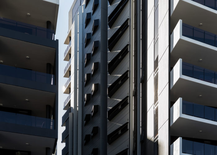
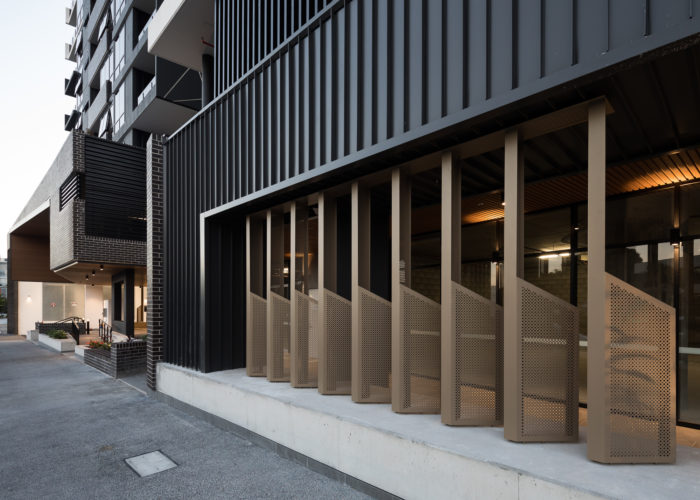
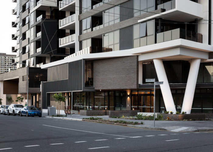
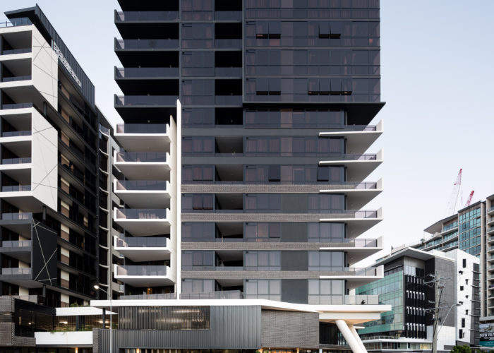
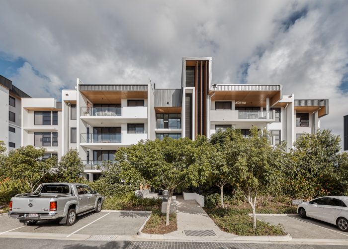
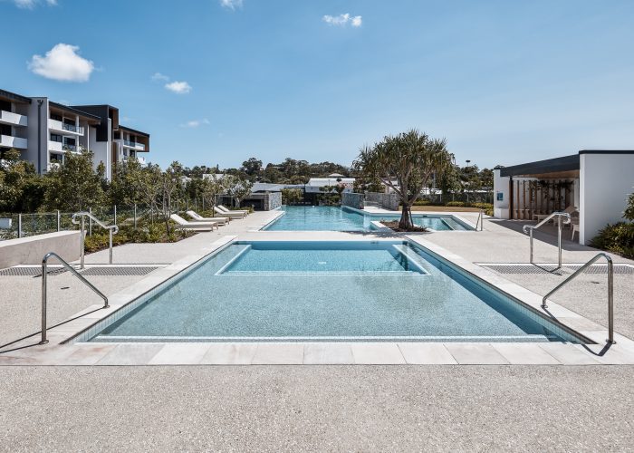
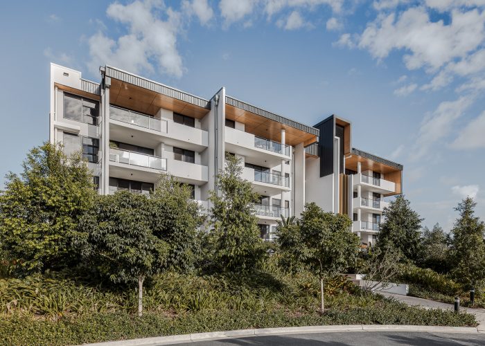
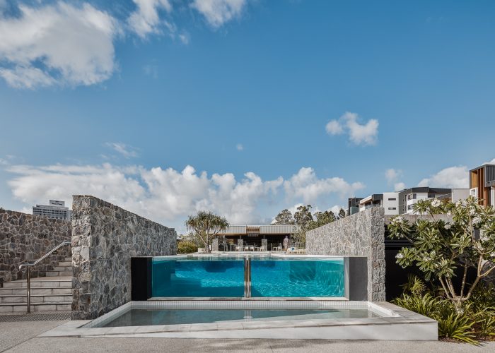
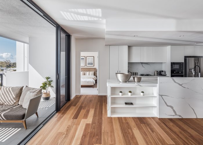
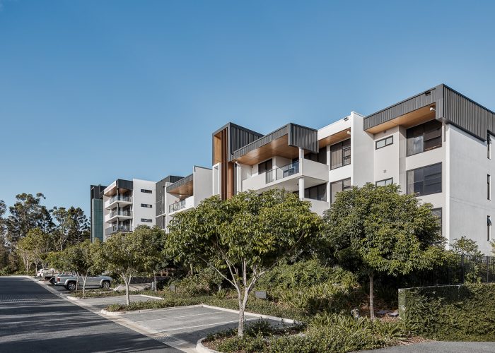
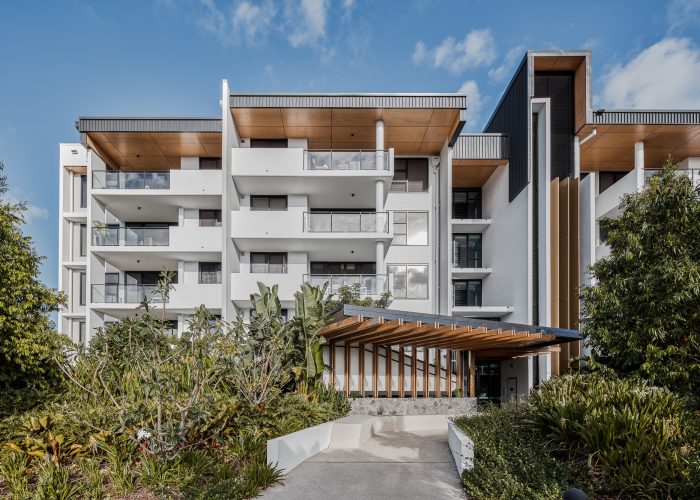
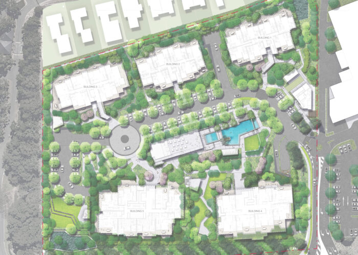
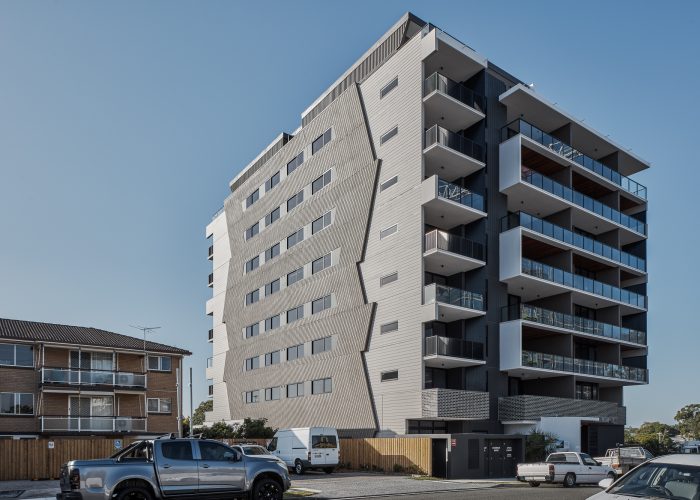
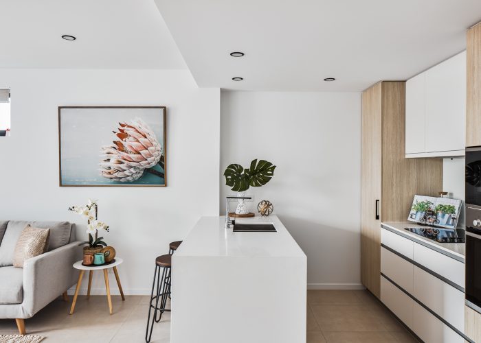
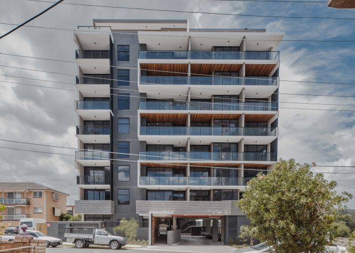
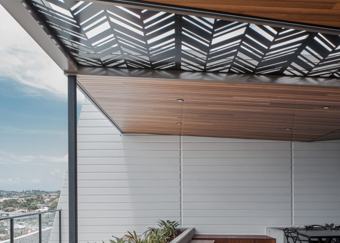
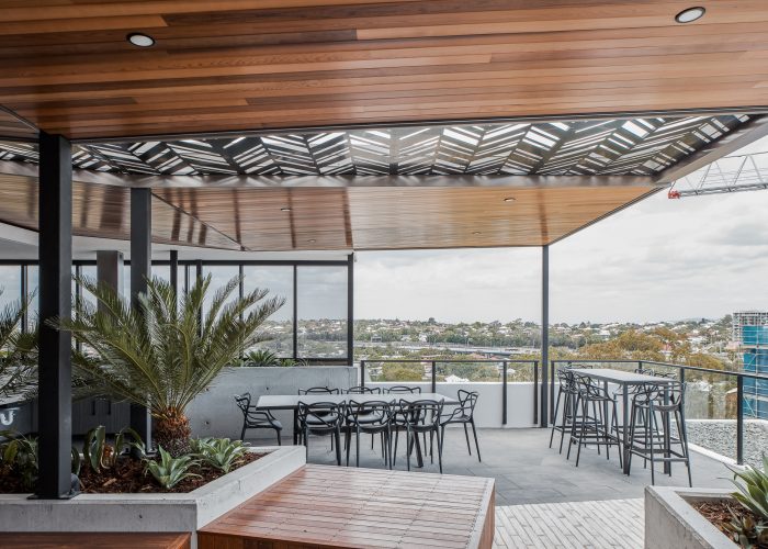
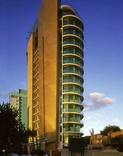
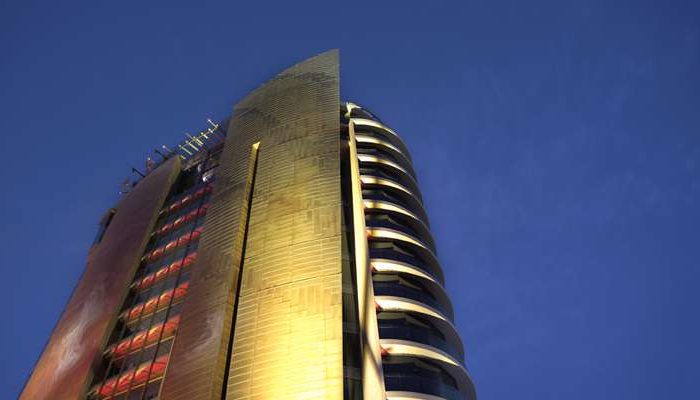
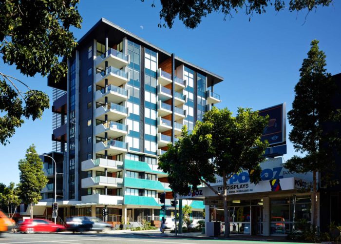
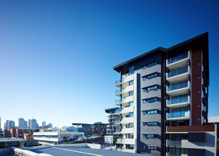
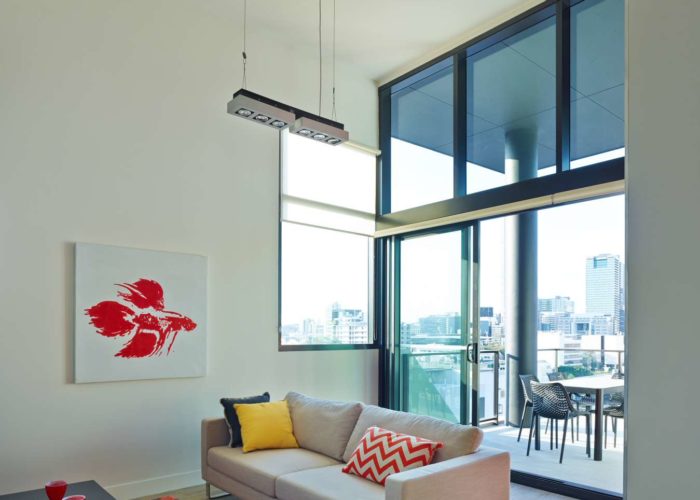
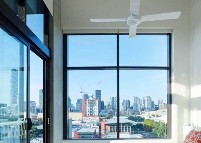
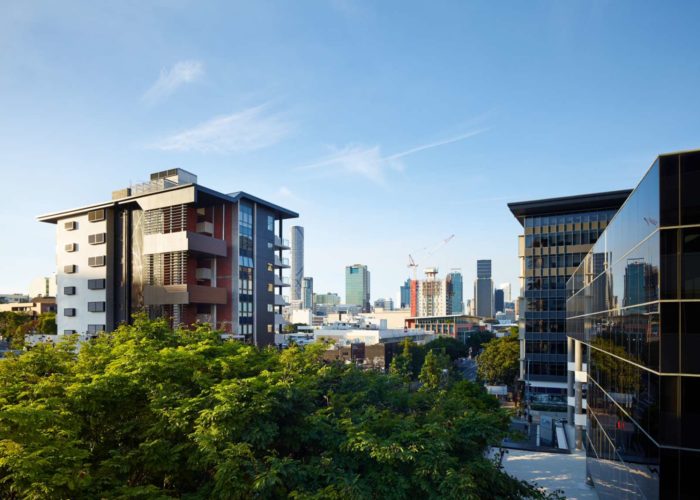
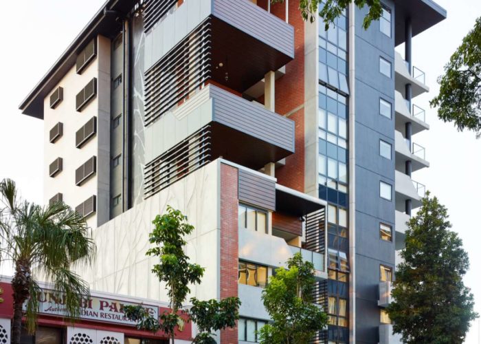
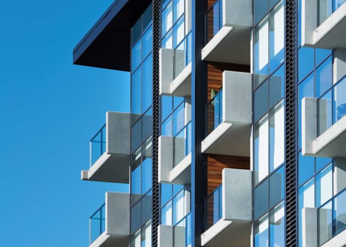
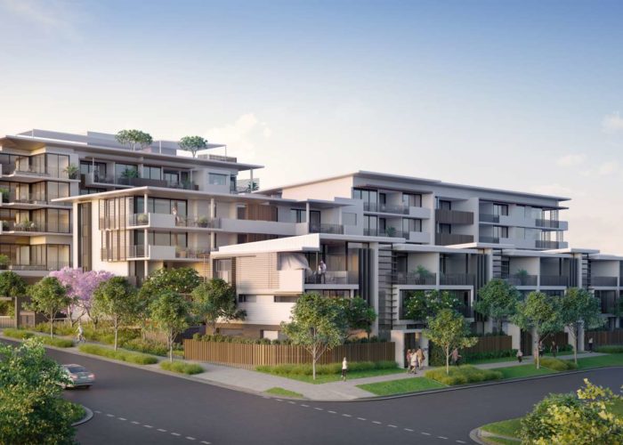
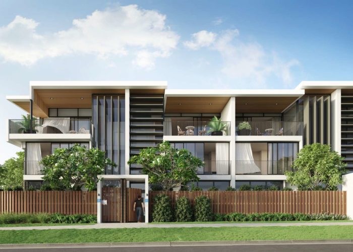
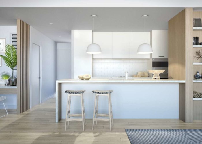
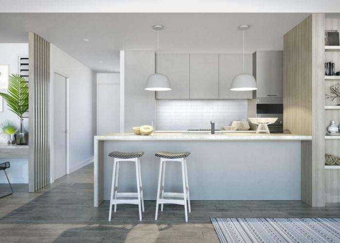
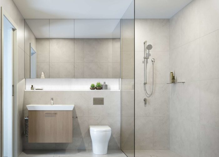
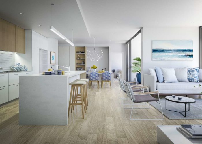
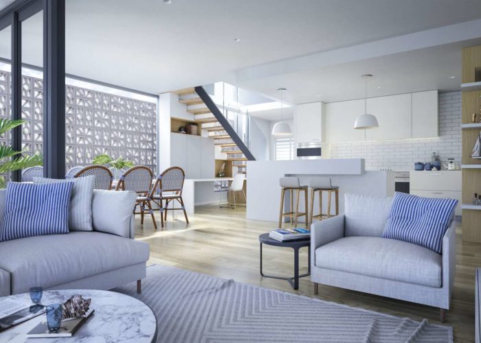
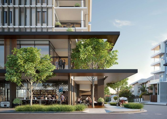
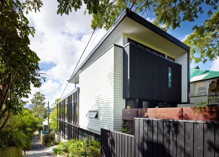
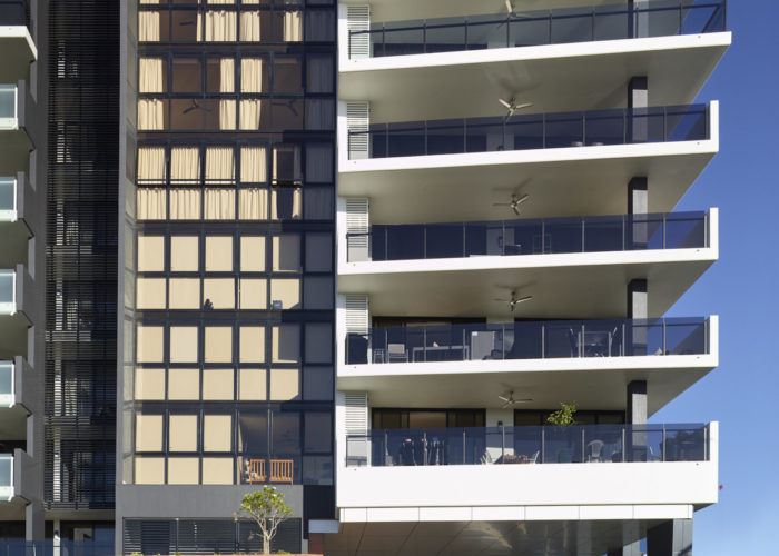
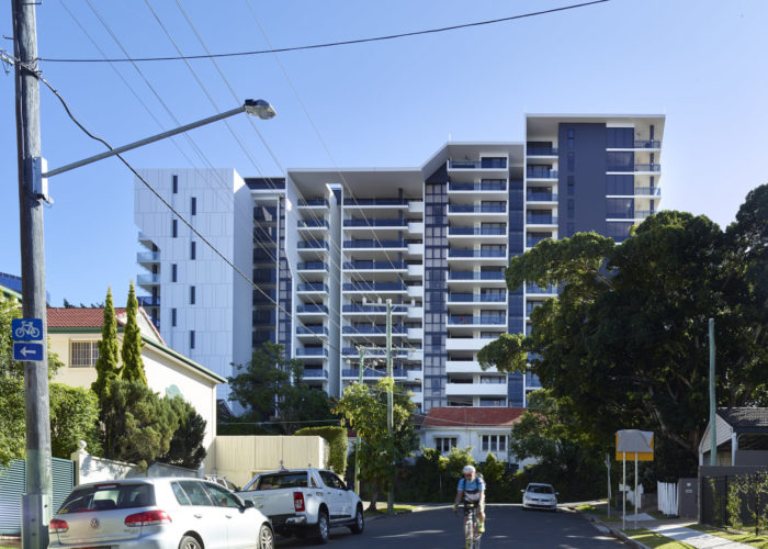
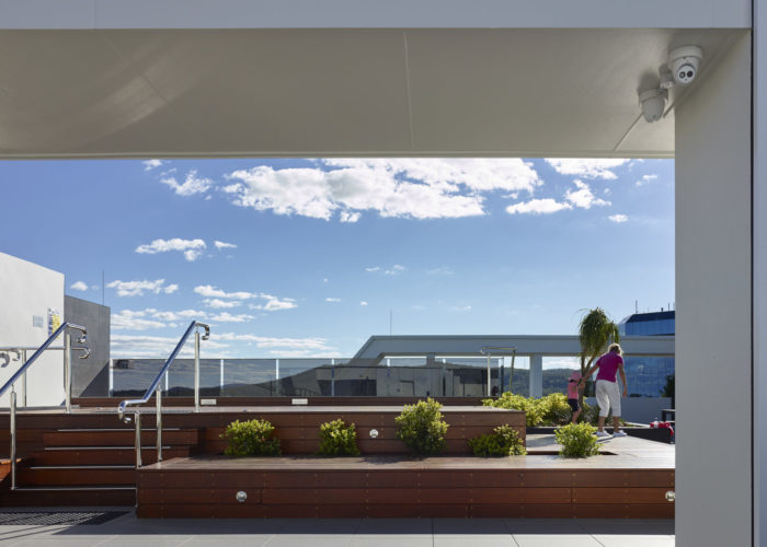
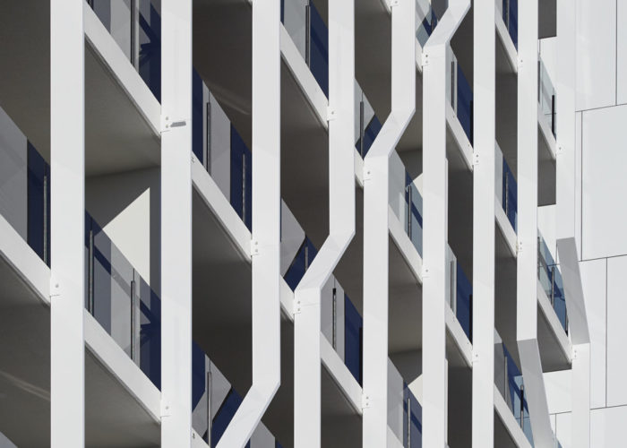
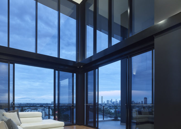
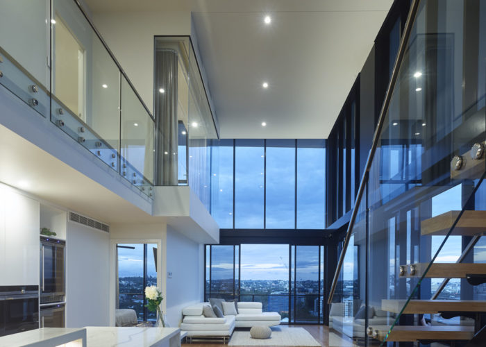
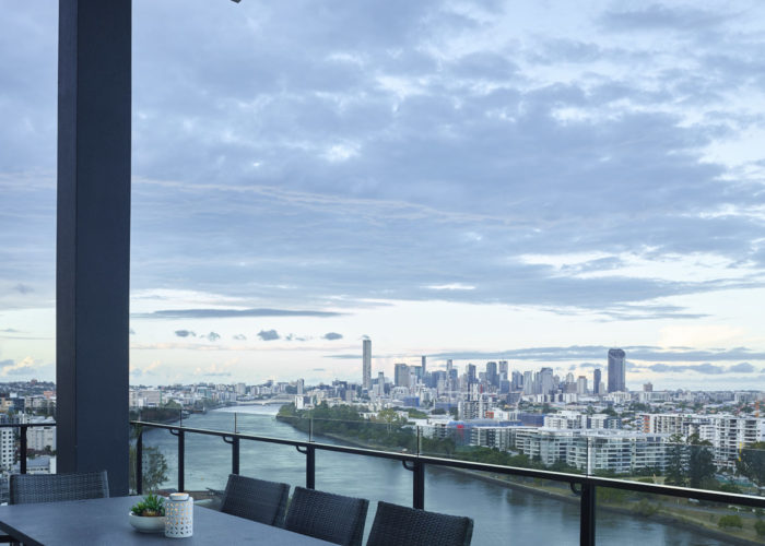
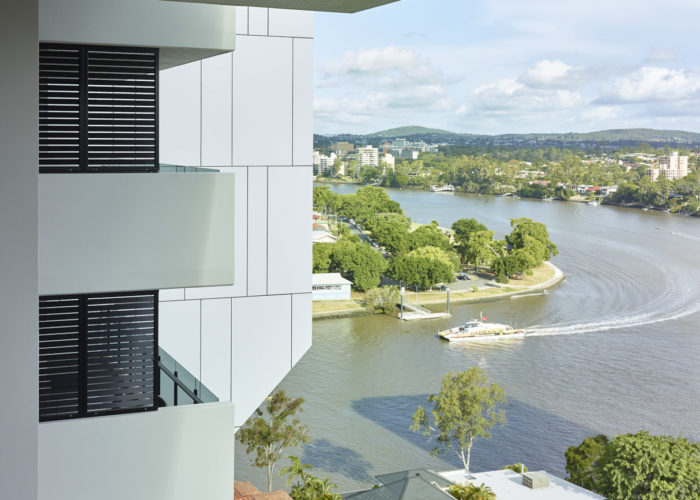
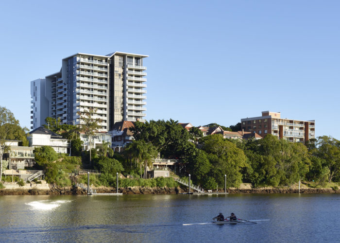
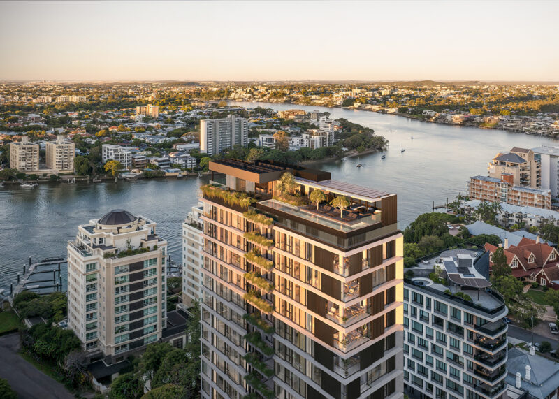
Situated in the sought-after Kangaroo Point peninsula, 130 Lambert offers an exclusive collection of 2 and 3 bedroom residences where luxury and sophistication seamlessly meet. Architecturally the design captures modern elegance with sleek lines, while full-height glazing floods each residence with natural light. The thoughtfully curated finishes blend timeless style with contemporary and executive living. Rooftop amenities, including an infinity pool, fitness studio, and private garden, provide residents with resort-like comfort while enjoying expansive views of the ‘river-city’ skyline. This desirable inner city address represents elevated urban living at its finest, with construction set to commence in early 2025.
Lambert
Kangaroo Point
Lambert (Kangaroo Point)
Where luxury and sophistication seamlessly meet

Tydal
Woody Point
Tydal (Woody Point)
A collection of beautifully crafted apartments positioned in one of the most sought-after locations in the Moreton Bay Peninsula.
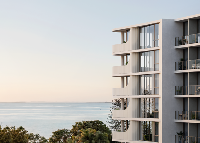
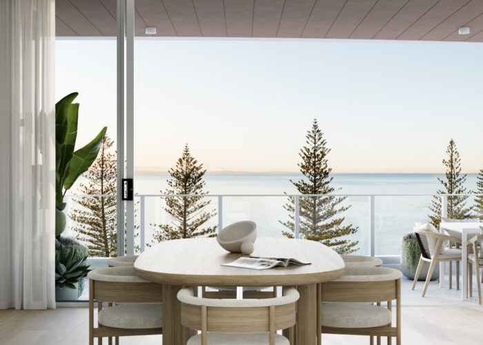
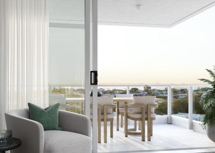
Working alongside Traders in Purple to deliver another iconic address in the Moreton Bay Region, Tydal emerges as a key landmark in the revitalization of this charming village. Proudly elevated on the highest point of the Woody Point Peninsula, Tydal promises a lifestyle that embraces the ocean and vast panoramic coastal views.
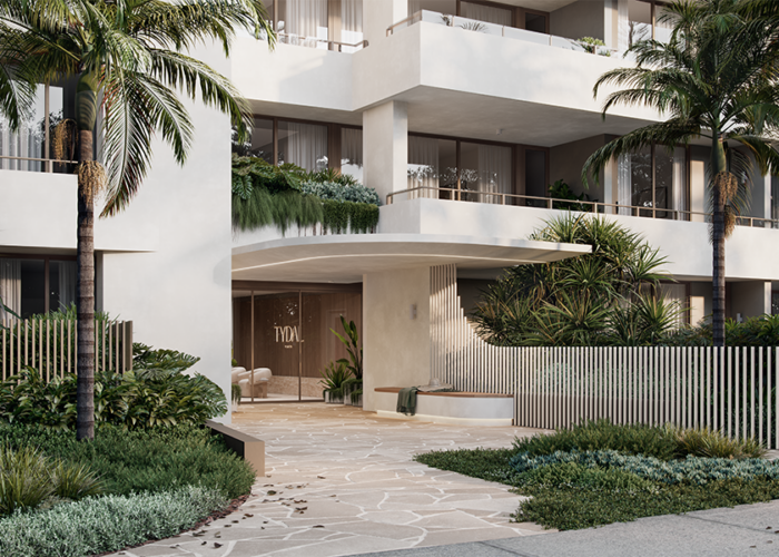
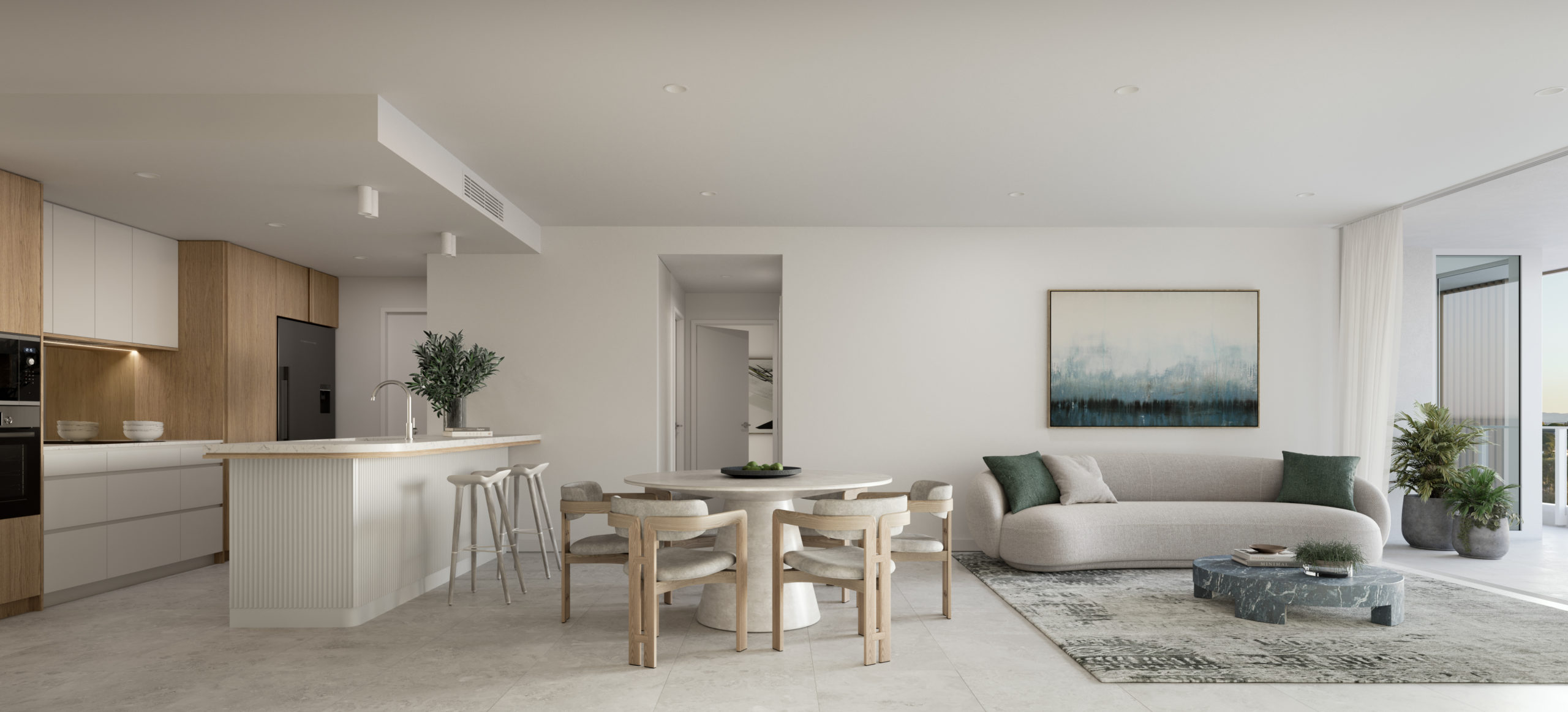
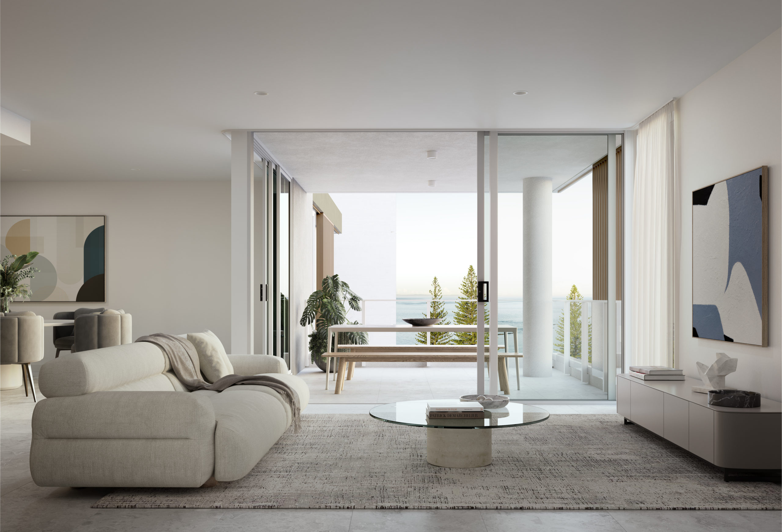
Tydal delivers uncompromising luxury with a collection of beautifully crafted 2 and 3 bedroom apartments, many with breathtaking water views. The architectural language is derived from the naturally occurring forms of the surrounding bays articulated by feature vertical battens. The finishes palette is a collection of soft tones and natural materials, creating a humble yet elegant space.
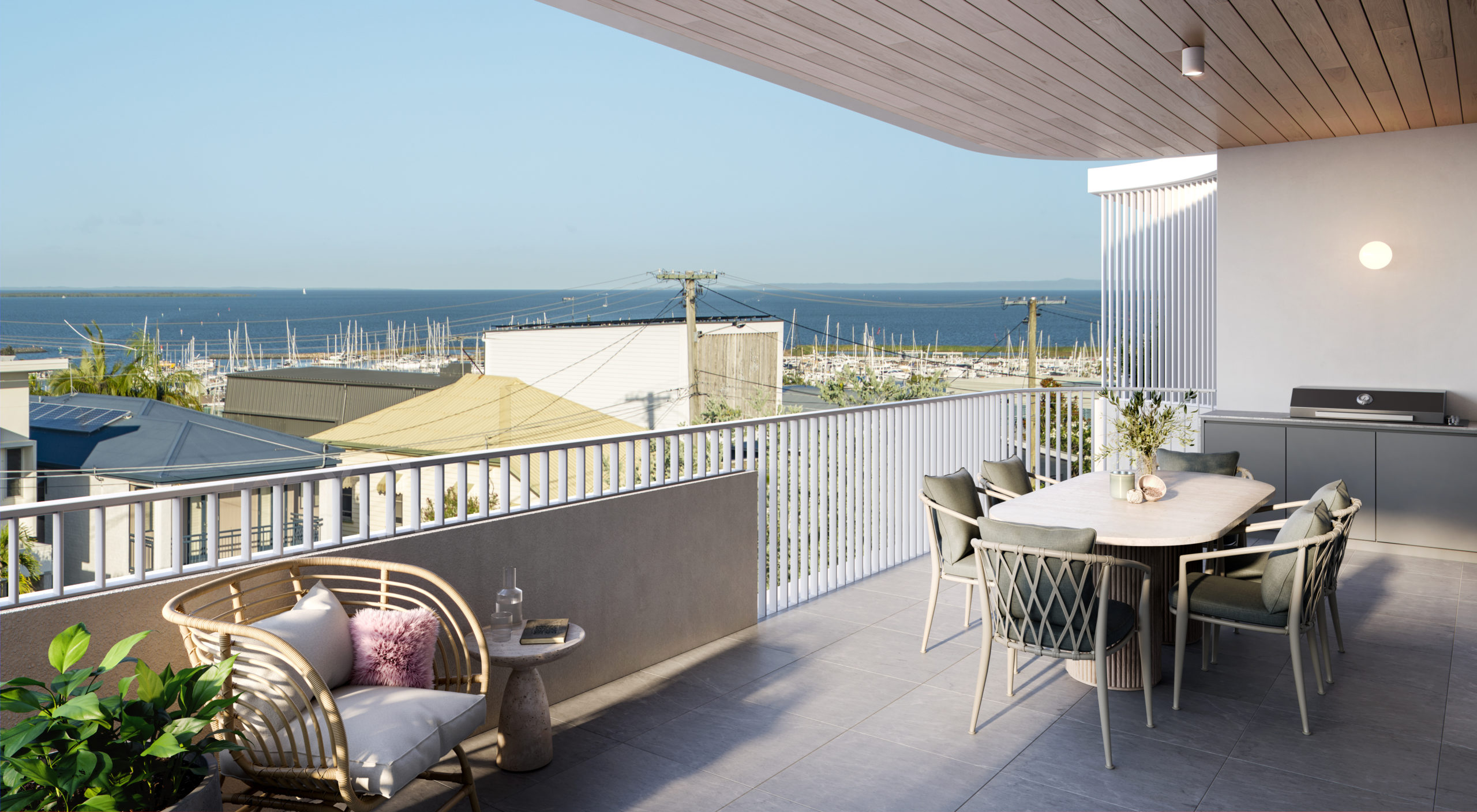
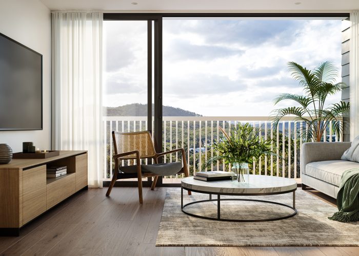
Interior spaces are well considered so residents can effortlessly transition from the stylish interiors to the expansive balconies that frame calming water views towards Moreton Bay. Resort like amenities offer poolside lounging, alfresco dining around the BBQ, even a dog wash for pooches after a morning stroll along the beach.
Visuals by Near Visual

Pipis
Bilinga
Pipis (Bilinga)
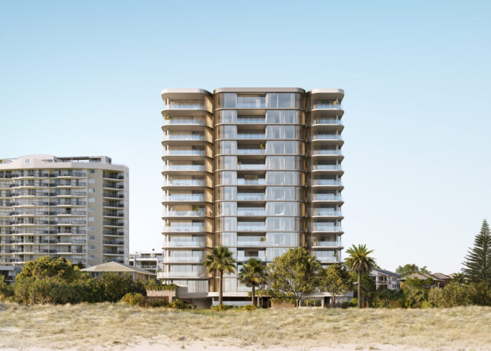
More than simply a home, Pipis captures the timeless essence of relaxed beachfront living and ties it in modern luxury.
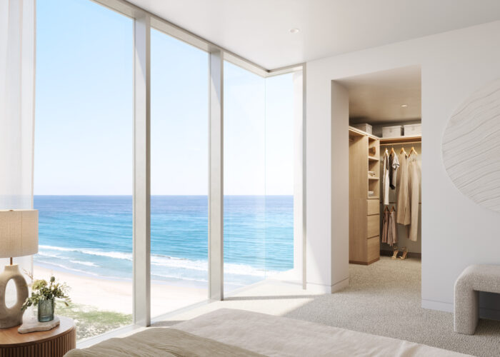
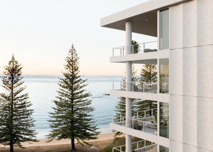
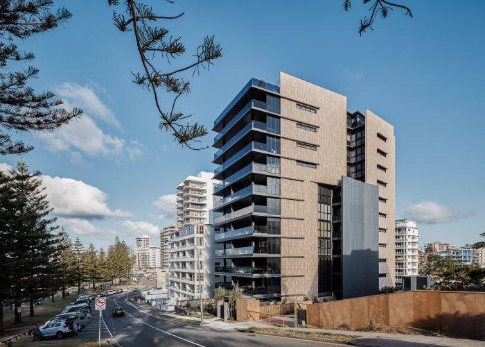
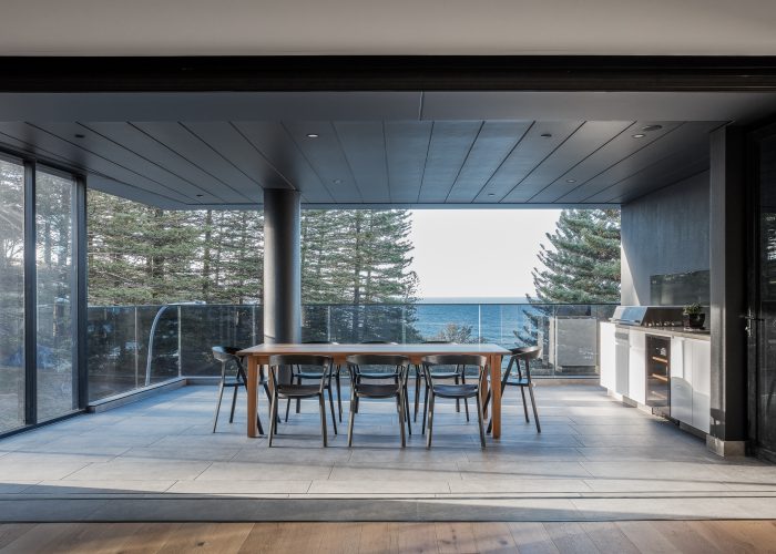
The ultimate in beachfront living, Pipis at Bilinga is an exclusive collection of 17 half floor residences and two double story penthouses with uninterrupted coastal views.
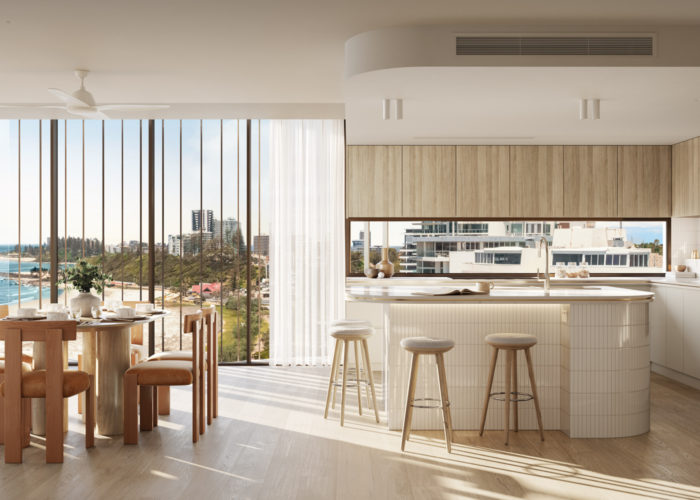
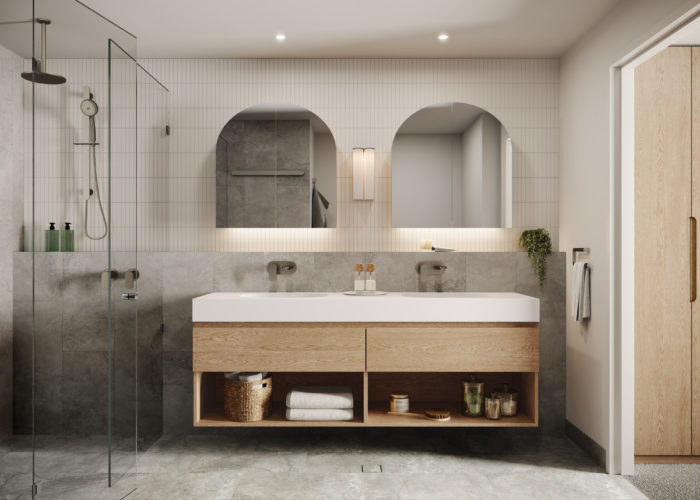
Drawing inspiration from the sculptured dunes that frame the idyllic coastal setting, Pipis is series of horizontally stacked forms, broken up by green breaks and floor to ceiling glazing, creating articulated and light dappled internal spaces. The masterfully designed interiors create light filled liveable spaces that capture cooling ocean breezes. Spacious and functional, each apartment features high quality fixtures, state of the art appliances and stone benchtops throughout.
A refined coastal palette of understated yet elegant finishes highlight bespoke details and embodies the timeless essence of beachfront luxury.
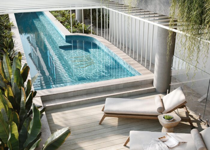
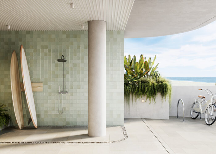
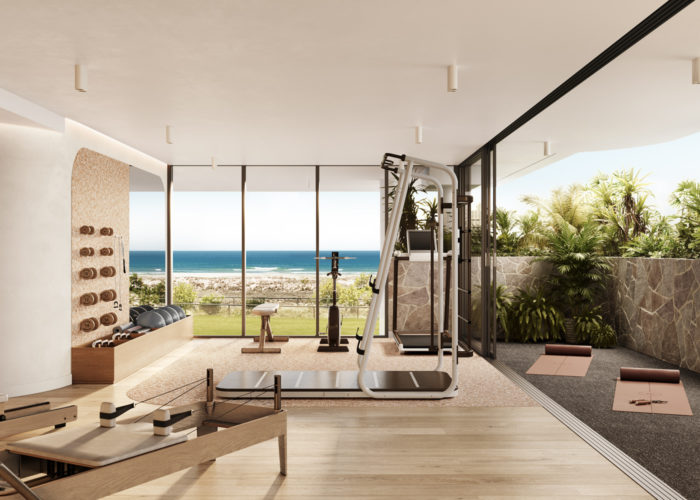
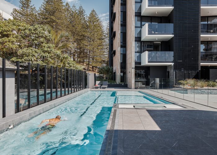
Pipis delivers high-end in-house lifestyle amenities; including a 15m heated lap pool and sun lounge deck, fully equipped gymnasium and outdoor rain shower with dog wash to rinse off the sand. Offering direct back entry access to the beach and ocean bike pathway, residents can enjoy the most the Gold Coast has to offer.
Florian
Taringa
Florian (Taringa)
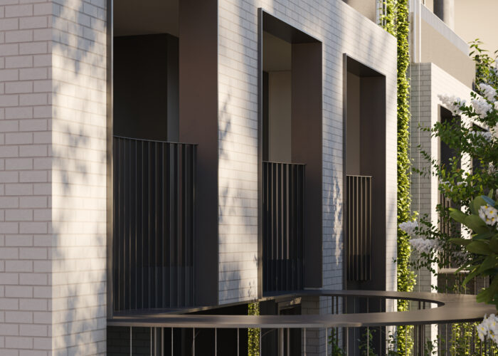
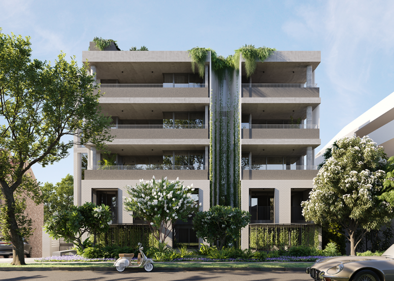
Located along Swann Road on a dual-frontage site, Florian Residences makes the most of its steep terrain, creating 16 luxurious apartments and a generous communal rooftop area
Located along Swann Road on a dual-frontage site, Florian Residences makes the most of its steep terrain, creating 16 luxurious apartments and a generous communal rooftop area.
The building has a timeless, robust expression of feature brick and articulated glazing which is softened with lush sub-tropical landscaping and the gentle curves of deep balcony recesses. Fine-grain operable screening elements and balustrades bring a human scale articulation to the design and give the residents control of their preferred levels of privacy, street interaction, and natural cooling.
Visuals: Nord Studio
Ashford Residences
Everton Park
Ashford Residences (Everton Park)
From dairy to exclusive residential enclave.
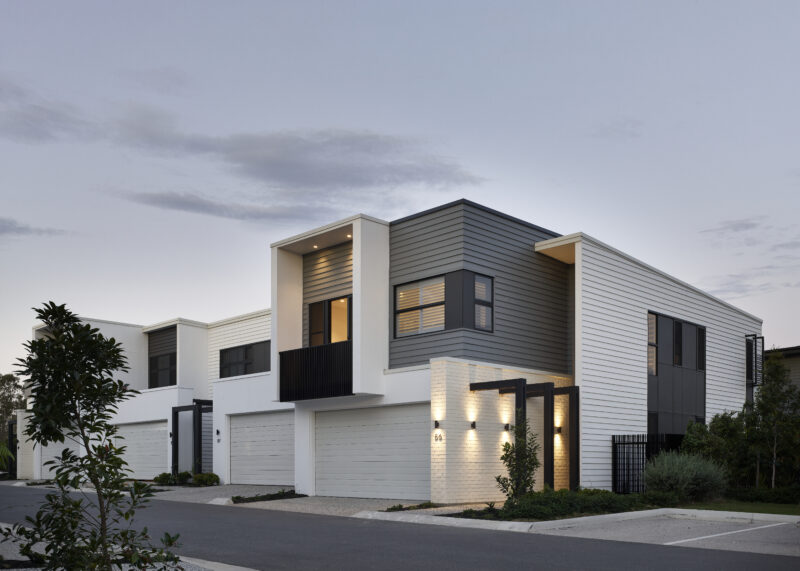
Ashford Residences is a master-planned residential enclave in Everton Park. The estate will comprise of a combination of attached and detached residences masterplanned to create a unique offering focusing on a owner occupier market.
In its current state, the site was used to house dairy livestock and has significant biodiversity and ecological overlays. These have influenced the masterplan design with a significant parcel of land to the south being dedicated as a landscaped wetland area which will bound the existing Kedron Brook reserve. The wetland will also act as an extension of the existing Kedron Brook Reserve, blurring the delineation between the waterway corridor and the site.
The existing Heritage-listed Murphy’s Dairy residence is located on the corner of Ashmore Street and the entry driveway into the development. This residence will form part of the “Entry Statement” into the development and may house uses such as a sales office. The integration of this dwelling into the development has been vital in respecting the sites previous life and defining a modern Queensland vernacular to continue throughout the development.
Photography by Scott Burrows
3D Artist Impressions by Render House Studios

Monterey
Kirra Beach
Monterey (Kirra Beach)
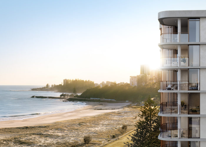
An exceptional, ultra-wide, north facing beachfront site located within one of the Gold Coast’s most coveted locations.
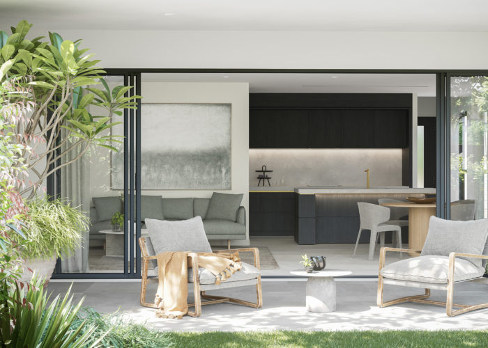
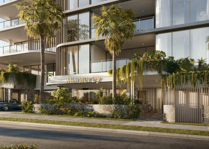
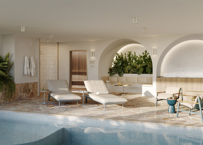
Monterey is nestled on one of the last remaining beachfront sites in Kirra Beach and was a rare opportunity to create something truly iconic. With approximately 50m of sweeping north-facing beach frontage and panoramic views of the Pacific Ocean & Gold Coast coastline – there is no comparison.
With a tonal, textural palette of finishes, married with lush tropical landscaping, we wanted to blur the line between inside and out. We kept the hardscape natural, earthy, light, and crisp to let the colours of the landscape really pop. Strong horizontal banding, reminiscent of the layers of sand waves from tidal movement, exaggerate the curved edges to open each residence to the stunning views.
The result is 35 residences over 14 levels of smooth, fluid design aesthetic, inspired by the stunning natural landscapes that surround.
First Bay
Coolum
First Bay (Coolum)
Luxurious living with a humble coastal feel.
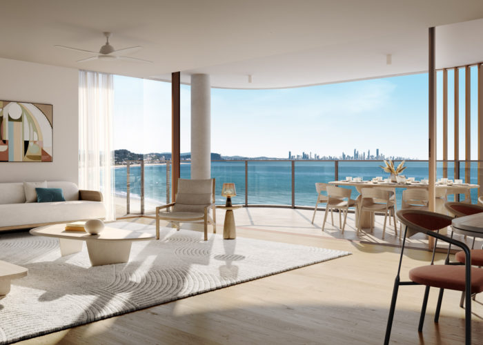
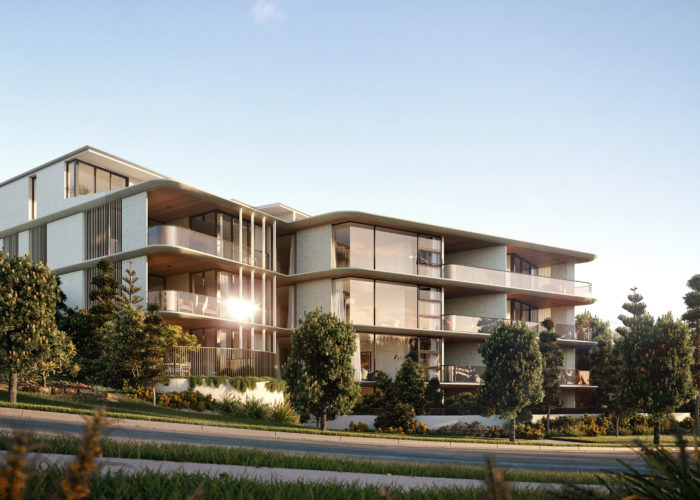
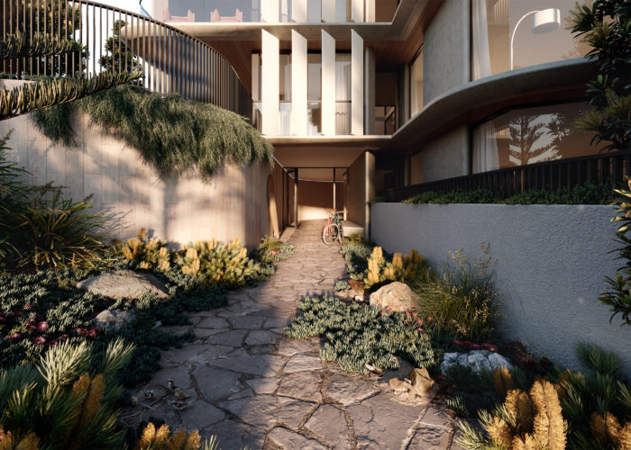
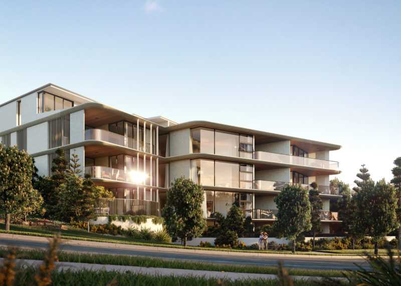
The coastal landscape of Coolum is characterised by eroded edges, where the ocean and tides have cut and formed the rocky landscape. The First Bay development, consisting of two interlinked buildings, evokes qualities of this varied landscape in its architecture - with solid concrete forms and soft edges referencing the rocky beach front. The material palette further grounds the building within the sloping context – using neutral-coloured stone and smooth concrete that will age gracefully and patina over time.
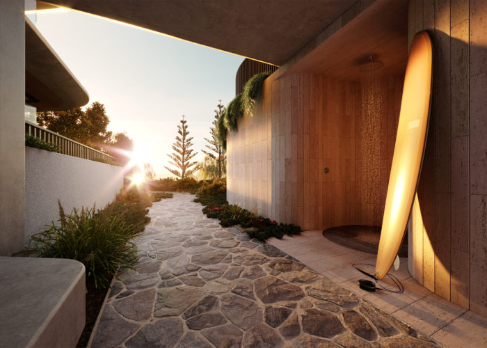
Consisting of 38 two- and three-bedroom units, split across two buildings, First Bay makes the most of coastal living. The buildings were designed as a curated string of experiences; each step in the journey fulfilling a need created by the location. There are showers and surfboard stores at the entry from David Low Way; and materials were selected to be hardwearing and tactile while lighting is minimal and thoughtfully-placed.
Carefully-planned internal spaces allow for cross ventilation and natural light, and prioritise the living spaces towards the breathtaking views in the East. The units address the demands and desires of an owner-occupier market, with generous living and storage spaces, and hardwearing yet luxurious-feeling material choices.
The Quarter
Wodonga
The Quarter (Wodonga)
An exciting commercial, dining and residential precinct located in one of Australia’s fastest growing regional cities.
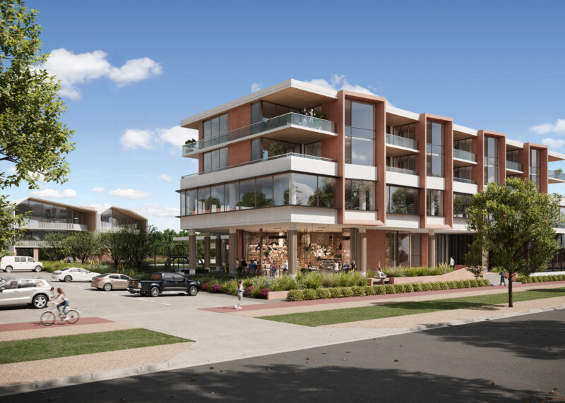
The Quarter at Wodonga integrates a mix of commercial, retail, dining and exclusive residential living units. A place to work, the Quarter offers light-filled contemporary office spaces in a high visibility, premium location right in the heart of town. As place to live, life at the Quarter embraces spacious indoor and outdoor living that brings people together combined with a range of uses and facilities that takes advantage of the location and the broader community.
Vantage, Burleigh
Burleigh
Vantage, Burleigh (Burleigh)
A carefully crafted living experience in the heart of Burleigh Waters.
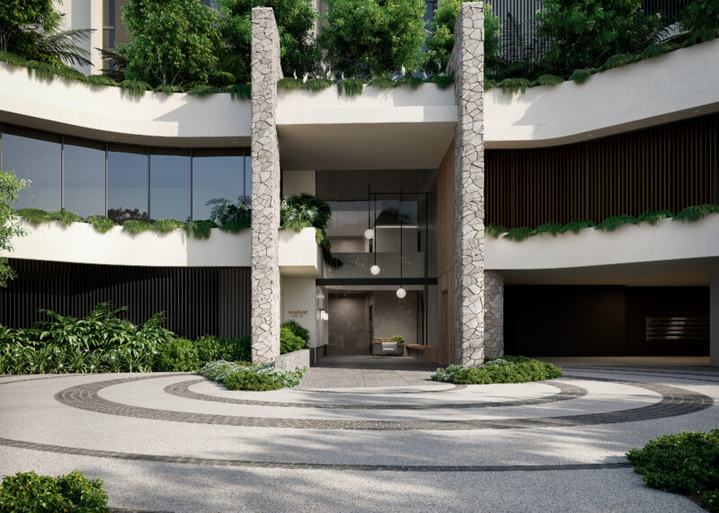
A collection of 56 north facing apartments that have been designed to take advantage of the northern aspect and lush landscaping and communal facilities. Spacious, light filled apartments are coupled with careful attention to views and outdoor spaces that combine to provide a unique and diverse living experience.

The Wellington Collection
Manly
The Wellington Collection (Manly)
Located in the heart of Manly, The Wellington Collection has been designed to take in the site’s expansive bay views; making the most of the relaxed bayside lifestyle.
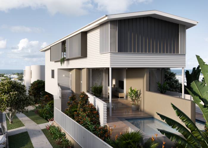
By working with the natural slope of the site, each residence has been designed to open up to the desirable Northern orientation and Moreton Bay views; allowing for an ideal living environment with an abundance of natural light and cross-ventilation. Conceived as a series of individual homes – made up of a mix of apartments and townhomes – each residence has a strong identity, with landscaped arrival courtyards that offer a layered entry experience.
The architecture is made up of an arrangement of screens, walls and balustrades that act together to balance views, natural light, and ventilation with the need for privacy. The building edges are rounded off, which helps to widen the view corridor to the northeastern bay views. A natural, textured material palette compliments the surrounding coastal region, while also fitting in with the character of the existing residential neighbourhood.

Marin
Scarborough
Marin (Scarborough)
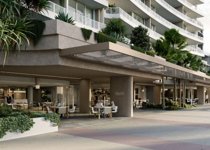
An exciting mixed use development featuring expansive outdoor dining under a green leafy podium which is both subtropical and coastal in its architecture.
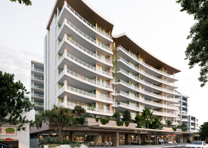
Ellivo have worked alongside Traders in Purple to create a unique vision for a new luxury apartment building in the bayside suburb of Scarborough. The Landsborough Avenue project derives its form from the natural bays that occur along the Southern Queensland coastline.
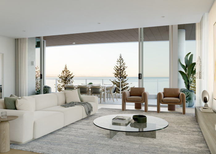
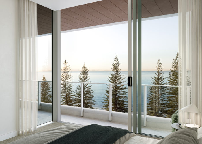
Nestled on the leafy Landsborough Avenue Esplanade, this marquee site in the heart of the Scarborough Village represents everything that is quintessential to a coastal life style. This mixed use development enjoys a magnificent waterfront location with direct views across to Moreton Bay.
Renders by Near Visual

Kiome
Highgate Hill
Kiome (Highgate Hill)
Creating a resilient, architectural response that embodies the permeable nature of the adjoining river and parklands to engage with the surrounding community.
7 Dudley Street has an elegant timelessness with inherent resilience in both its finishes and form – inviting the outside in and talking to its neighbours; while also standing up to the ravages of time to create a long-lasting, truly sustainable building.
Over the building’s robust base-form is a lush layer of sub-tropical planting and a permeable layer of screens, balconies, and terraces. These elements extend into the building interior through expansive courtyards which enhance the liveability of the internal spaces, as well as adding visual interest and passive surveillance to the streetscape and the neighbouring park.
The planting is a mix of native flora and edible planting – increasing the biodiversity of the area, adding to the food security of native fauna, and mediating with the great Brisbane river along the delicate riparian zone. KIOME has been carefully considered to create the best of sub-tropical living for residents, while connecting with the community and natural environment in a meaningful way.

Thornclyffe
Kangaroo Point
Thornclyffe (Kangaroo Point )
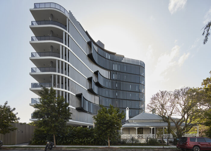
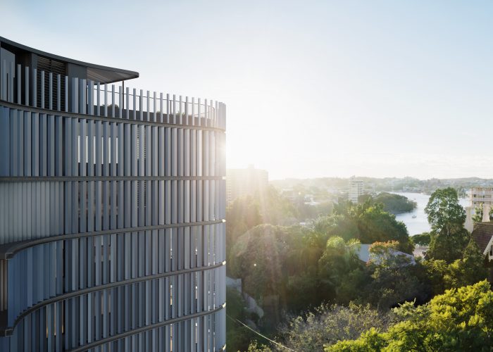
The unique tower form creates a curvaceous and sculptural backdrop to the heritage residence located on site.
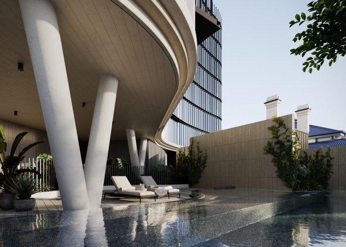
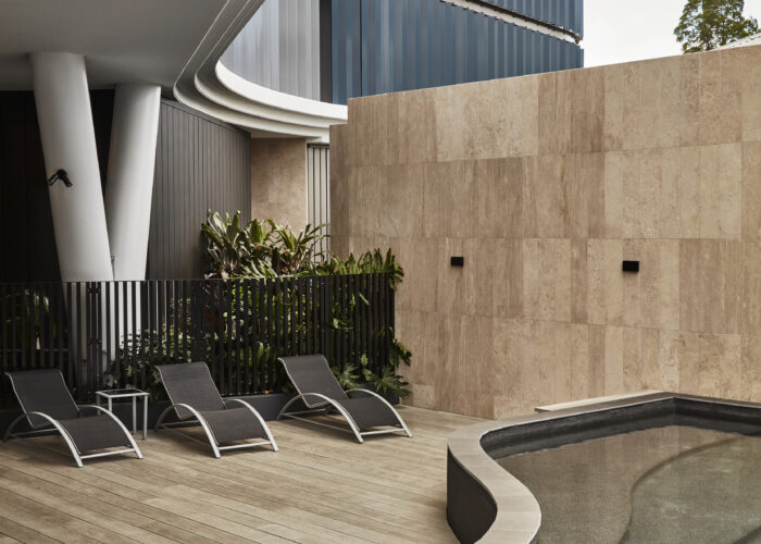
Located in the highly sought after area of Kangaroo Point, the development sets out to showcase the heritage significance of the existing residence, Thornclyffe. The tower form curves around the house, and makes use of large screen elements to create a backdrop to the heritage setting. The screens help to produce an aesthetic quality that blurs the line between background and foreground, inspired by the Bokeh photography style.
The development comprises of the existing heritage house and 20 luxury apartments, including two sub penthouses and two penthouse apartments that feature spacious, private rooftop gardens. The location and design of the tower captures a range of outlooks, from the Brisbane CBD, to stretches of the Brisbane River. Each apartment maximises its unique view with open-plan layouts and generous glazing.

Alouette
Newstead
Alouette (Newstead)
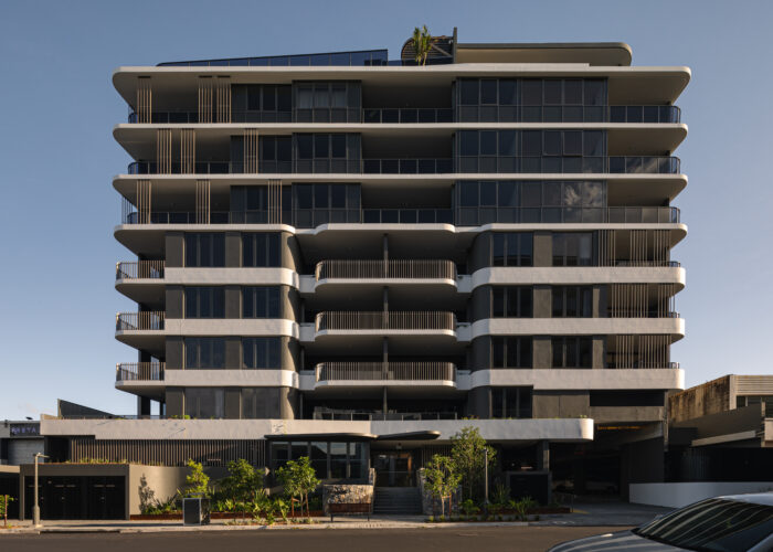
Alouette, is an exciting new addition to the Newstead skyline. Alouette offers luxury layouts, and all have been meticulously designed to respond to the Queensland lifestyle and create comfortable, private and liveable homes.
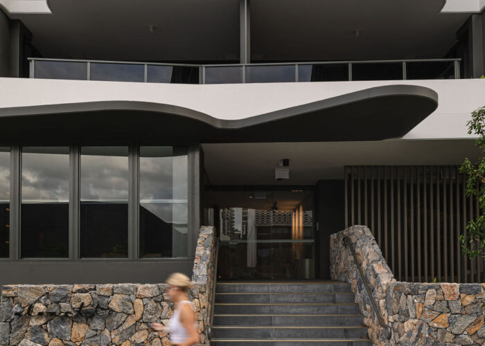
The fluid form and curved edges of the façade emulate a “wing like” aesthetic that is balanced by a neutral palate of materials that allows the building form to speak for itself. This refined aesthetic is further enhanced through careful consideration of screening elements, balustrades and edge details. The balustrade design has been carefully considered to provide privacy to the balconies where required and opens-up to the expansive city, river and neighbourhood view at the upper levels. Residents also enjoy common facilities including resort style pool with views to the city skyline, and covered BBQ, dining and lounge areas.
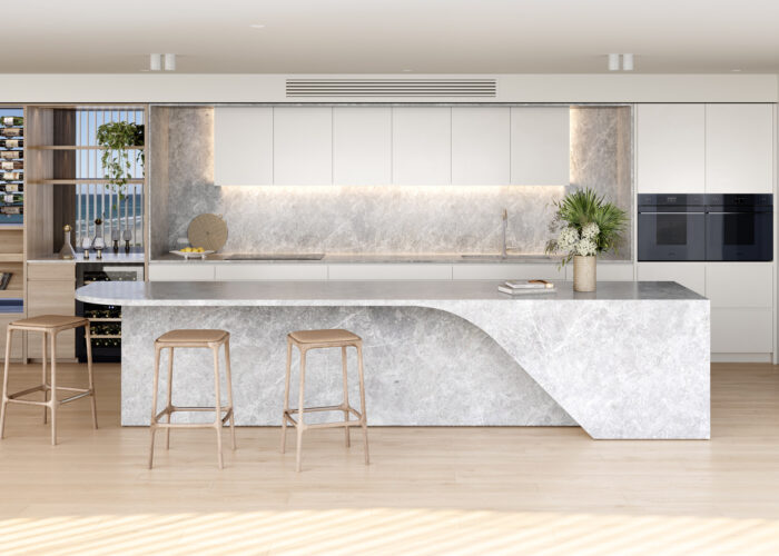
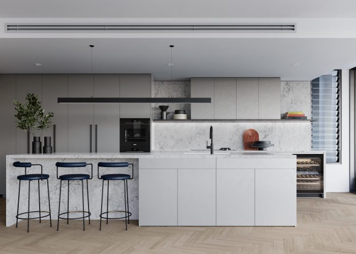
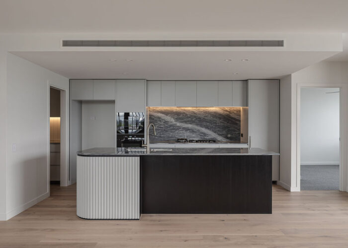
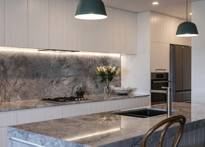
The fluid form of the external has been thoughtfully carried into the apartments. The kitchen adopts a simplistic yet sophisticated palette, with soft greys, natural stones and black contrasts. Subtle references to the curves of the building have been embraced in the kitchens with a curved feature end to the island benches, ensuring fluid movement in and around the space. Both textural and contrasting elements emphasise the palette, creating a high end and timeless feel. Where possible, the interiors have been designed with Indirect and concealed lighting, which will help create a relaxed and beautiful home.
Renders by Binyan Studios Photography by Cam Murchison & Hutchinson Builders

Emmeline
Paddington
Emmeline (Paddington)
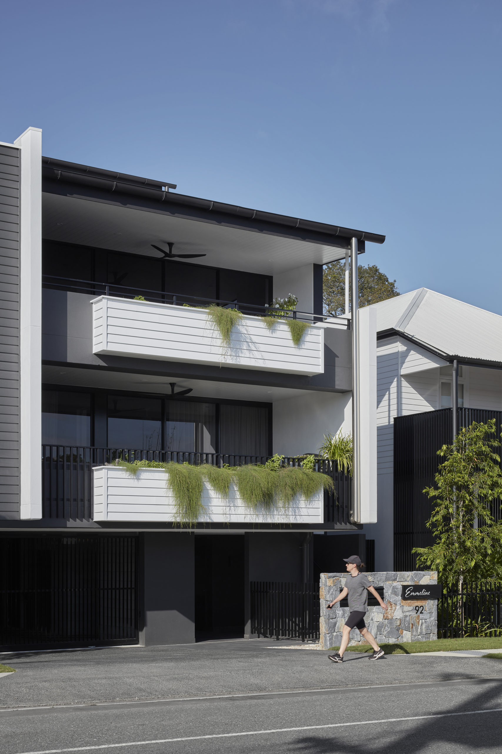
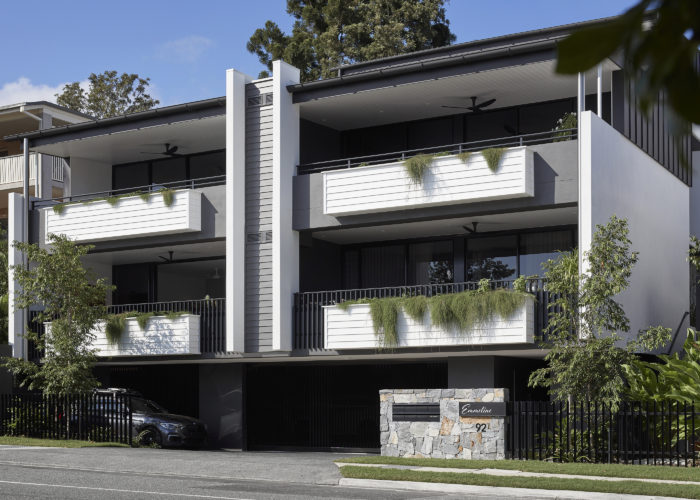
Paying homage to the rich history of the site and the heritage of the land and surrounding neighbourhood, Emmeline on Elizabeth is named in honour of the original owner Emmeline Chowne.
A series of seven homes nestled into the quiet and leafy suburb of Paddington, Emmeline draws on the local vernacular and materials of the area to create a development that fits comfortably within its heritage context, including revitalisation of a traditional cottage.

Summerlin
Banyo
Summerlin (Banyo)
Crafted to elevate the living experience, each of the terrace homes are located overlooking the ‘Summerlin Green’ resident oasis.
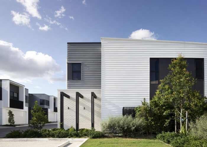
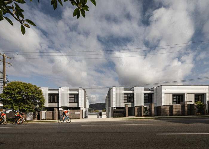
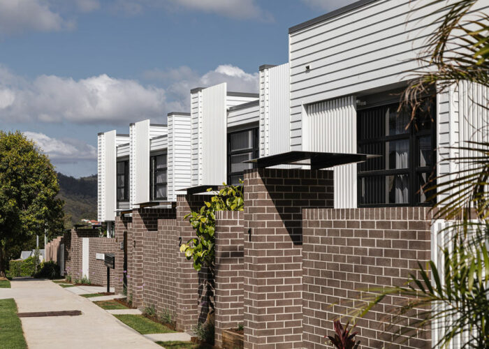
Located in Banyo, the Summerlin residences are a collection of homes, carefully designed to provide ultimate living space. We partnered with Dennis Family Corporation to provide a range of well-considered town homes designed to appeal to the local community. The poolside terrace homes include 2 and 3 bedroom townhouses, with fully fenced gardens and raised external balconies that overlook an expanse of communal area.
Benson
Fortitude Valley
Benson (Fortitude Valley)
A build-to-rent project. Simplified architectural expression in the heart of the valley.
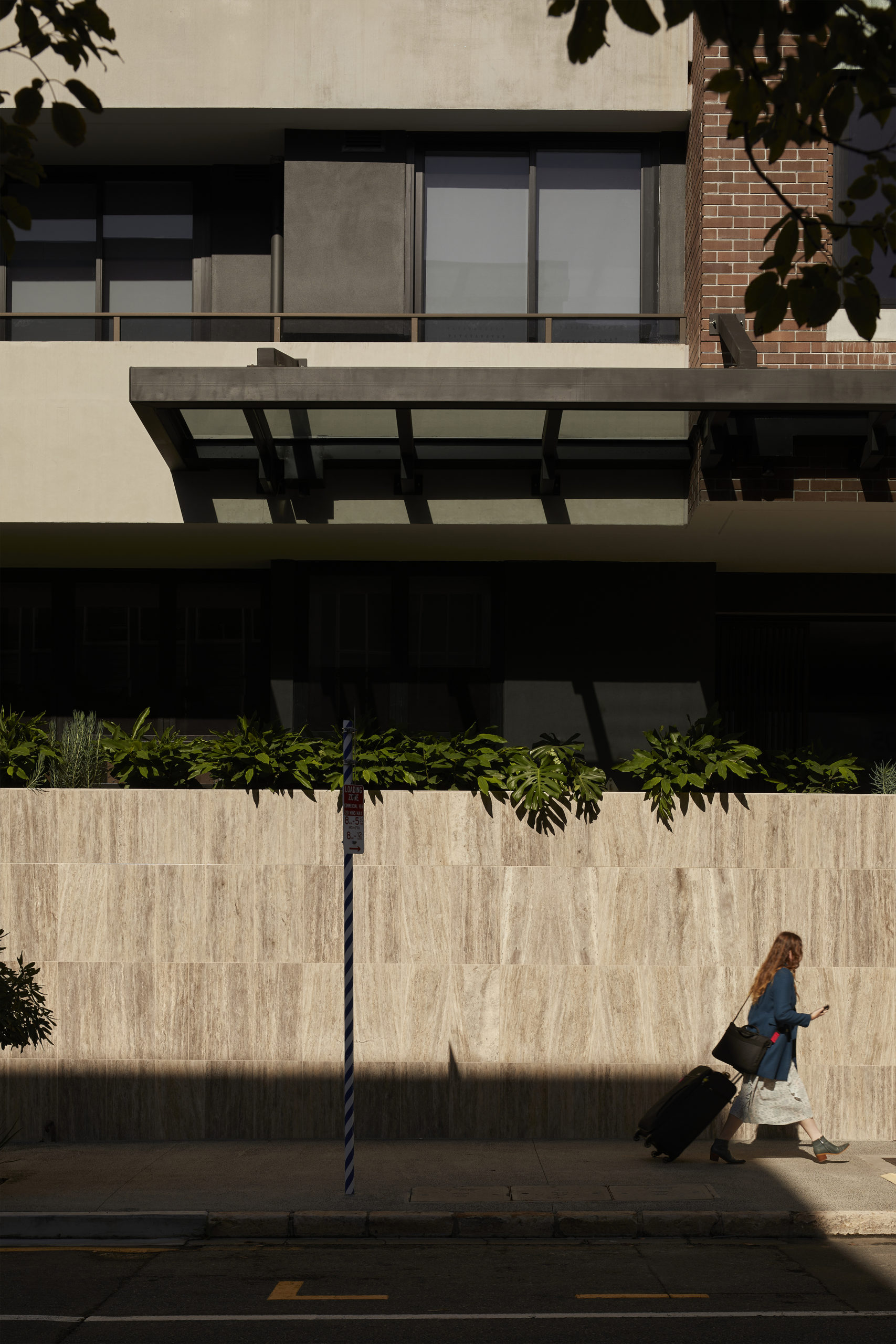
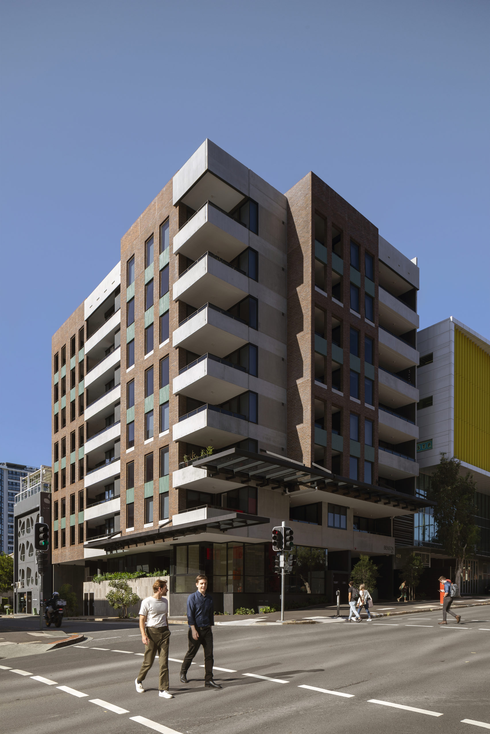
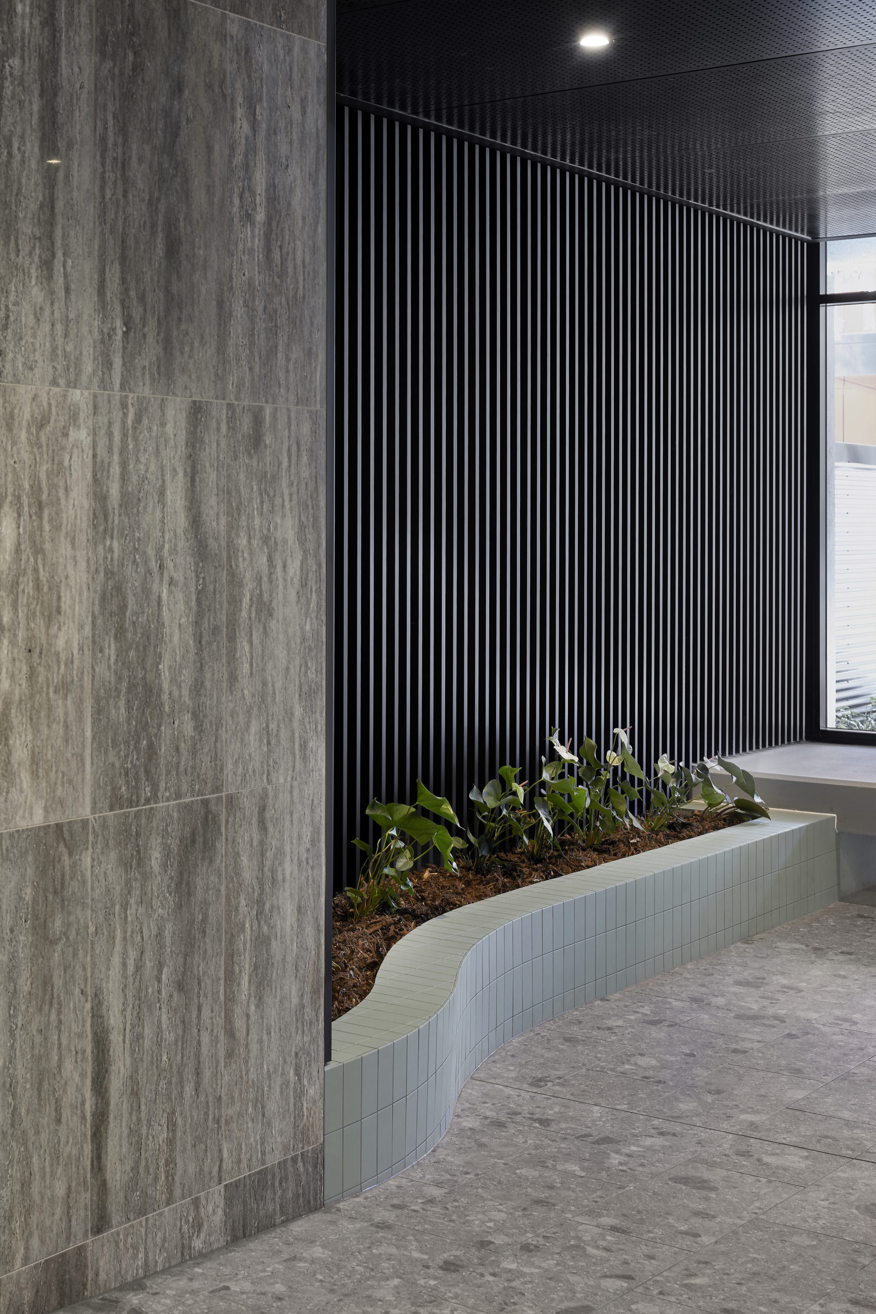
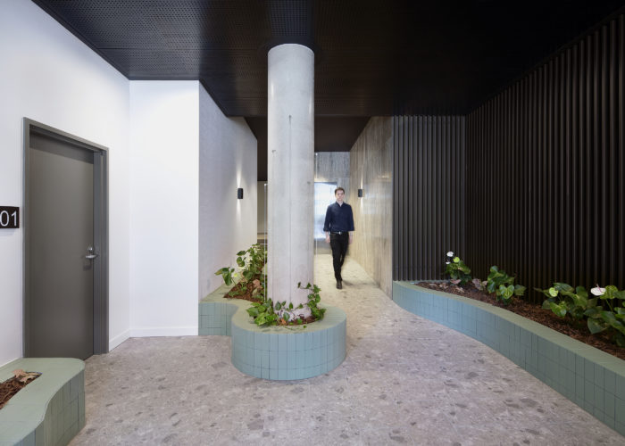
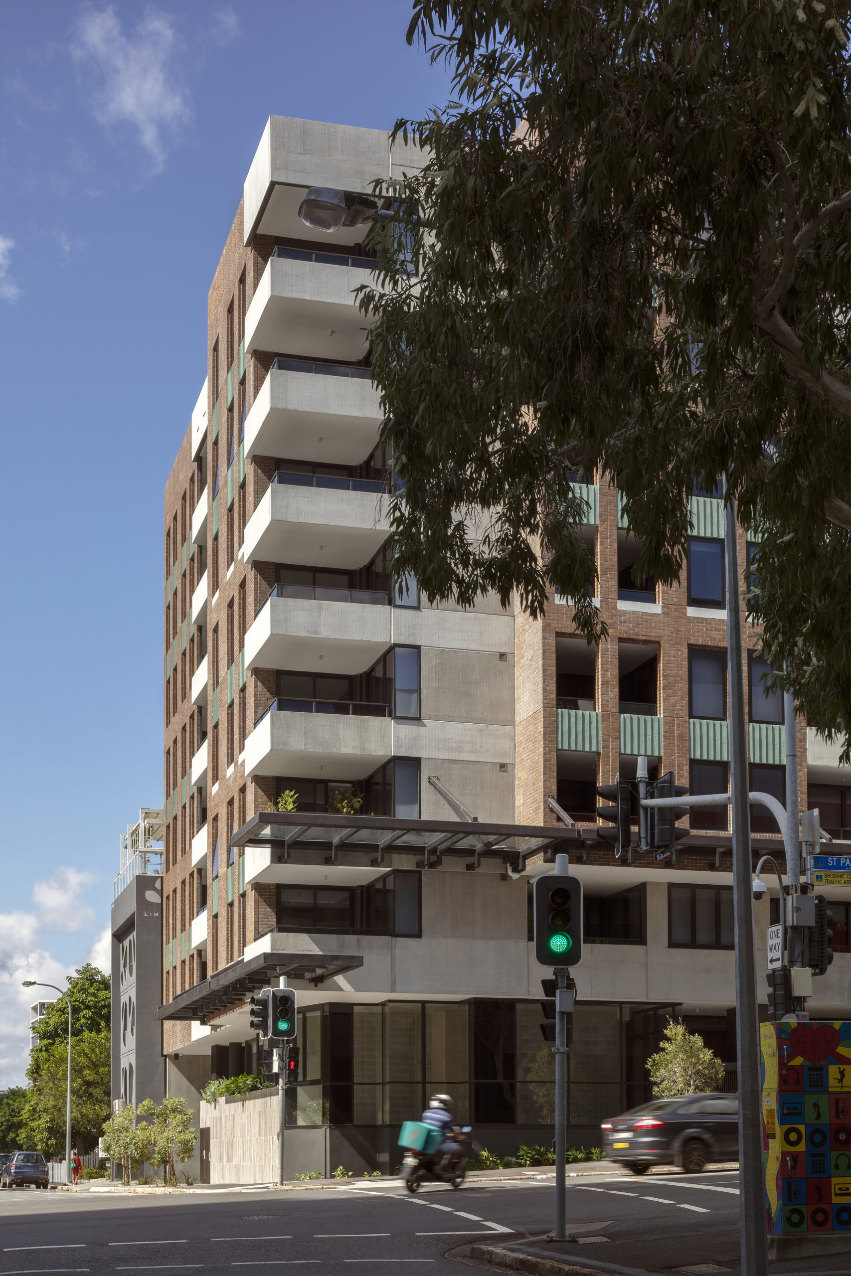
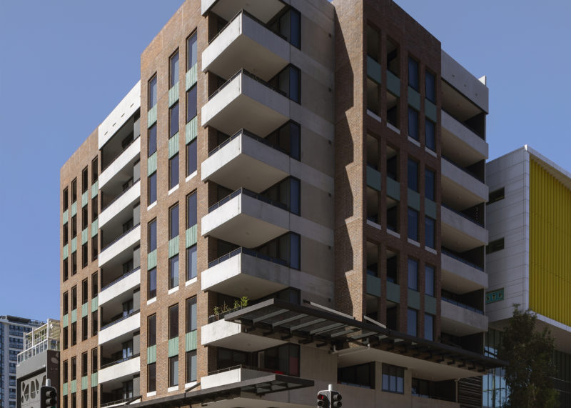
Located in the Valley Heart Precinct, 465 St Paul’s Terrace carefully curates a mix of uses, spaces and materials to create a strong and vibrant build-to-rent community.
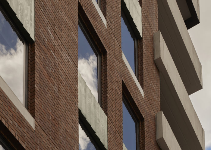
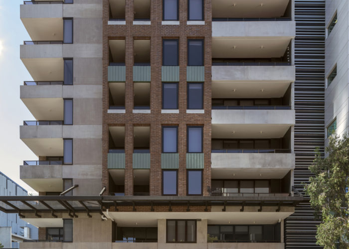
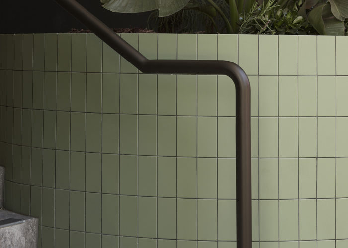
The building’s façade is simple in its expression and materiality – responding to its urban surrounds with a solid, recycled red-brick façade that is punched through with large openings. This brick screen shields residents from the harshness of the two street frontages; while providing an assertive architecture to the streetscape. Each material, and its interaction with the site boundary is carefully considered to encourage activation; accommodating the functional requirements for vehicle access and building services without allowing them to dominate. The ground level landscaping works to soften and complement the built form by using various tones, textures and heights.
With only 37 one- and two-bedroom apartments, the development follows a build-to-rent delivery-model that places a high importance on lifecycle costs, longevity of materials and overall good design outcomes.
Photographed by Cieran Muprhy
Holm
Bardon
Holm (Bardon)
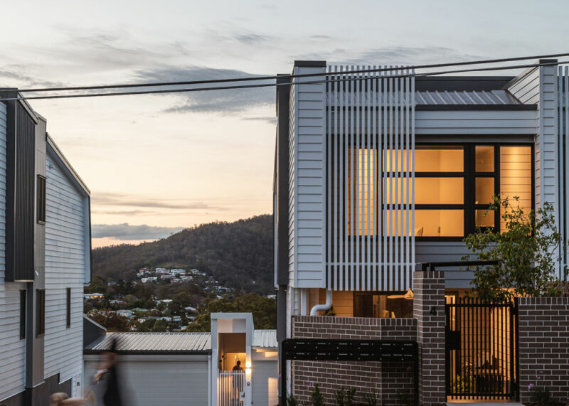
The buildings are designed as modern interpretations of timber-and-tin construction, with lightweight materials, batten screens, awnings and metal roofs.
Located between two streets - Simpsons Road and Rosewood Street, Holm makes the most of the steep site to provide amenable, self-contained residences with views down into the valley.
The townhouses vary between 3 and 4 bedrooms, and all have North-facing living spaces and balconies to take advantage of the site’s favourable aspect. The Simpsons Rd frontage comprises six townhouses; however, they present as three residential-scale homes complete with face brick fencing, articulated awnings and screens. In contrast, the townhouses fronting Rosewood Street follow a similar character to other residences in the street – recessed into to the side of the hill, they have front entries at the Rosewood St Level, and access their backyards from the first level above ground.
Photography by Cam Murchison
Renders by Binyan Studios
Argentum
Fortitude Valley
Argentum (Fortitude Valley)
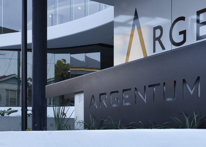
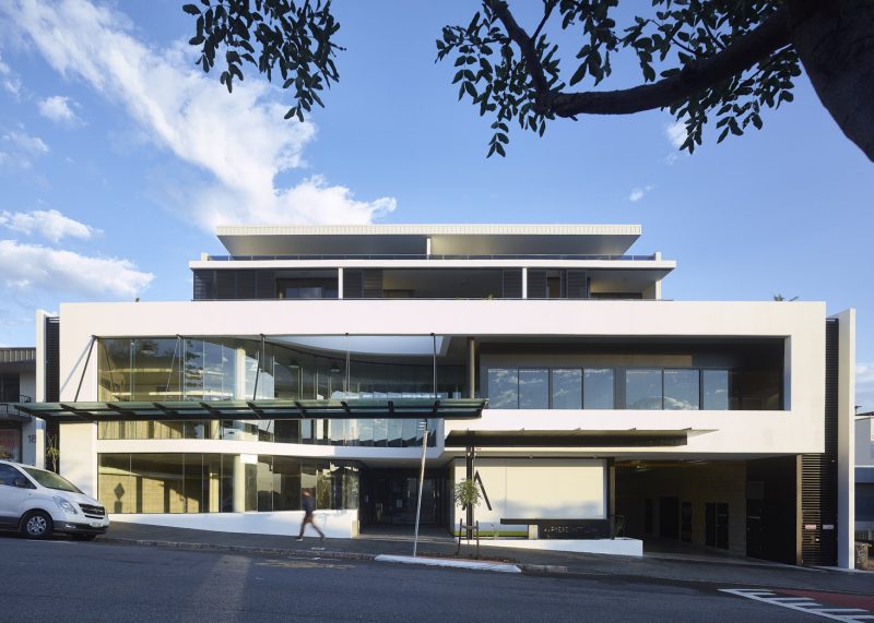
“Argentum” is Latin for silver, appropriately named as this is Argent Australia’s Head Office & Brisbane showroom.
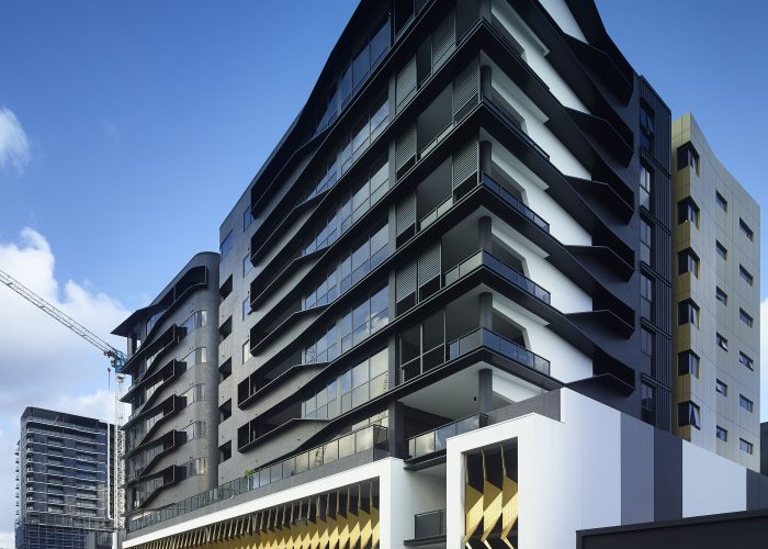
Our brief was therefore twofold, create a sleek commercial podium, and a multi-residential upper that responds to the transitionary nature of the site.
We drew upon early 20th century modernism as inspiration for the simple yet bold forms of the façade. Bands of concrete frame the showroom, which is softened by a double height curved glass façade that is grounded by a garden. The curved glass wall draws residents & visitors into the entry, giving back space and volume to the street and giving a sense of openness to the street.
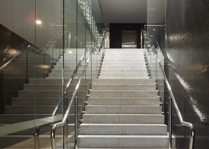
A simple material pallet of concrete, glass, steel, metal cladding & vegetation create a balance between a commercial aesthetic podium and a human scale level of detail for the residential component above.
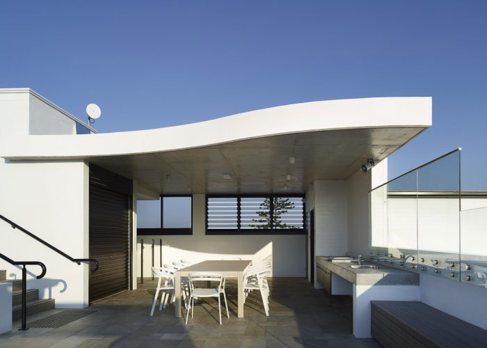
We used subtropical design fundamentals including vegetation, flow through ventilation, natural light & solar control to make sure we created a high-quality living environment for the residents & commercial tenants. This includes a communal recreation space on the roof with a pool and steam room to offer a meeting place for residents.
Photography by Scott Burrows

Nero
Newstead
Nero (Newstead)
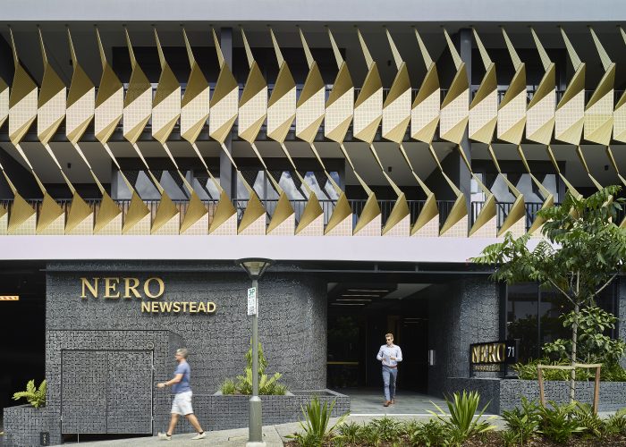
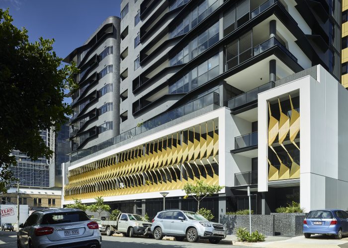
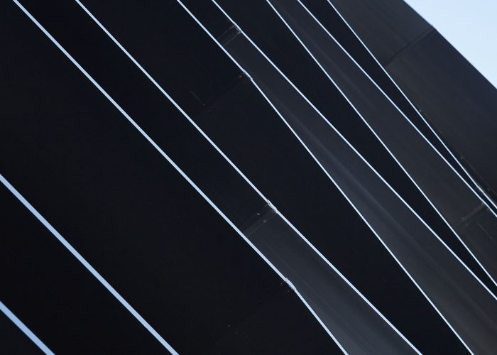
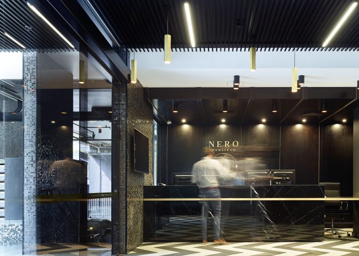
Nero, meaning black in Italian, inspires the dark personality of the building’s overall expression and resulting material palette.
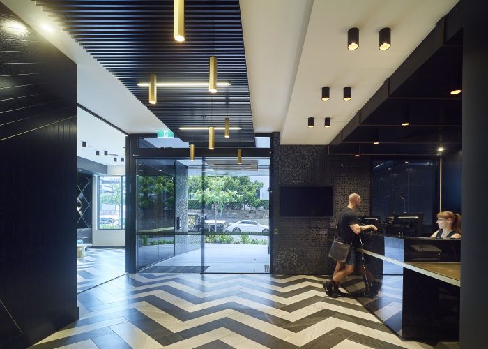
Nero Apartments offers a high-quality living environment within the rapidly evolving Newstead neighbourhood. Located within close proximity to the newly developed and growing Gasometer retail precinct, the development benefits from an abundance of recreation and amenity options for its residents. Positioned amongst a multitude of high-density apartment buildings, Nero seeks to stand out from the crowd and strives to offer something a little different. Residents are offered concierge type facilities to welcome them home, as well as apartment technologies more akin to hotel accommodation.
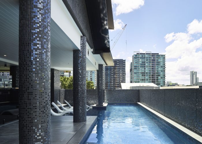
Nero, meaning black in Italian, inspires the dark personality of the building’s overall expression and resulting material palette. The external form of the building creates a homogeneous façade that conceals the apartment balconies behind it. This is a direct response to the due west orientation of the apartments, balancing solar protection without limiting access to light and views.
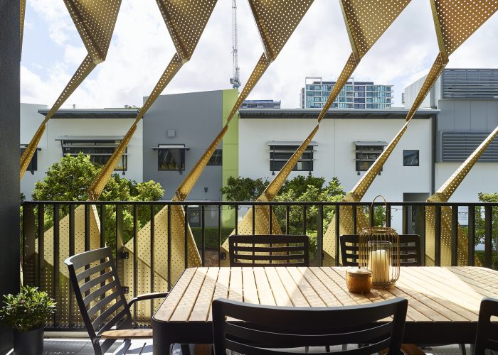
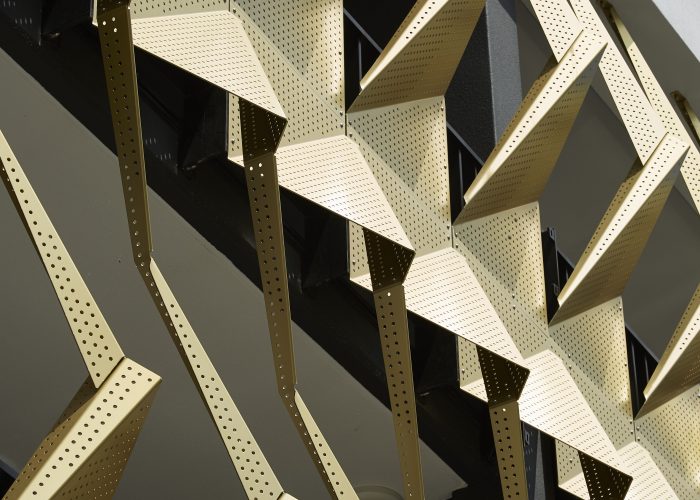
Clad in black tile, aluminium cladding and screening, the development has a sleek and timeless appearance. The folded gold screening to the lower podium levels has many roles; it provides solar protection towards the west while folding open towards the north, it provides privacy up to the balustrade height, creates foreground interest where there are no views, and forms a sculptural contribution to the streetscape.
Photography by Scott Burrows
Arvia
Rainbow Bay
Arvia (Rainbow Bay)
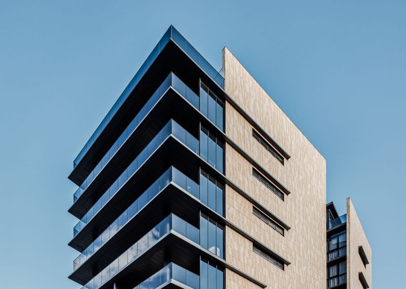
We focused on creating a timeless built form, minimising the amount of rendered surfaces was important in delivering a building that aims to look admirable long into the future.
Rainbow Bay is an evolving beachfront boulevard of Coolangatta. We partnered with our long-term client Aspect Property Group, to deliver a catalyst of exclusive living which reflects the unique assets of the site, in particular the direct proximity to Rainbow Bay beach. Our client sought to deliver to a niche of down-sizing owner-occupiers looking for a premium product. We focused on creating a timeless built form, minimising the amount of rendered surfaces was important in delivering a building that aims to look admirable long into the future.
Photographed by Andy MacPherson Studio
Arena
South Brisbane
Arena (South Brisbane)
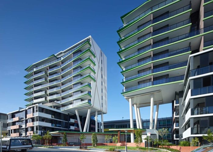
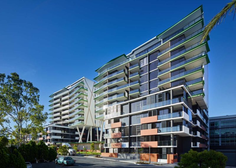
Arena is a collective response to the context of the people, the site, views, orientation and ground level activation. We partnered with Galileo, to deliver something unlike anything else is South Brisbane.
Arena is a collective response to the context of the people, the site, views, orientation and ground level activation. We partnered with Galileo, to deliver something unlike anything else is South Brisbane and its strong bold form makes a real statement in the vibrant South Brisbane community. The central courtyard defined by the expression of the podium form, is the heart of Arena and is host to active public gathering areas, and private retreat and refection nooks. The rotated podium and tower form takes advantage of the expansive view lines, allow views for neighbouring buildings and creates an urban courtyard that contributes to both the public and private amenity.
C2 House
Fairfield
C2 House (Fairfield)
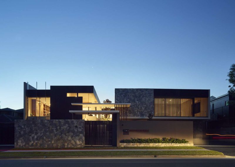
The site of Corso House occupies a unique oxbow in the Brisbane River in Fairfield that provides for uninterrupted river views.
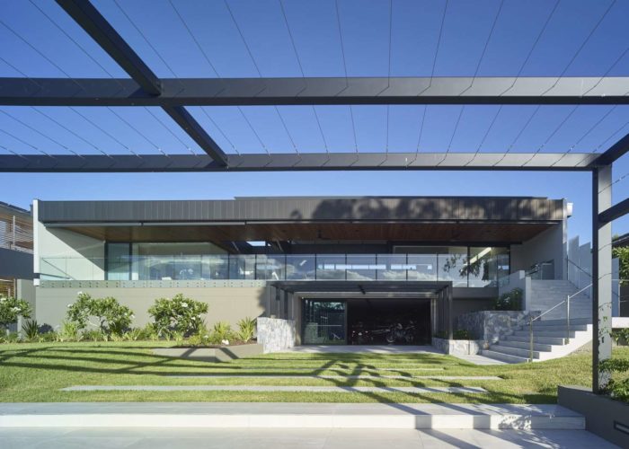
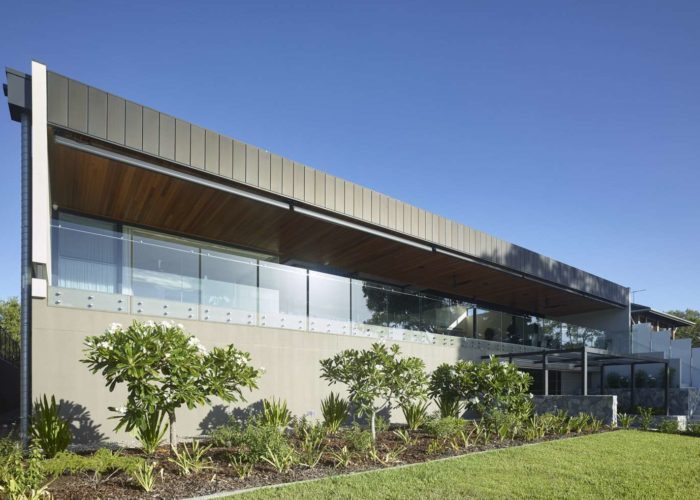
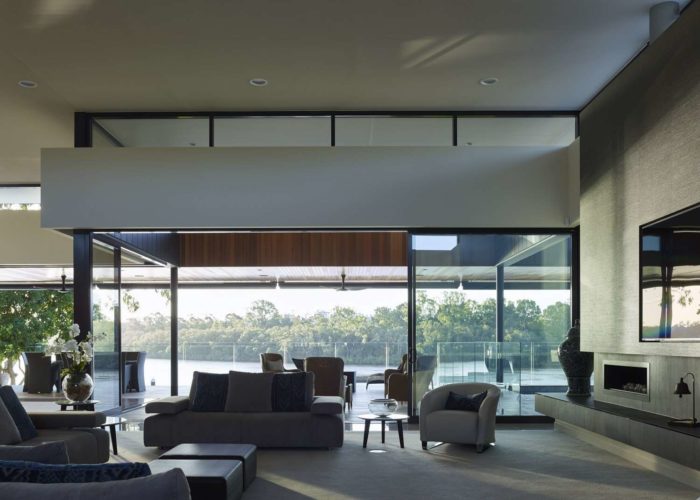
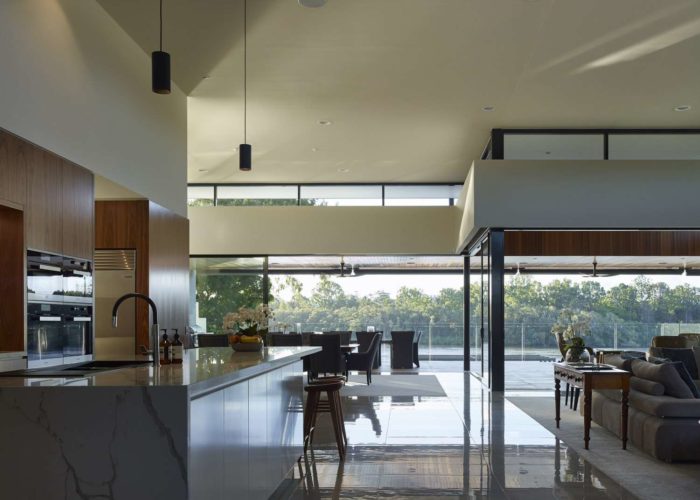
The site and client held three key criteria, design for flood immunity, design for ultimate privacy and design for openness and light. The contrasting requirements for achieving privacy in a light filled home formed the framework for the project. As each step up toward the house protects it from potential flood waters, the gardens that surround its entry step into the house. Our clients were our co-creators of this new home. Being retired empty nesters, this was a place not only for them to call home, but a retreat for their extended family and friends. With this in mind we focused on provided flexible living spaces, which could accommodate activated living and entertaining as well as private play and sleep out guest rooms.
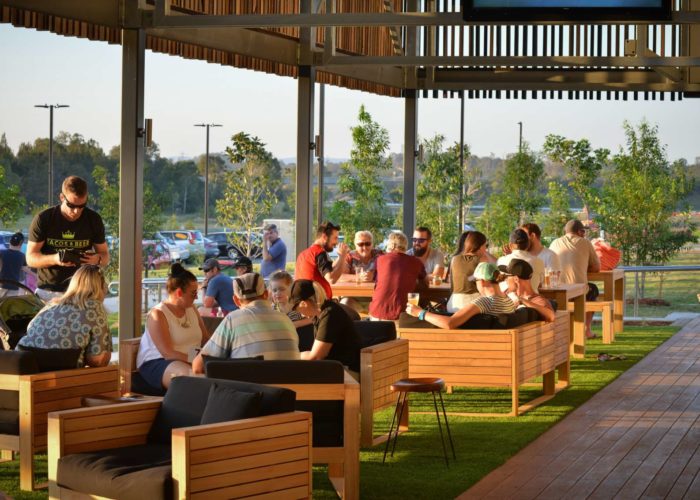
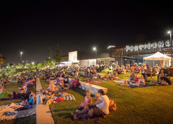
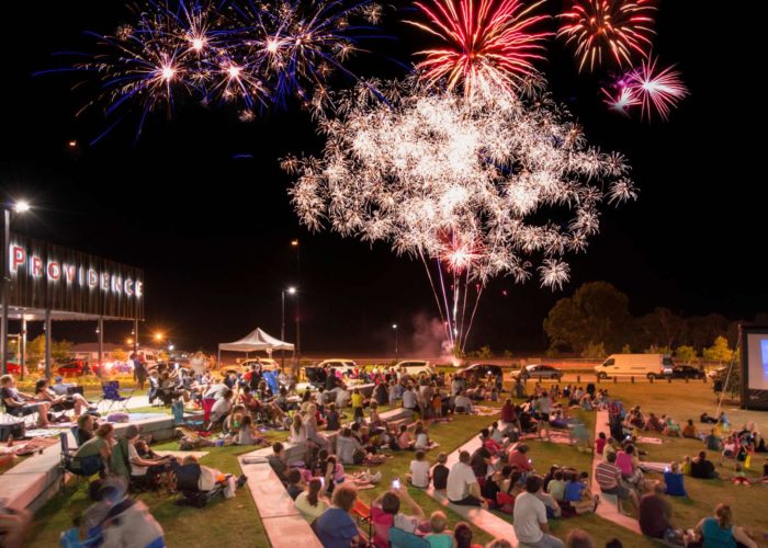
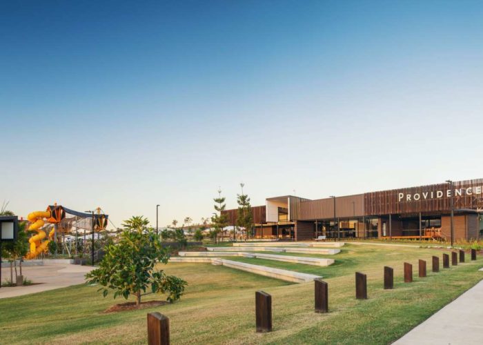
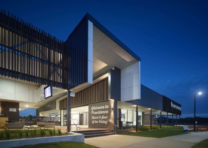
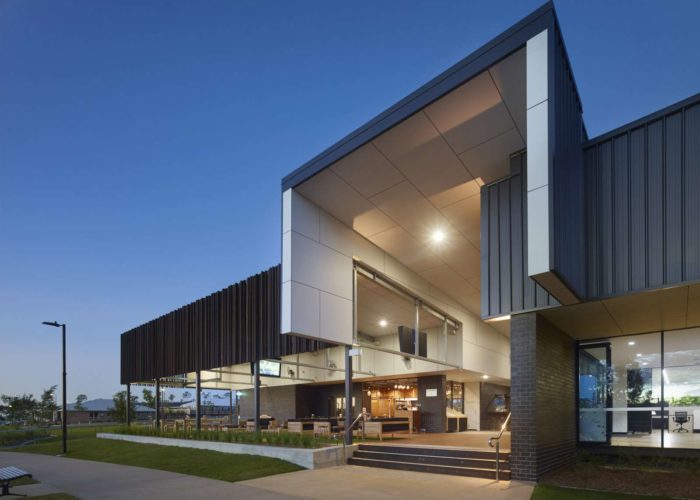
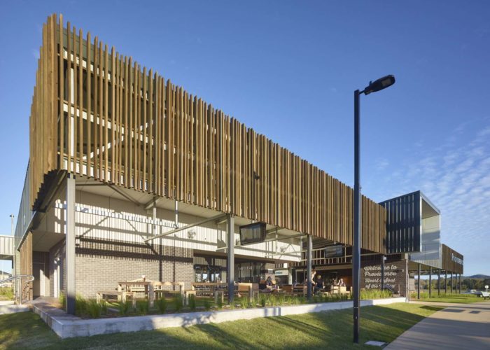
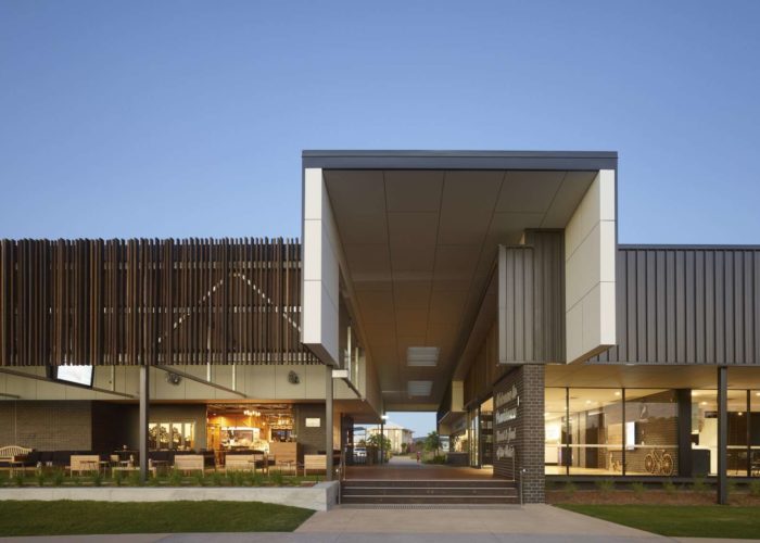
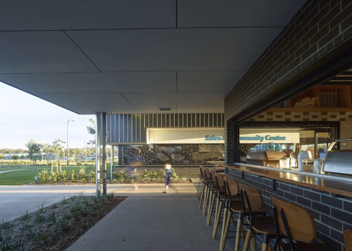
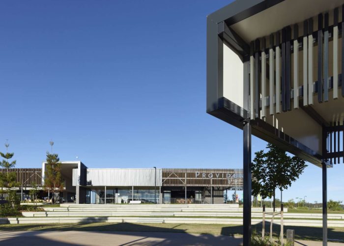
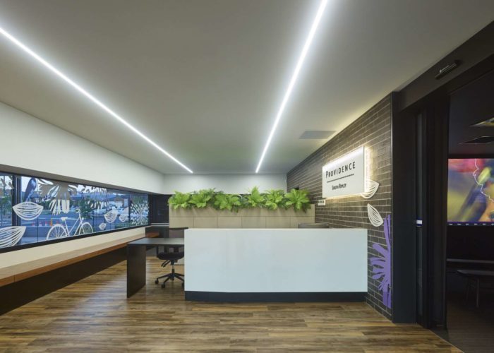
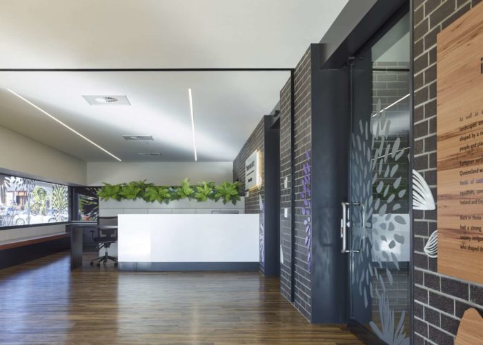
Providence Sales and Community Centre
Ripley Valley
Providence Sales and Community Centre (Ripley Valley)
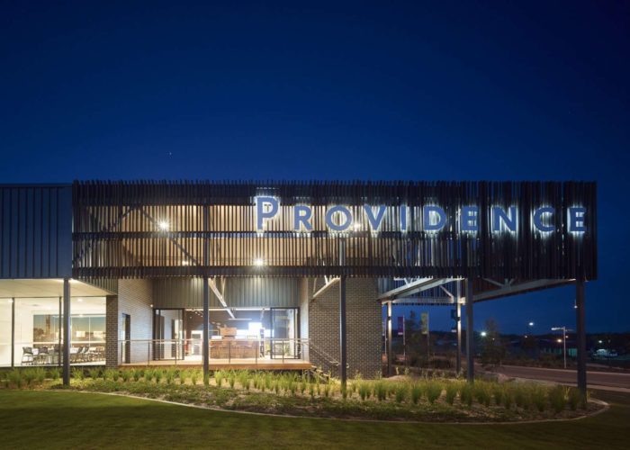
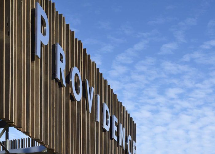
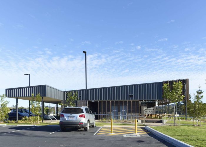
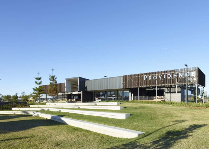
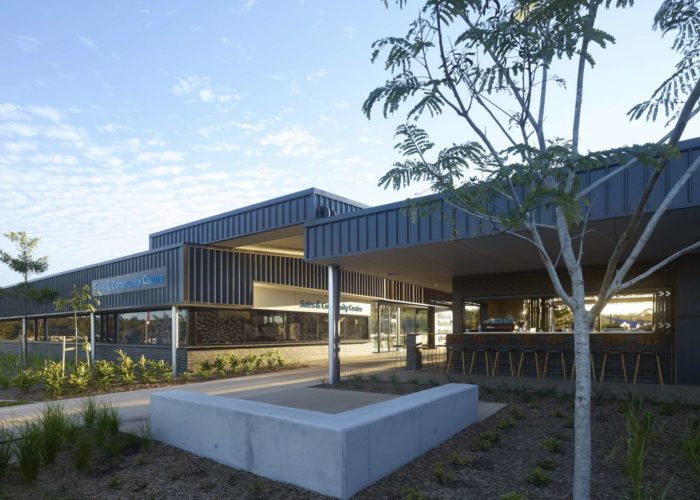
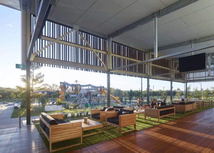
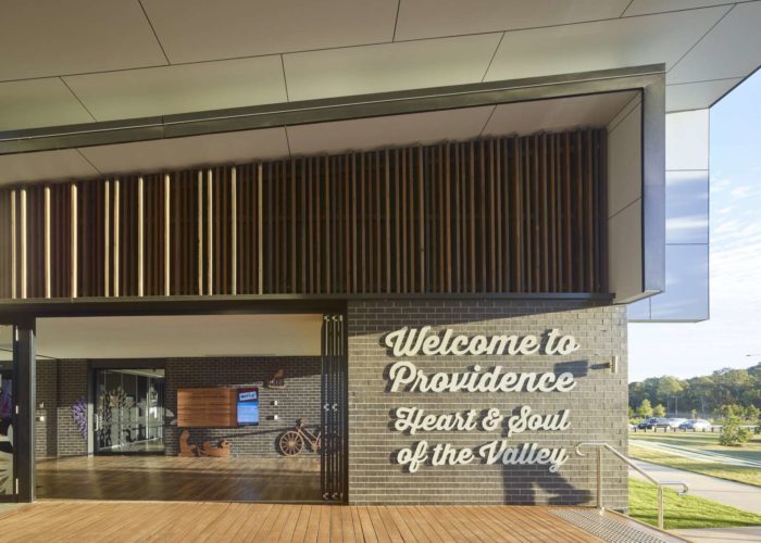
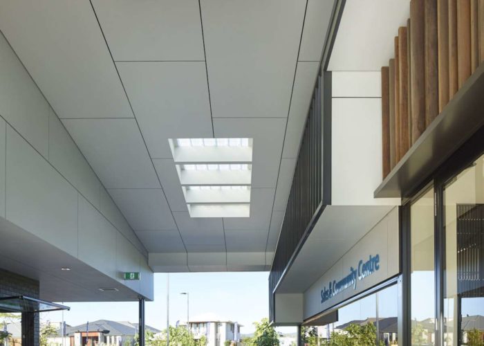
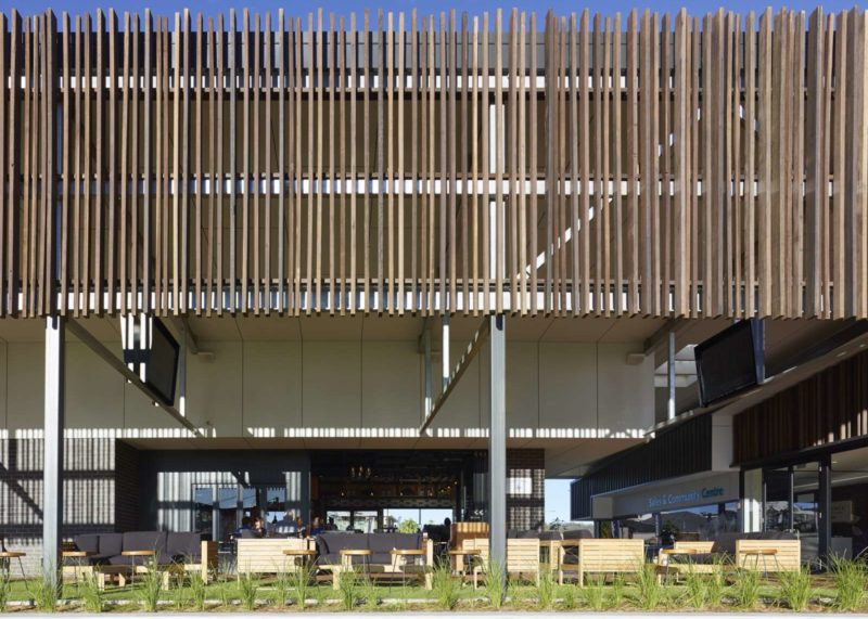
The Centre embodies the values of a vibrant new neighbourhood precinct located in the Ripley Valley and serves as a welcoming gateway, reflecting true community living while holding a strong connection to the landscape in which it is sited.
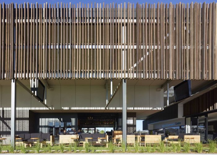
The Providence Sales and Community Centre embodies the values of a vibrant new neighbourhood precinct located in the Ripley Valley. The Centre serves as a welcoming gateway, reflecting true community living while holding a strong connection to the landscape in which it is sited. Situated amongst vegetated nature reserves, the design seeks to connect and blur boundaries between the inside and outside, unlocking views across the adventure playground and mountain ranges beyond and balancing the requirement of an open accessible ‘pavilion’, while engaging with the landscape. The design is accessible, welcoming and familiar and enhances the existing features of the site for all visitors to share and enjoy.

Hotel L.A
Petrie Terrace
Hotel L.A (Petrie Terrace)
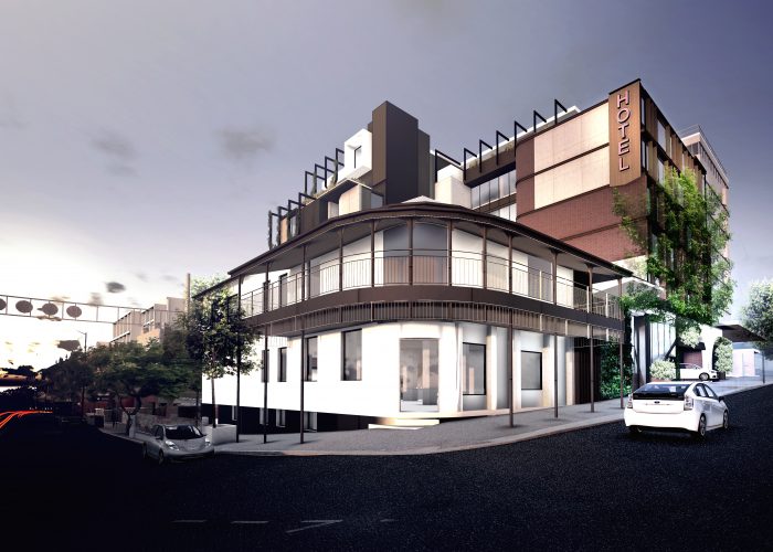
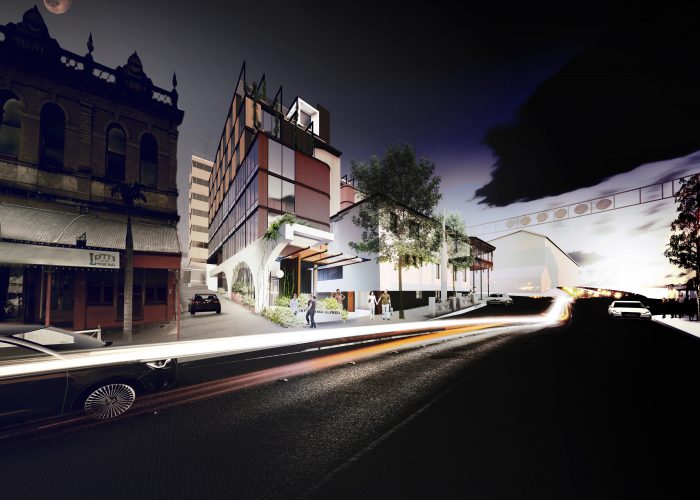
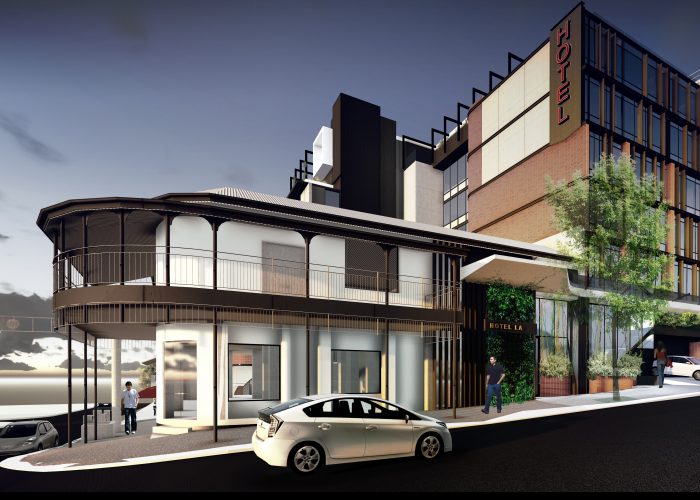
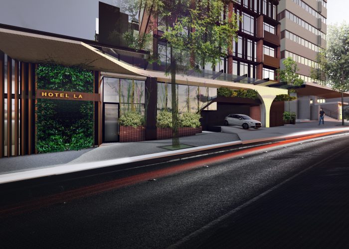
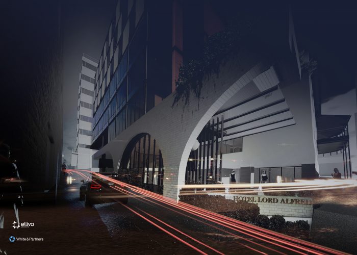
The articulated building form and selection of materials including white tiled archways and classic red brick, nod at Petrie Terrace’s industrial past and highlights the elegance of the surrounding heritage brick and stone buildings.
Petrie Terrace, wedged between the CBD, Milton and Paddington, is rapidly becoming a hot spot for after-work drinks, evening dining and weekend catch-ups from young professionals to inner-city workers. Growing tired of the existing ordinary hotel offerings, visitors seek a dynamic, elegant yet acquainted answer to their short-stay accommodation. We felt it only fitting to pay homage to the cultural background of Petrie Terrace. The articulated building form and selection of materials including white tiled archways and classic red brick, nod at Petrie Terrace’s industrial past and highlights the elegance of the surrounding heritage brick and stone buildings.
Bridgeman Downs Residence
Bridgeman Downs
Bridgeman Downs Residence (Bridgeman Downs)
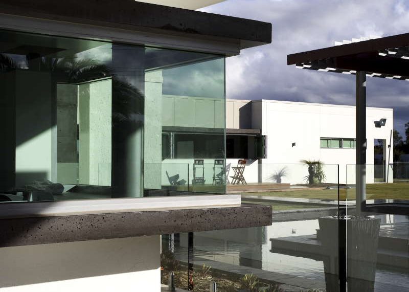
What material do you use to build a home with for a guy in the concreting business? Concrete of course.
In this generous family home, we were able to celebrate our client’s connection with this eternal material but also making sure that the other needs of the family were catered for.
A simple crucifix form created four courtyards for different outdoor activities. In the centre of the cross is the kitchen-the “command centre” of the modern family unit. Everything radiates out from the kitchen hub to the more private spaces within the home. Kids have their own wing to run wild in, but are never too far from the kitchen for mum to keep an eye on things.
The four courtyards defined by the plan created different activity zones- a car court, pool zone, tennis court and a green space for the kids and dogs. The home flows out through a generous double height terrace that is the summertime focus for outdoor living. Like all our projects for individual clients, the real pleasure is seeing how the family makes the spaces their own and really engage with the architecture.
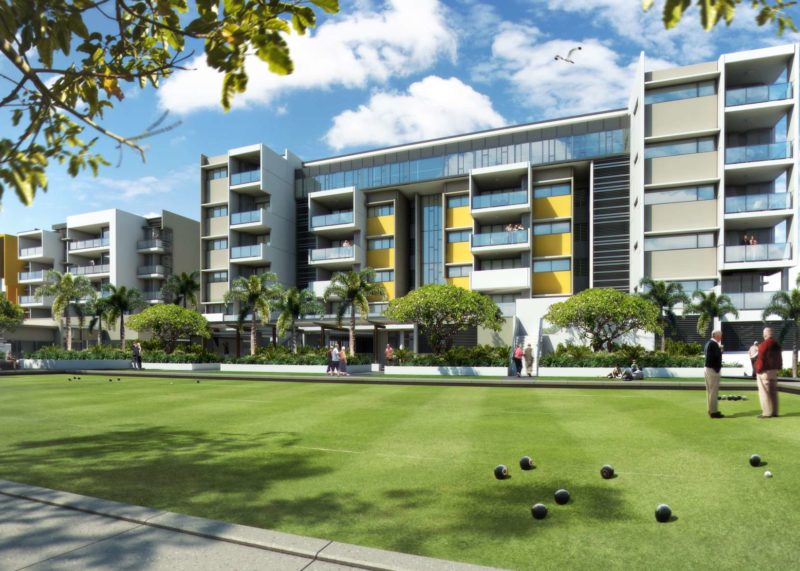
The Village
Yeronga
The Village (Yeronga)
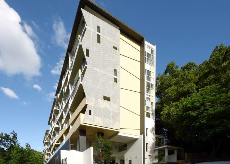
Uni Lodge
St Lucia
Uni Lodge (St Lucia)

The Pad
Kelvin Grove
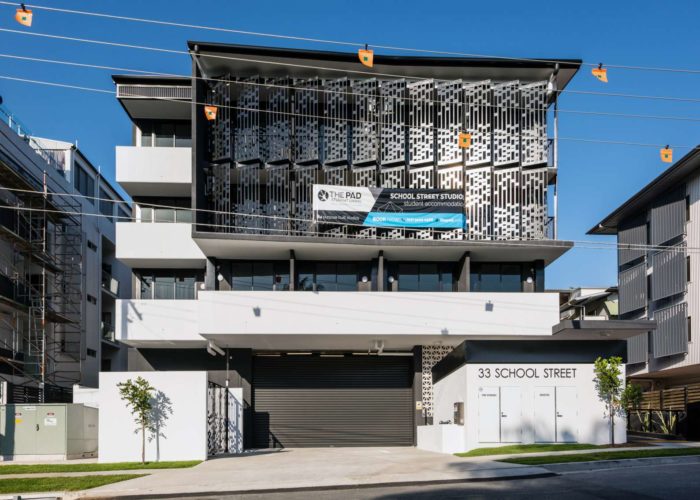
The Pad (Kelvin Grove)
The demand for student accommodation has boomed on the back of Councils drive to make Brisbane one of the most desirable higher education centres in South East Asia
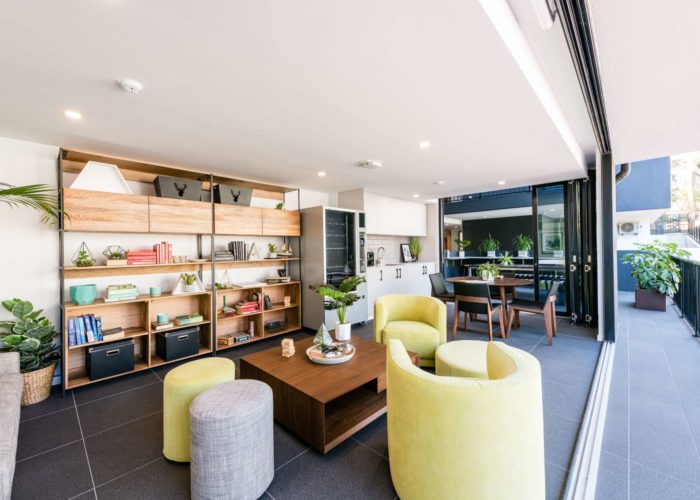
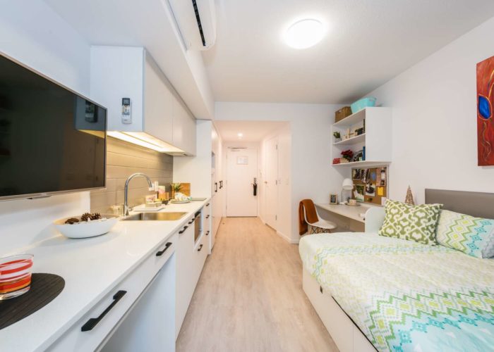
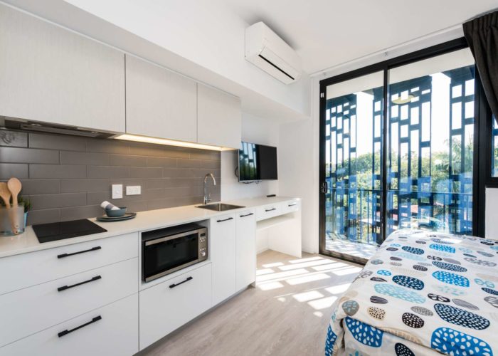
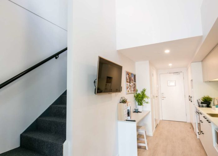
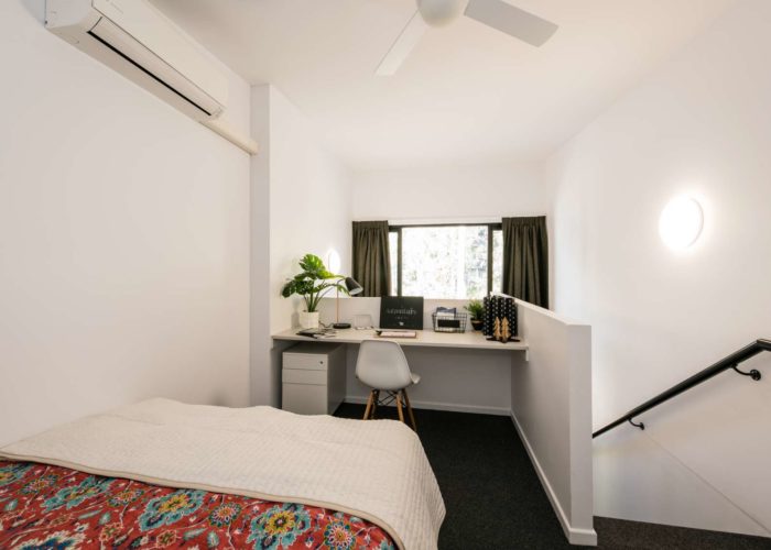
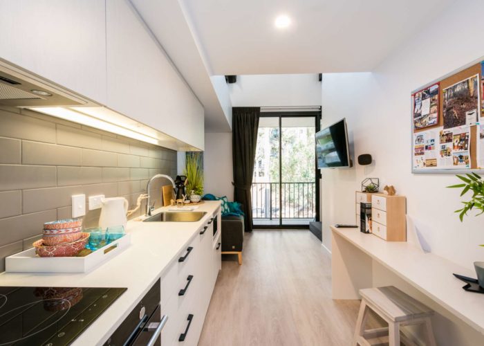
The demand for student accommodation has boomed on the back of Councils drive to make Brisbane one of the most desirable higher education centres in South East Asia. As the demand has grown, a wide range of developers have answered the call to house a diverse demographic into facilities near our educational hubs. The Pad in the Kelvin Grove Campus precincts is one such facility, catering primarily to the post-graduate market. It has “walk-in / walk-out” convenience - bring your suitcase and basically everything else is provided. You can have WIFI access almost instantly and a comfortable, quite place to study and socialize.

La Vida
Newstead
La Vida (Newstead)
La Vida is an extension to this energetic community.
Newstead a suburb in transformation – converting from a warehouse district into a hip, inner city hub with no shortage of shopping, dining and nightlife options. With Brisbane CBD, New Farm’s James Street and Fortitude Valley just a short stroll away, the site is at the heart of the entertainment and lifestyle precinct. La Vida is an extension to this energetic community. Together with Bekaa group, we sought to deliver a sleek and contemporary expression of the suburb, providing residents with resort living amenities with a luxury touch with views to the edges of Brisbane. These large, open, spacious apartments are designed with luxury in mind while still being an entertainer’s dream.
Photographer: Scott Shirley

Vantage
Benowa
Vantage (Benowa)
A new community, Vantage is located in the Royal Pines Gold Precinct known for its PGA Quality Golf Course and Carrara Stadium.
Nestled between Southport and Nerang, residents enjoy the close proximity to major Gold Coast hot spots and major golf courses, while also having a peaceful buffer away from the hustle and bustle. Ellivo partnered with the Rayjon Property Group, to maximise the potential area’s nature assets and create a rich community for people to live in.
Photography by Andy Macpherson

Oxy
Stones Corner
Oxy (Stones Corner)
Less than five kilometres from Brisbane CBD, Stones Corner is a well-connected inner south-eastern suburb of the city nestled between Greenslopes and Woolloongabba
Less than five kilometres from Brisbane CBD, Stones Corner is a well-connected inner south-eastern suburb of the city nestled between Greenslopes and Woolloongabba. With a strong history, this gazetted nook is growing as a cultural and lifestyle precinct. Being a major residential destination for Brisbane’s young professionals, Stones Corner residents seek a dynamic home which enhance the existing offerings of the area including its connections to Hanlon Park and Bikeway, and the active Stones Corner retail strip.
In Partnership with Lantona, the design of Oxy aims to be complementary to its context by using a material palette that is sympathetic to its surroundings, while providing a high level of private and social amenity. Materials such as weatherboard, timber palings and brickwork provide a sense of familiarly. The weatherboard façade pattern represents the roof form of the traditional Queensland Cottage – a nod to the historical vernacular.
Photographed by Andy MacPherson Studio
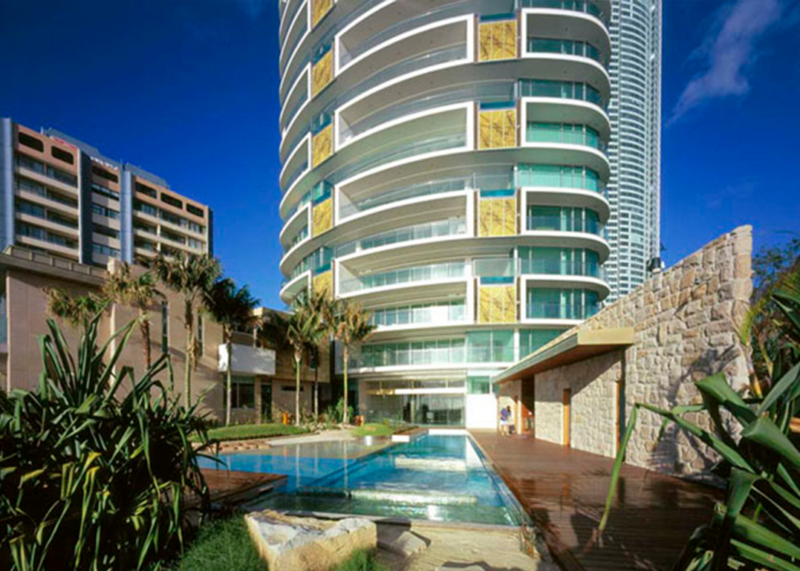
Jade
Gold Coast
Jade (Gold Coast)
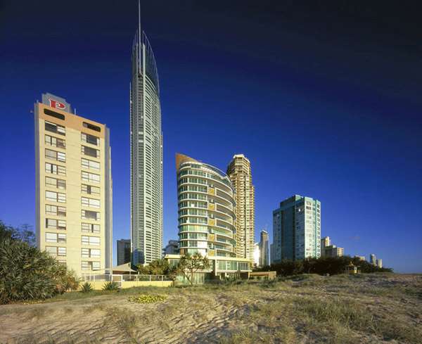
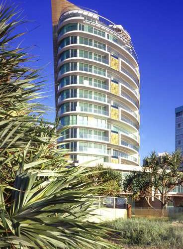
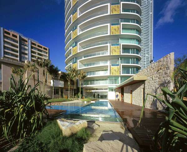
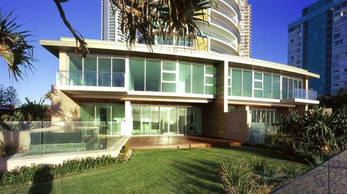
Jade is one of our most iconic and memorable projects
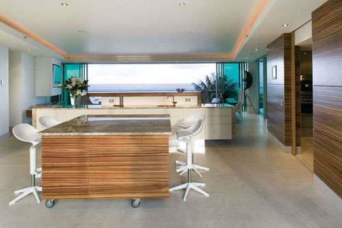
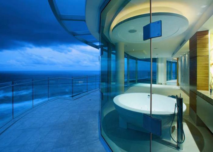
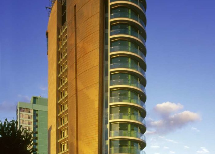
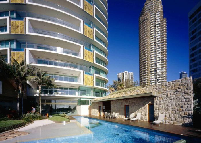
Jade is one of our most iconic and memorable projects. Everything about the project was exemplary. The vision for the project was to attract an international clientele who would be using these for permanent residences or for holidays. This understanding informed the project at every level, from the flow of the floor plan to the detailing of the understated but opulent finishes. The result is pure luxury but with genuinely Queensland sense of relaxed living.
Timeless architecture is difficult to achieve, but there is no doubt that this project still remains one of our most recognised and enduring projects.

Fish Lane
South Brisbane
Fish Lane (South Brisbane)
As a gateway to South Brisbane’s laneway culture and a stone’s throw from the cultural hub of West End, the site on the corner of Fish Lane attracted residents that were searching for more than just a place to call home
As a gateway to South Brisbane’s laneway culture and a stone’s throw from the cultural hub of West End, the site on the corner of Fish Lane attracted residents that were searching for more than just a place to call home. We identified the need for an alternative design vernacular in contrast to the existing commercial provisions in the South Brisbane precinct. We placed a focus on connections with the outdoors, activation of the ground plane network of bustling cafes and bars, and providing visual connection to neighbouring precincts of West End and the CBD were essential components of their living criteria.
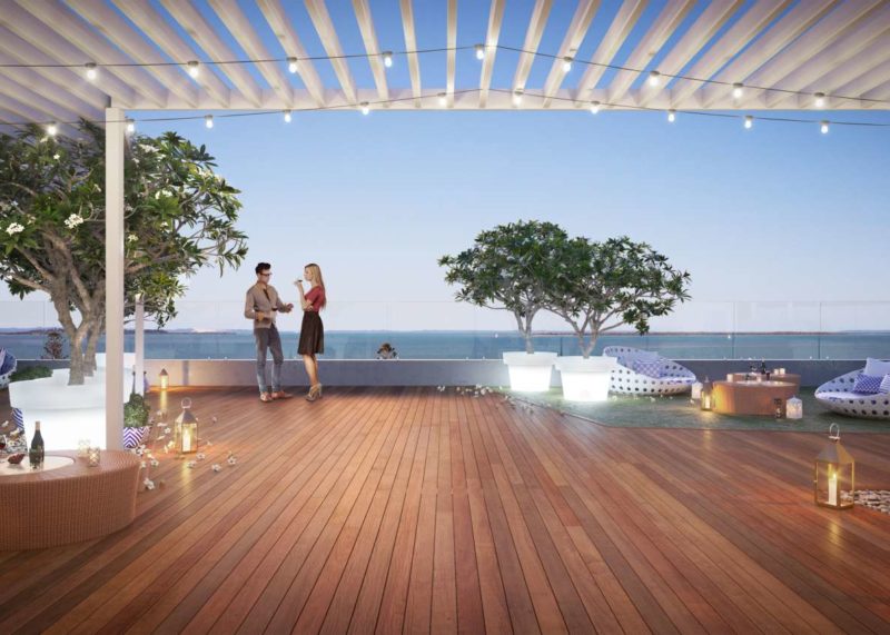
Enclave
Wynnum
Enclave (Wynnum)
Designing for the specific characteristics of a place and its people is a mantra in our studio
Designing for the specific characteristics of a place and its people is a mantra in our studio. Enclave at is a great example of how an understanding of these elements can make a great place. Our client recognised the limited offerings for medium density options in the Wynnum Manly area. Our brief was born out of the area, its residents and the characteristics that define bayside living. Three buildings offer three types of living, from townhomes to generous apartments. The key elements of the design are views, bay breezes, and a level of accommodation that appeals to owner occupiers. It also has to “fit“ in the local area. The materials and scale were driven by the desire to embrace and reflect the scale and feel of the neighbourhood. The central timber boardwalk reflects the nearby mangrove boardwalks. But the most important ingredient is to create the spaces that reinforce community. This is not a gated community, it provides security but contributes to the streetscape and provides great communal spaces for the owners.
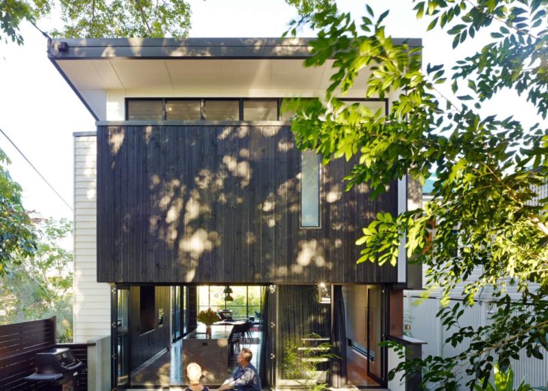
Paddington Residence
Paddington
Paddington Residence (Paddington)
Minimal and raw yet textured and welcoming, the Paddington Residence is an exploration of space and materials for a rigorously contemporary family home in a historical setting.
What is the appropriate response when designing a contemporary family home in a sensitive and historical setting? Minimal and raw yet textured and welcoming, the Paddington Residence is an exploration of space and materials for a rigorously contemporary family home in a historical setting. Beyond simply satisfying the client’s spatial requirements, the design explores how to create layered spaces with edges that offer privacy and flexibility.
The challenge within this brief was to deliver their spatial requirements on a small 400 square metre site with heritage neighbours, a very steep slope and ensuring protection of the significant tree. The design response has been to imagine the home as a procession of 5 distinct spaces, each with their own function, transitioning from the historic Moreton Bay Fig Tree to the west and the views to the city to the east.
